
Football Uniform Design Ideas for Teams That Stand Out
The best football uniform designs start with two or three colors, one signature graphic and numbers that can be read from the top row of the bleachers. Everything else is a variation on that. Below you will find color schemes that work, design ideas you can adapt for a youth, school or rec team, and the rules that decide what you can and cannot put on a jersey.
TL;DR
- Pick two main colors plus one accent, then check how they look in grayscale and under stadium lights before you commit.
- Build the look around one repeatable element, such as a stripe pattern, a shoulder mark or a custom number style, and carry it across jersey, pants and accessories.
- School and league teams should confirm the jersey rules first: under NFHS rules, home jerseys are dark, visiting jersey bodies are white and numbers must contrast clearly.
- Keep names, numbers and logos simple enough to read at a distance.
- Capra Sports offers free design mockups returned within 24 hours, so you can compare options before ordering.
Table of Contents
- Start with the rules, then get creative
- Football color schemes that work
- Design ideas for a distinctive, cohesive look
- Numbers, names and logos: where design meets readability
- Fit, fabric and durability shape the design too
- Flag football has its own design rules
- Our perspective: design for the team photo and the back row
- See your design before you commit
- A simple process for designing your football uniform
- FAQ
- Sources
Start with the rules, then get creative
Most design mistakes in football are not about taste. They are about a jersey that a referee, league or state association will not allow. Sort that out first and the creative part gets easier.
For high school football, the 2025 NFHS football jersey and pant rules say home jerseys must be dark and clearly contrast with white, while visiting jerseys must have a white body. Number bodies must be a single solid color that clearly contrasts with the jersey. Jerseys must cover the pads, pants must cover the knees and pads, and logos and manufacturer marks are limited. The same document says players are numbered 0 to 99, that a number preceded by zero is illegal, and that numbers must be clearly visible on the front and back.
What that means for design:
- Your home design lives in the dark family: navy, black, maroon, forest, royal, deep purple. Your away set is white-bodied, and your personality shows in the trim, sleeves, numbers and pants.
- You have a lot of freedom with stripes, sleeve graphics and accent colors. You have little freedom with the number color and body color.
- Youth leagues, parks and recreation programs and flag leagues often set their own rules. Ask your league for its uniform requirements before you send artwork to anyone, then check the current rulebook for your level.
If you coach or run a school program, bring the NFHS document to your first design conversation. It saves a revision round.
Football color schemes that work
A color scheme is more than a favorite pair of colors. It has to work on a dark home jersey, a white away jersey, under lights, on a wet field and on a phone photo a parent posts that night.
Choose two main colors and one accent
Two main colors and one accent is the classic structure. The main colors carry the jersey and pants. The accent shows up in trim, outlines, sock bands and small graphic details. A third full color on the jersey body often makes the design look busy from a distance.
Test in grayscale and under lights
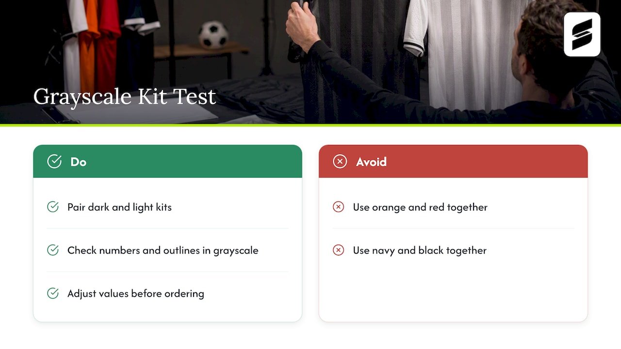
Color choices can fail in ways a screen mockup hides. A widely shared piece of kit-selection advice from the International Federation of Cerebral Palsy Football suggests checking kits in grayscale, pairing one dark kit with one light kit, and watching for combinations that can vanish against the field or under different lighting. It is written for another sport, but the logic carries straight over to football.
Try it yourself: turn your mockup to black and white. If the numbers and outlines still separate from the jersey, you have enough contrast. If orange and red or navy and black melt together, adjust the values before you order.
Color pairings to look at
These are pairings that work well on football jerseys. Each links to a design we have built, so you can see the layout and not only the colors.
| Pairing | Why it works | Example |
|---|---|---|
| Black and white | Maximum contrast, easy to read numbers, fits both home and away rules | Black and white design |
| Navy or blue and white | Classic and clean, forgiving on youth and school budgets | Blue and white design |
| Maroon and white | Traditional school look, strong on a dark home jersey | Maroon and white design |
| Orange and white | High energy, stands out in a crowd of blues and reds | Orange and white design |
| Yellow and white | Bright and visible, works best when numbers get a dark outline | Yellow and white design |
| Black and blue | Moody and modern, needs careful number contrast | Black and blue design |
| Gray and navy | Understated, professional, good for a premium look | Gray and navy design |
The white-bodied away options follow the same logic. See the white and blue and white and orange layouts for how color moves into the sleeves and trim when the body has to stay white.
Design ideas for a distinctive, cohesive look
Cohesive means every piece of the uniform feels like it belongs to the same team. Distinctive means someone could pick you out of a team photo without reading the jersey. Here are the ideas we see work most often.
1. One signature element, repeated
Pick a single graphic idea and use it everywhere: a stripe, a zigzag, a claw mark, a lightning bolt. Repeat it on the shoulders, pants and sock bands in different sizes. When the NFL’s Houston Texans unveiled their redesign, NFL.com reported that a bullhorn shoulder mark echoed the primary logo, a custom number typeface ran across all four uniforms and the same stripe logic was adapted to the different jersey and pant colors. You do not need a pro budget to copy the method: one idea, applied consistently.
2. Mascot-inspired patterns
If your mascot has a natural texture, use it. Tiger stripes, scales, feathers or flames can run down the sleeves or sides as a tone-on-tone pattern. Our orange tiger stripe football set shows how an animal pattern can fill the sleeves and sides while the chest stays clean enough for a readable number.
Because our uniforms are sublimated, the pattern is printed into the fabric. That means gradients, textures and all-over graphics do not add complexity the way stitched or heat-applied details would.
3. Sleeve and shoulder panels
Shoulders are the part of the jersey fans see from the stands and the part cameras catch. A contrasting yoke, a shoulder stripe or a small logo on the cap of the sleeve adds identity without crowding the chest number. Check your league rules on logo size and placement first.
4. Side panels that slim the silhouette
A darker panel under the arm and down the torso gives jerseys a tapered look. It is a good option for teams that want the uniform to feel athletic without adding any graphics to the front.
5. Pants that match the story
Football pants are a design surface too. A single side stripe in the accent color is the classic choice. A stripe pattern that echoes the jersey sleeves ties the set together. Pants must cover the knees and pads under the NFHS rules, so design around the full length of the leg.
6. Matching or contrasting helmets and socks
If your helmet color is fixed by what the program already owns, build the uniform around it. A helmet in the accent color often looks better than one matching the jersey body exactly. Sock bands in the stripe colors finish the look and cost little in design time.
7. Throwback and heritage looks
Simple block numbers, two-color striping and a flat solid body read as classic. If your school has history, a heritage set for rivalry games gives players and alumni something to talk about. Keep it to one or two colors and let the stripes do the work.
8. Tone-on-tone and blackout
A dark body with slightly lighter dark graphics looks sharp and costs nothing extra in color count. The risk is readability: the numbers still need to clearly contrast with the jersey, so keep number bodies bright even when everything else is dark.
9. Alternate sets for special games
Some programs run a color-swap set for senior night, a community game or a rivalry. Keep the same layout and swap the palette. Players recognize the design and you do not have to start from scratch.
10. Youth-friendly simplicity
Younger players grow, change positions and trade jerseys. A clean layout with a strong color block, a readable number and one accent graphic holds up better than a busy design, and it photographs well.
Numbers, names and logos: where design meets readability
This is where most good designs get ruined, so slow down here.
NFHS liaison Bob Colgate has said that jersey numbers exist to clearly identify players. Treat that as the design brief. Numbers are not decoration.
- Size and weight. Choose a thick block or slab style. Thin, italic or script numbers are hard to read from a distance and on a moving player.
- Contrast. Use a single solid number color that contrasts strongly with the body. Add an outline in the accent color only if it does not make the number harder to read.
- Placement. Front and back numbers are required under NFHS rules. Shoulder or sleeve numbers are a bonus for officials and spectators.
- Names. Use them on the back above the number for youth and rec teams if your league allows it. Keep a plain, uppercase font.
- Numbers for everyone. Plan for numbers 0 to 99 and avoid zeros before a digit, since NFHS says a number preceded by zero is illegal.
Logos and crests
Your logo should be simple enough to survive being small. Fine detail, thin lines and gradients turn to mush on a sleeve. If you are redrawing a team emblem or building one for a new program, it helps to see how club crests are chosen, because the same principles of symbol, color and simplicity apply to a jersey mark.
A short checklist for placing the mark:
- Put the primary logo where your league permits it and where it is not hidden by pads.
- Use a one-color version for secondary placements such as the sleeve or pants.
- Check that the logo stays recognizable at about an inch tall.
- Avoid placing logos where they conflict with limits on manufacturer marks and league-specific rules.
Fit, fabric and durability shape the design too
A great design on the wrong fit is still a bad uniform. Football jerseys sit over shoulder pads, so the cut matters as much as the color. The NFHS rules require that mandatory equipment be properly fitted and that jerseys be unaltered, so cutting down a jersey that is too large is not an option.
Things to plan for:
- Pad room. Order sizes with pads on. Players often need a different size over pads than they do in a T-shirt.
- Colorfastness. Dark home jerseys take a lot of washing. Textile standards organizations such as ASTM define tests for breaking and tear strength, stretch, dimensional change and colorfastness, which are the same qualities you should ask about when comparing uniforms.
- Sublimation. Because the design is printed into the fabric and not applied on top, graphics do not crack or peel the way layered applications can.
- Sizing sample. We include one sizing sample at no extra charge, so you can test fit with a player before the whole team is sized.
Flag football has its own design rules
If you are designing for flag football, the priorities shift. The USA Flag 5’s and 7’s high school rulebooks prohibit pockets and belt loops on shorts or pants and require flags to sharply contrast with them. So the pants or shorts color should differ from the flag color, and you should leave off pockets. Jerseys can carry more graphic detail since there are no pads. Check the specific league’s rules, then look at our flag football uniforms.
Our perspective: design for the team photo and the back row
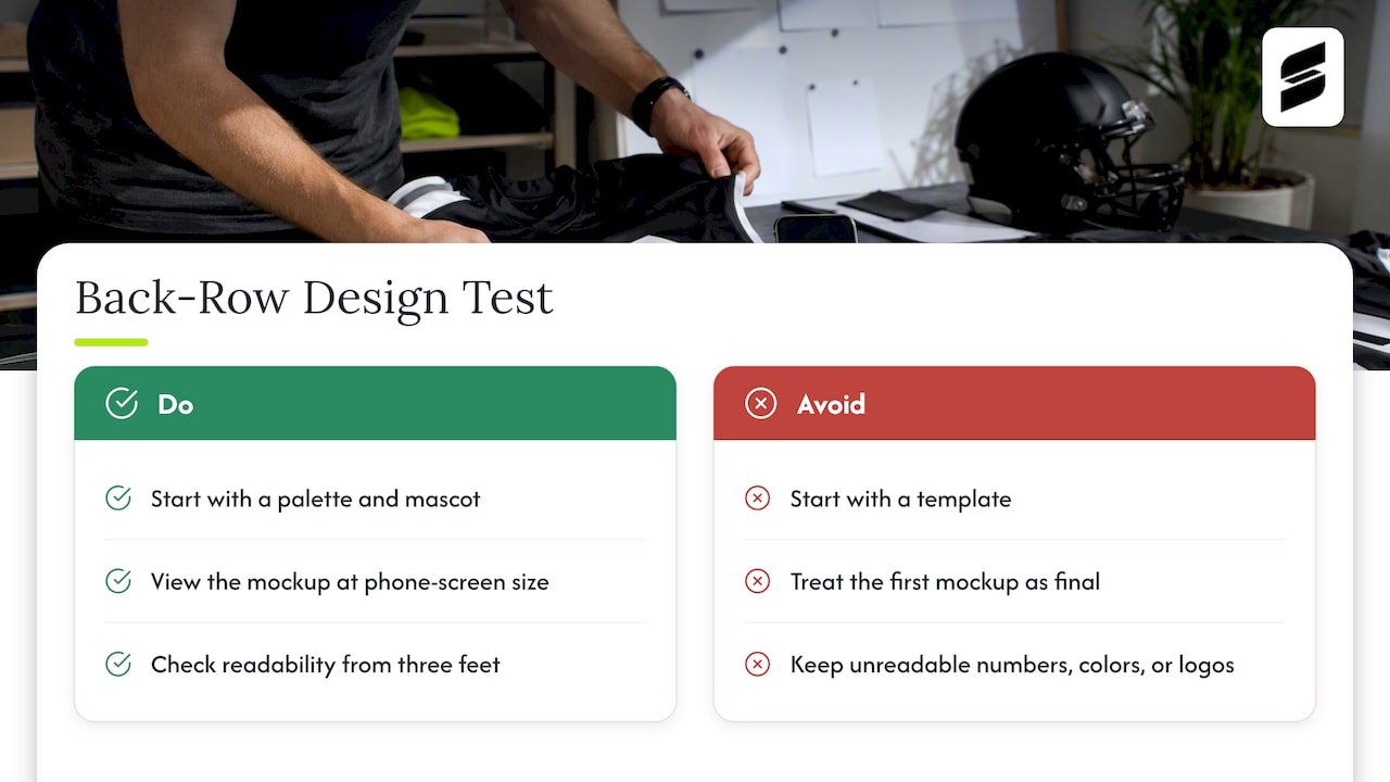
We design uniforms for teams in many sports, and the pattern is consistent. Teams that start with a color palette and a mascot idea usually end up with a better uniform than teams that start with a template. The first mockup is rarely the last, and it should not be. That is why we work with professional designers on your layout and allow unlimited revisions: the right uniform tends to show up on the third or fourth look, once a coach has seen the numbers at size and a parent has weighed in on the color.
Our rule of thumb is the back-row test. Show the mockup at the size of a phone screen, step back three feet and ask whether you can read the number, name the colors and spot the logo. If you can, the design is ready. If you cannot, simplify.
— Agha
See your design before you commit
Capra Sports builds custom sublimated football uniforms for youth teams, school programs, parks and recreation leagues and adult rec groups. You send colors, a logo or an idea, and a designer returns a free mockup within 24 hours. You can revise as many times as it takes, and one sizing sample comes at no extra charge. Team orders start at a 10-set minimum. For pricing, see our pricing page ([PRICE TBD]).
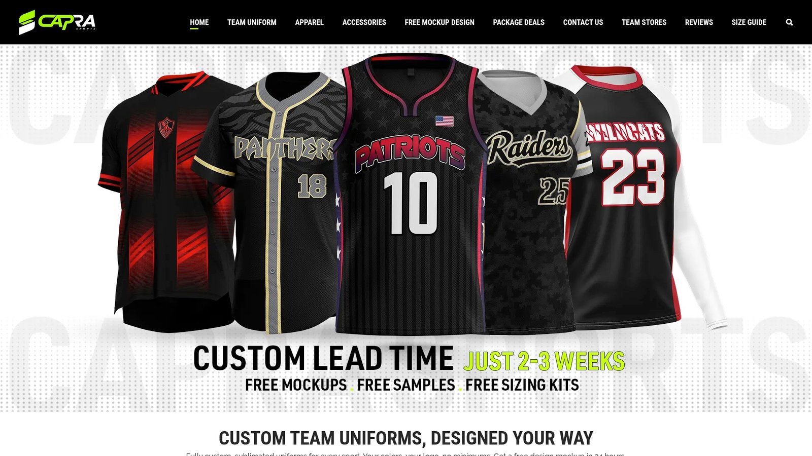
Ready to start? Look at our custom football uniforms, or browse football jerseys if you are planning the top half first.
A simple process for designing your football uniform
- Check your rules. Confirm league or state association requirements for colors, numbers, logos and pants.
- Set your palette. Choose two main colors and one accent. Test them in grayscale.
- Pick the signature element. A stripe, pattern or shoulder mark that repeats across the set.
- Lock numbers and names. Bold block numbers, plain fonts, strong contrast.
- Request a mockup. Review it at phone size and at full size.
- Revise. Adjust colors, stripe widths and logo placement.
- Test the fit. Use the sizing sample over pads before the full order.
- Finalize the roster. Names, numbers and sizes confirmed by a coach or manager.
FAQ
What colors look best on football uniforms?
High-contrast pairings such as black and white, navy and white, maroon and white, or orange and white are the safest. Pick two main colors and one accent, and test the design in grayscale to be sure the numbers still stand out.
Do football uniforms have to follow specific color rules?
For high school teams that follow NFHS rules, home jerseys must be dark and clearly contrast with white, and visiting jerseys must have a white body. Numbers must contrast clearly on the front and back. Youth and rec leagues set their own rules, so ask your league before you finalize a design.
How many colors should a football jersey have?
Two main colors plus one accent is a good limit. More colors tend to make the design look busy from the stands and can make numbers harder to read. Sublimation does allow gradients and patterns, but the base layout should still be simple.
Can I design my own football uniform with Capra Sports?
Yes. Send us your colors, logo and ideas, and one of our professional designers will return a free mockup within 24 hours. You can ask for revisions until the design is right. Team orders have a 10-set minimum.
Sources
- 2025 NFHS Football Jersey and Pant Rules
- NFHS: 40-Second Play Clock, Postseason Instant Replay Among Football Changes
- NFL.com: Houston Texans unveil first uniform redesign
- USA Flag 5’s and USA Flag 7’s High School Rulebooks
- IFCPF: Advice When Selecting Kit Colours
- ASTM: Fashioning Standards for Textiles
- How Football Club Crests Are Chosen