
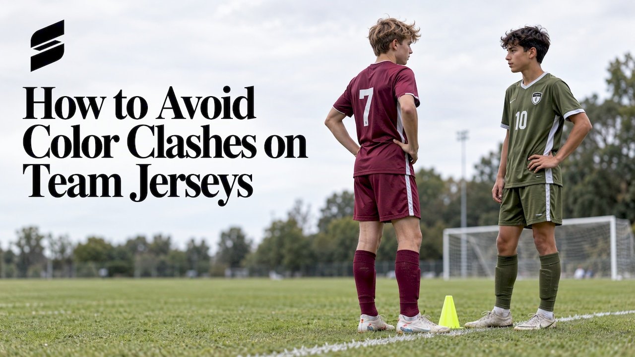
How to Avoid Color Clashes on Team Jerseys
The simplest way to avoid a color clash is to own one light set and one dark set, then make sure the two differ in lightness, not just in hue. Add a number color that contrasts with the jersey body, and check your pair in a greyscale photo before you order. Do that and the referee, your players and the parents in the bleachers can tell the teams apart from across the field.
This guide is for coaches, athletic directors and league organizers who are picking colors for a new season. It covers what governing bodies actually say, how to test a color pair, which combinations fail most often, and what to settle before you place an order.
TL;DR
- Order a light set and a dark set. Across US youth soccer rules, the home team commonly wears light and the away team dark, and the team that is not home is usually the one that changes.
- Contrast means lightness (value), not only color name. Two different hues can look identical in grey.
- Take a photo of both jerseys side by side and switch your phone camera to greyscale. If you cannot separate them, neither can a referee or a player with color-vision deficiency.
- Numbers need their own contrast against the jersey body. Volleyball and football rules say so explicitly.
- Settle the home and away pair, the number color and the libero or special-role colors before you approve a mockup.
Table of Contents
- Why jersey clashes happen
- What the rules say about home and away colors
- How to choose colors that are easy to tell apart
- Test your colors before you order
- Colors and players with color-vision deficiency
- Design choices that cut clash risk
- Three checks before you place an order
- Our perspective
- Get a matched pair designed for your team
- FAQ
- Sources
Why jersey clashes happen
Most clashes are not a surprise. They happen because a team chose one jersey it loved, or two sets that look different in a catalog photo but not on a gym floor or a field at 6 p.m.
Three causes show up again and again:
- One set only. A team with a single navy jersey meets another team in black or dark green. Someone has to change, and you have nothing to change into.
- Matching darkness. Red and green, navy and maroon, or purple and black are different colors but sit at nearly the same darkness. At game distance they blur together.
- Busy designs. Stripes, panels and gradients add colors. The more colors a kit carries, the more chances it has to resemble an opponent’s.
The fix is a small set of decisions made before the order, not a redesign after the first match.
What the rules say about home and away colors
There is no single national rulebook for every youth league, so the answer depends on your sport and organization. But the pattern is consistent: home wears light, away wears dark, and a conflict is resolved by one side changing.
Soccer: light versus dark
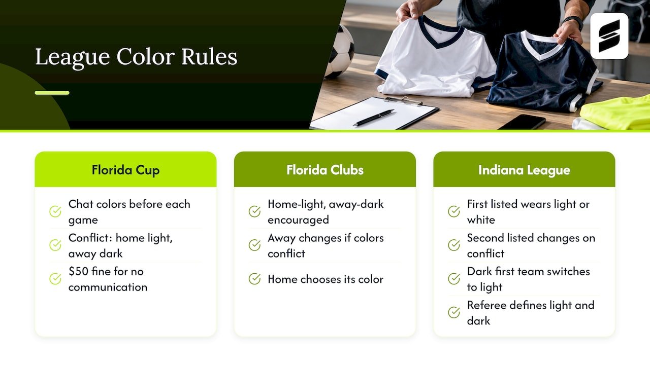
The US Youth Soccer Florida State Cup rules for 2025-26 require teams to confirm jersey colors in the match chat before each game. In a conflict, the home team wears light jerseys and socks and the away team wears dark. There is a $50 fine for failing to communicate.
Florida Club Leagues encourage a Home-Light, Away-Dark standard for 2025-26. If colors conflict, the away team is responsible for changing, and the home team chooses the color it wears.
Some leagues work differently. The Indiana Soccer League’s referee instructions say the first team on the schedule wears light or white, and in a conflict the second-listed team changes. The exception: if the first team is in dark jerseys, it must change to light or white. The referee decides what counts as light and dark.
Two lessons follow. Read your own league’s rules, and carry both a light and a dark set so you are never the team with nothing to change into.
Europe’s standard, a useful model
US youth leagues are not bound by European rules, but UEFA’s wording is a clear benchmark. Article 9.01 calls for a clear contrast between each team’s first-choice and second-choice outfield kits, to the extent they could be worn by opposing teams. Article 9.02 adds that if one kit is predominantly dark, the other must be predominantly light. If one is striped, banded, hooped or checked, the other must not use those stripe colors.
That last point is the one teams miss. A striped away jersey in your colors can clash with an opponent’s solid home kit if they share a stripe color.
For more on this logic, see our piece on why home and away colors need contrast.
Football and volleyball: numbers count too
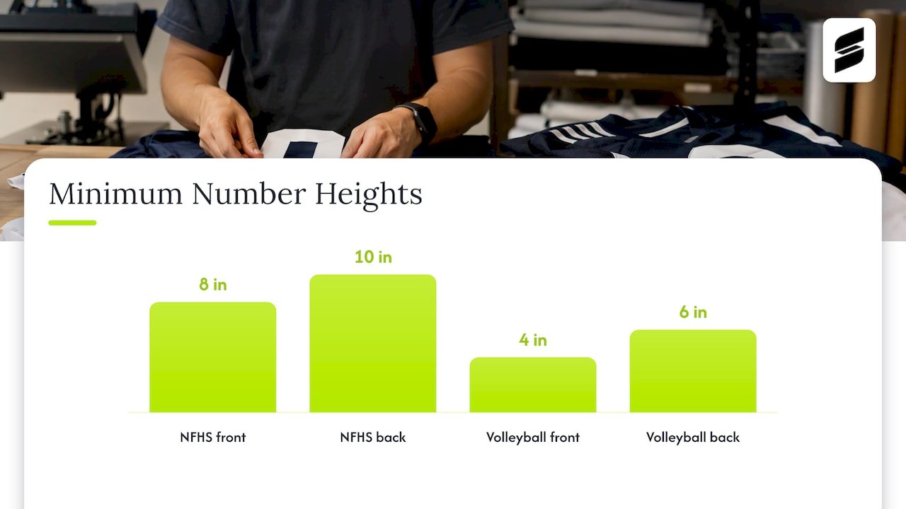
Contrast rules often apply to the number as much as the jersey. The 2026 NFHS football jersey and pants rules require numbers at least 8 inches high on the front and 10 inches on the back, in a single solid color that clearly contrasts with the jersey body.
USA Volleyball is more specific. Its uniform guidance for 2025-26 requires contrasting number colors, at least 6 inches on the back and 4 inches on the front. It names purple/black, dark green/black, navy/black, white/light yellow and navy/maroon as combinations that are not distinctive enough. The same document requires the libero’s jersey to contrast with the predominant colors of the rest of the team, and lists several of the same pairs as non-compliant.
If you coach volleyball, our guide to libero jersey rules for NFHS and USA Volleyball goes deeper.
How to choose colors that are easy to tell apart
Here is the process we suggest, in order.
- Start with the school or club color. Your primary color is fixed. Decide whether it is light or dark.
- Build the opposite set. If your main set is dark, your second set is light or white with your primary color as the accent. If your main set is light, the second set is dark.
- Limit the number of colors. Two or three per kit is easier to keep distinct than five.
- Choose the number color separately. It should contrast with the jersey body on its own, not just look good beside the trim.
- Match socks, shorts and pants to the set. In rules like Florida’s, socks follow the jersey light or dark call. A mismatched pair can recreate the clash you just solved.
- Test the pair using the greyscale check below.
Our guides on choosing team colors and color combinations that look sharp and stay legal walk through palettes in more detail.
Light and dark pairs that work
Use this as a starting point. Final checks still apply.
| Your main set | Strong second set | Why it works |
|---|---|---|
| Navy | White with navy trim | Large gap in lightness |
| Royal blue | White or light grey | Light body, dark number |
| Black | White with a bright accent | Maximum contrast |
| Red | White | Reads clearly at distance |
| Forest green | White or gold | Light body breaks up dark green |
| Maroon | White or light grey | Avoids the navy/maroon trap |
Pairs to avoid
- Red against green, or either against black
- Navy against black
- Navy against maroon
- Purple against black
- Dark green against black
- White against light yellow
Several of these are named directly in USA Volleyball’s guidance, and they fail for the same reason in any sport: the lightness is too close.
Test your colors before you order
You do not need special tools. You need a phone and the field or gym where you play.
The greyscale test
The English FA’s guidance on colour blindness says a quick way to check for a clash is the greyscale function on a phone camera. UEFA’s kit selection advice gives the same tip.
To do it:
- Lay your two jerseys, or the two mockup images, side by side.
- Turn on a greyscale or black-and-white filter in your camera.
- Look at them from several feet away.
- If the two shades look close, change one set.
This also works with a digital mockup on a screen.
Check in real light and in motion
The FA’s guidance also says to check clashes on the field rather than in the changing room, because lighting changes how colors look. It adds that confusion gets worse in real life when players move quickly.
So test at game conditions:
- Gym lights, which often cast a yellow or cool tone
- Late-afternoon or evening field lights
- A distance of 30 to 50 feet, roughly where a coach on the sideline or a referee stands
Watch for jerseys that merge with the background too. A green set on a green turf sideline or a white set against a bright wall loses definition.
Colors and players with color-vision deficiency
Color-vision deficiency is common enough that it should be part of your plan. The FA notes that in men’s and boys’ football there will statistically be colour-blind players among a starting 22.
UEFA’s kit selection advice offers practical principles:
- Ideally put one team in a dark kit and the other in a light kit.
- Avoid single-colour red, orange, green or black kits.
- Patterned versus single-colour combinations generally help, as long as the colors do not clash with the opponent’s.
It also notes that the more colors a kit has, the greater the chance of a clash, and that the fix is about how colors are used, not necessarily changing team colors. That is reassuring: you can keep your identity and still get the contrast you need.
In practice, this means a bold two-color design with a high-contrast number is easier on everyone than a five-color gradient.
Design choices that cut clash risk
Sublimated printing lets you put color wherever you want, which is useful here. A few design moves help.
- Put the contrast in the body, not just the trim. A thin white stripe on a navy jersey does not make it a light jersey.
- Keep numbers big and solid. One solid color, with a clear gap in lightness from the body.
- Use your accent color on the away set only. A tertiary accent on one set keeps the two kits distinct.
- Keep side panels honest. Dark side panels on a light jersey can make it look dark from the side.
- Plan the libero or goalkeeper separately so they contrast with both your sets and the opponent’s.
See the volleyball uniform design ideas for examples of contrast done well.
Three checks before you place an order
Before approving any design, run through these. Our guide on uniform color matching covers them in more depth.
- The pair check. Do you have a light set and a dark set, and do they pass the greyscale test side by side?
- The number check. Does the number color contrast with the jersey body in the same photo?
- The league check. Have you read your league’s uniform rules, including who changes in a conflict, sock and short requirements, and any special-role rules?
If any answer is no, fix it at the mockup stage. It is far easier to change a digital file than a finished set.
Our perspective
Most clashes we see in a design review are not bad taste. They are teams picking one set they love and never imagining the opponent’s jersey beside it.
Our advice is to design the pair together. When a coach sends us a school color, we suggest building the light and dark sets in the same session, so the number color, trim and accents are chosen with both in mind. Sublimation makes this easy because the design is printed in full color, with no limit on where a color goes.
We also like to look at the mockup in greyscale with you. Our designers work with you directly and can revise the design as many times as you need until the pair reads clearly. Our mockups come back within 24 hours, so you can compare options without slowing your season down.
A uniform that is easy to read from the stands is a uniform your players look sharp in, win or lose.
Agha
Get a matched pair designed for your team
If you are building a home and away set, we can design both with you. Capra Sports makes custom sublimated uniforms for basketball, baseball, football, soccer, volleyball and more, and our team works with you on colors and numbers. Pricing for each sport is on our pricing page ([PRICE TBD] per set for your order).
Our policy is a 10-set team minimum, with one sizing sample at no extra charge. Free design mockups arrive within 24 hours.
Browsing by sport? Start with our custom soccer uniforms or custom volleyball uniforms.
FAQ
Should the home team wear light or dark jerseys?
In many US youth soccer leagues, home wears light and away wears dark, and the away team changes in a conflict. Not every league does it that way. Indiana’s league, for example, goes by the order on the schedule. Check your league’s rules and carry both sets.
How many jersey sets does a team need?
Two is the safe answer: one light and one dark. That way you can resolve a conflict whether you are home or away. A single set leaves you exposed if an opponent shows up in a similar color.
What colors should I avoid putting together?
Avoid pairs that sit close in darkness: navy and black, navy and maroon, purple and black, dark green and black, and white with light yellow. USA Volleyball names these specifically as not distinctive enough. Red and green are also a common problem for colour-blind players.
How can I check two jerseys for a clash quickly?
Photograph them side by side and switch your phone camera to greyscale. If they look nearly the same shade, change one. The FA and UEFA both recommend this check, and the FA adds that you should test in real lighting on the field.
Do numbers need to contrast with the jersey too?
Yes. NFHS football requires a single solid number color that clearly contrasts with the jersey body, and USA Volleyball requires contrasting numbers of minimum sizes. Choose the number color separately for each set.
Sources
- 2025-2026 US Youth Soccer Florida State Cup Rules
- Florida Club Leagues Quick Reference Rules 25/26
- Indiana Soccer League instructions to referees
- UEFA Article 9, Colour choices and combinations
- UEFA, Colour Blindness in Football: kit selection advice
- The FA, Colour blindness guidance for referees
- 2026 NFHS Football Jersey and Pant Rules
- USA Volleyball ’25-’26 Uniform Feedback, QA and Resources