

Volleyball Jersey Ideas for Coaches and Teams
Pick your team identity and a primary color first, then check number sizing and libero contrast against your governing body’s rulebook. That order matters because chasing a cool design before confirming its legal is how teams end up reordering jerseys two weeks before their first tournament.
Three moves start the process right now:
- Brief whoever is designing (a parent, a teammate, or a supplier’s design team) on your team name, colors, and personality in one paragraph.
- Request a free mockup before committing to fabric or print method.
- Check your league’s uniform rules for number size, placement, and libero contrast before you approve anything.
Pro Tip: Screenshot your governing body’s uniform page and keep it open in a browser tab while you design. It’s faster than re-searching the rule every time a question comes up.
Key Takeaways
A legal, distinctive volleyball jersey starts with team identity, holds up under rulebook contrast and number requirements, and gets tested through a mockup before full production.
| Point | Details |
|---|---|
| Start with identity | Define your team’s personality in one phrase before choosing colors or fonts. |
| Confirm libero contrast | Check USA Volleyball, NFHS, or your state association’s specific libero contrast rule. |
| Prioritize number legibility | Meet minimum height and placement rules before adding decorative elements. |
| Match style to play | Sleeveless fits suit overhead hitting motions better than sleeved styles. |
| Test with Capra Sports | Request a free mockup and sample from Capra Sports before committing to a full order. |
Table of Contents
- How Do You Define Your Team’s Jersey Identity?
- What Colors Work Best for Volleyball Jerseys?
- Which Style, Fabric, and Fit Suit Volleyball?
- What Number Size and Font Keep Jerseys Legal?
- How Should Logos and Sponsor Marks Be Placed?
- What Are the Best Volleyball Jersey Design Trends Right Now?
- What Should Your Mockup and Ordering Checklist Include?
- How Does a Professional Supplier Simplify the Process?
- Get a Mockup Before You Commit to a Design
- Sources
- FAQ
How Do You Define Your Team’s Jersey Identity?
Every strong jersey starts with a one-line description of who the team is: aggressive and fast, classic and disciplined, or modern and minimal. That phrase becomes the filter for every design decision that follows, from font weight to how much negative space you leave around the logo.
Identity choices cascade directly into three visual decisions: your color palette (bold contrast versus tonal restraint), your logo scale (a large chest mark reads as confident; a small sleeve mark reads as understated), and your typography (blocky numerals feel aggressive, thin serif-inspired numerals feel classic). Get the identity phrase right and the rest of the brief writes itself.
Before you hand anything to a designer, gather quick input:
- Ask three to five players what single word describes the team.
- Confirm whether the mascot or school colors are locked or flexible.
- Note any colors that must stay (booster club colors, school branding) versus colors that are open.
Pro Tip: If players disagree on direction, let the captains vote on two mockups instead of designing by committee. Committees produce beige jerseys.
What Colors Work Best for Volleyball Jerseys?
Pick one dominant color that carries the jersey and one or two accent colors for numbers, trim, or side panels. Dominant colors work best when they’re saturated enough to read clearly from the stands and under gym lighting, since fluorescent overheads wash out pale pastels fast.
Libero contrast isn’t optional. NFHS rules require the libero’s top to clearly contrast from the team’s predominant colors, and USA Volleyball enforces the same principle for its sanctioned events. Some state associations go further. IESA requires the libero jersey to be solid white or safety yellow starting in the 2026-27 season.
A fast way to test contrast: photograph your mockup, convert it to grayscale, and check if the libero top still stands apart. If it blends in gray, it will blend in under gym lights too.
- Dominant color: the jersey’s visible surface should be primarily covered by one color.
- Accent colors: reserved for numbers, side panels, or piping.
- Libero top: confirm contrast against your specific league’s written rule, not just a visual guess.
Which Style, Fabric, and Fit Suit Volleyball?
Sleeveless jerseys dominate competitive volleyball because they free the shoulder for overhead swings without fabric bunching at the armpit on a hitting motion. Short-sleeve styles work for teams that want more coverage or a distinct look, though they can restrict some players’ arm swing at full extension. Long-sleeve tops belong in warmups, not match play.
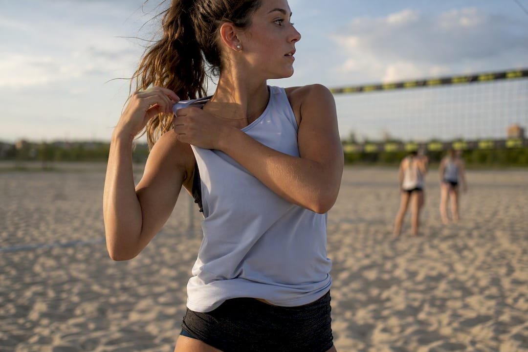
Fabric matters as much as cut. Sublimated polyester lets you print gradients and full-panel graphics without the fabric weight or cracking that heat-transfer vinyl can add over a season, and moisture-wicking weaves keep sweat from soaking into the jersey during five-set matches.
Fit comes down to two lanes: athletic fit (closer to the body, less fabric flapping mid-dive) and a looser modern fit (more room, easier to layer over a compression top). Athletic fit tends to suit faster, more physical playing styles.
Pro Tip: If your team dives and slides on hardwood or sport court, ask your supplier about reinforced side seams. They wear out first, not the print.
What Number Size and Font Keep Jerseys Legal?
Numbers exist for referees and scorekeepers, and every rulebook treats legibility as a hard requirement, not a suggestion. USA Volleyball requires Arabic numerals between 1 and 99, recommends 6 inch minimum height on the front and 8 inches on the back, and requires numbers to be permanently applied and centered, according to USA Volleyball’s uniform requirements. At the elite level, FIVB’s Paris 2024 Olympic guidelines specify front numbers at 15 centimeters and back numbers at 20 centimeters.
Readable numbers come down to three things: thick enough strokes to survive distance viewing, strong contrast against the base color, and no decorative flourishes that turn a 3 into something that reads like an 8 from section 12.
Skip script fonts, outlined numerals with thin interior strokes, or numbers layered over busy graphics. If a teammate can’t read the number from ten feet away in normal gym lighting, an official won’t either.
- Front numbers: check your league’s minimum height before finalizing the mockup.
- Back numbers: typically larger than front numbers across every rulebook referenced here.
- Placement: centered, permanent, and unobstructed by seams or logos.
Pro Tip: Print a full-size number on paper and tape it to a wall. Walk twenty feet away. If you squint to read it, so will the line judge.
How Should Logos and Sponsor Marks Be Placed?
Logos and sponsor marks need a spot that doesn’t compete with the number for visual space. The chest, above the number, and the upper sleeve are the standard zones because they leave the number’s background clean.
Keep sponsor logos consistent in size and placement across every jersey on the roster. One player with a bigger logo than the rest looks like a printing error, not a design choice.
- Reserve the number’s background zone completely, no overlapping graphics.
- Match sponsor logo scale within a half inch across all jerseys.
- Pick logo colors that hold contrast against the jersey base rather than blending into it.
Pro Tip: Group multiple sponsor logos into a single sleeve band instead of scattering them. It reads cleaner and keeps the front of the jersey focused on team identity.
What Are the Best Volleyball Jersey Design Trends Right Now?
Design trends shift, but the smart move is picking the one that reinforces your team identity rather than chasing every option at once. According to 2026 trend reporting from Veetrends, the strongest directions this season include gradients, retro looks, bold color blocking, minimalism, and reflective detailing.
- Gradient or ombre fades — a smooth color transition from shoulder to hem, best for teams with a modern, high-energy identity and access to sublimation printing.
- Retro stripes — throwback horizontal or diagonal bands, ideal for programs leaning into school tradition or alumni nostalgia.
- Bold color blocking — sharp geometric panels in two or three colors, strong for teams that want maximum visibility under bright gym lighting.
- Minimalist logo-first design — a clean base color with one prominent mark, suited to teams on tighter budgets who still want a sharp look.
- Asymmetrical patterns — off-center panels or diagonal splits, a distinctive choice for teams wanting to stand apart in a crowded tournament gym.
- Reflective accents — subtle metallic or reflective trim that catches arena lighting during evening matches.
- Sustainable fabric blends — recycled polyester options for programs prioritizing environmental impact alongside performance.
- Personalized number fonts — a custom numeral style unique to the team, as long as it still passes the readability test above.
Match the trend to your venue and budget before your identity, not after. A gradient looks incredible under arena lighting and can look muddy under flat gym fluorescents.
What Should Your Mockup and Ordering Checklist Include?
A mockup review catches expensive mistakes before they’re stitched into fifteen jerseys. Work through this sequence:
- Request front, back, and side mockup views, not just the front panel.
- Confirm number placement, size, and font against your league’s specific rule.
- Verify logo scale and margin spacing around the number zone.
- Confirm the fabric type in writing, especially if you’re expecting sublimation for a gradient or photographic print.
- Measure every player using a consistent protocol (chest, waist, and length) and add slight room for range of motion.
- Order one sample garment before committing to the full roster size run when the option is available.
- Confirm lead time against your first competition date, plus time for a reorder if a size runs wrong.
Pro Tip: Order the sample in the size your tallest and shortest players will need, not just a medium. That’s where sizing surprises usually show up.
How Does a Professional Supplier Simplify the Process?
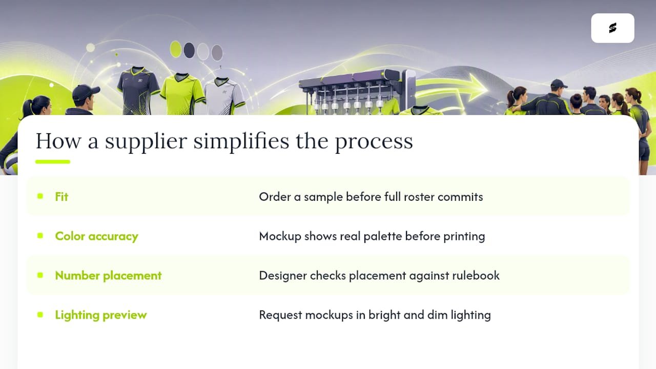
A supplier built around team uniforms removes most of the guesswork above. Capra Sports offers free design mockups, low minimum order quantities, direct collaboration with professional designers for unlimited revisions, and sublimation printing suited to gradients, color blocking, and full-panel graphics.
Those services reduce risk in three specific spots: fit (because you can order a sample before the full roster commits), color accuracy (because a mockup shows the real palette before printing), and number placement (because a designer checks it against rulebook requirements before production).
Pro Tip: Ask for your mockup under both bright and dim lighting settings if your supplier offers digital previews. Gym lighting varies more than most teams expect.
A Coach’s Take on Style Versus Practicality
Coaches who chase every design trend usually end up with a jersey that photographs well and plays poorly. The most common trade-off is a busy graphic pattern that looks sharp in a mockup but muddies the number underneath it. Resolve it by locking in number legibility first, then building the design around that constraint rather than squeezing the number in last.
Get a Mockup Before You Commit to a Design
There are ways to design jerseys in-house, through a local print shop, or through a big-box team supplier. Capra Sports is the faster route for teams that don’t want to manage fabric sourcing, print testing, and sizing corrections themselves.
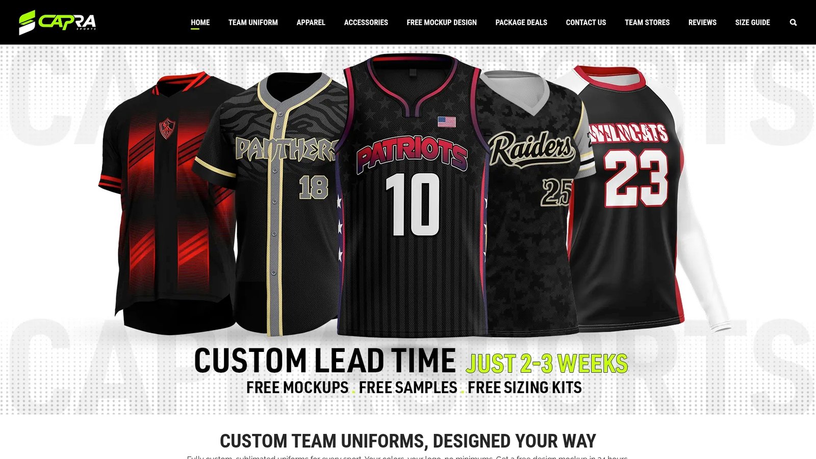
Capra Sports builds volleyball jerseys with factory-direct pricing, no middlemen markup, and low minimum order quantities, so a small club team can order the same quality as a large athletic program without overbuying inventory. Every design goes through unlimited revisions with a professional designer before printing, and sublimation ensures gradients and color-block panels hold up wash after wash. Start with a free mockup request to see your team’s colors, logo, and number placement rendered before you spend a dollar on production.
Sources
- Uniform Requirements and Reminders for 2024-2025 USA Volleyball Competition
- TEAMS’ UNIFORMS GUIDELINES FOR GAMES OF THE XXXIII OLYMPIAD PARIS 2024
- Top 10 Custom Volleyball Jersey Style Trends in 2026 | Veetrends
FAQ
What are the latest volleyball jersey trends?
Gradient fades, retro stripes, bold color blocking, minimalist logo-first designs, and reflective accents are leading directions for 2026, according to Veetrends.
What makes a good volleyball jersey?
A good jersey balances team identity with legibility: clear libero contrast, readable numbers that meet governing-body minimum sizing, and fabric like sublimated polyester that holds up through a full season of play.
How can I create my own volleyball jerseys?
Define your team identity and colors, check your league’s number and contrast rules, then request a free design mockup from a supplier like Capra Sports before approving a full order.
What is the best outfit for volleyball?
Competitive volleyball uniforms typically pair a sleeveless jersey for unrestricted arm movement with spandex shorts or fitted bottoms, made from moisture-wicking, sublimated fabric for durability and breathability.
Recommended
- Custom Volleyball Uniforms from $39.99 | Jerseys from $27.99
- Custom Volleyball Uniforms for Schools & Athletic Programs
- How to Design a Custom Team Uniform | Coach’s Guide | Capra Sports
Found a colourway you like? Try it in our AI jersey customizer and see it on a real volleyball kit in about a minute.