
How to Choose Team Colors That Look Sharp and Win on Game Day
Pick one primary color, one secondary color, and one accent, in that order of priority, then judge every option against two questions: does it represent who this team is, and can a referee, teammate, or camera actually read it from 40 yards away? That’s the whole formula. Everything else, the psychology, the fabric science, the league rules, exists to help you apply it well.
Before you sketch a single jersey, run through three checks:
- Contrast test: hold your top two color choices next to a photo of your actual field, court, or gym floor. If your jersey disappears into the background, you have a visibility problem before you have a design.
- Rulebook check: confirm your league or governing body doesn’t restrict color clashes or require a distinct away set. Skipping this step is how teams end up repainting a season’s worth of gear.
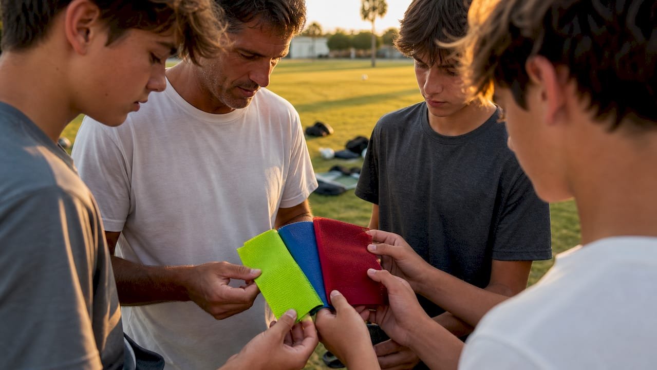
- Fabric test: order a swatch or a printed mockup before you commit. Screen colors and fabric colors are not the same thing, and you don’t want to learn that after 20 jerseys arrive.
If your project involves sponsor logos, multiple sports within one athletic program, or a color clash with a rival that shares your gym, bring in a professional designer early. A coach with a good eye can pick two colors that look great on a laptop screen and still get vetoed by a facility manager or a league official three weeks later. Working with someone who does this daily saves you that round trip.
Key Takeaways
Choosing team colors works best when identity and visibility drive the decision equally, and every color gets verified on fabric before it reaches full production.
| Point | Details |
|---|---|
| Use the 3-color structure | Limit your palette to one primary, one secondary, and one accent color for cohesion. |
| Match colors to identity | Extract two or three identity traits from team history, then map them to a color family. |
| Treat red psychology with caution | Red is linked to perceived dominance, but the effect is modest and context-dependent, not guaranteed. |
| Test on fabric, not just screen | Order a physical swatch since sublimation, lighting, and cameras all shift how colors actually appear. |
| Check league rules before finalizing | Governing bodies like FIFA set kit contrast requirements that vary by competition. |
| Work with a direct-collaboration vendor | Capra Sports offers free 24-hour mockups and a free sizing sample to confirm colors before full production. |
Table of Contents
- How to Choose Team Colors That Match Your Identity
- What Do Red, Blue, and Other Team Colors Actually Communicate?
- How Do You Combine Colors Into a Working Palette?
- Why Fabric, Printing, and Lighting Change How Colors Look
- What Kit Color Rules Do Leagues and Governing Bodies Set?
- How Should You Test and Approve Colors Before Ordering?
- How Capra Sports Turns Your Color Choices Into Approved Uniforms
- The Case for Treating Visibility as a Design Requirement, Not an Afterthought
- Get Your Colors Onto a Real Uniform, Fast
- Sources
- FAQ
How to Choose Team Colors That Match Your Identity
Color choice starts with a harder question than “what looks cool”: who is this team, actually? A youth soccer club playing for fun on Saturday mornings and a competitive travel baseball program chasing a state title need different colors, even if they both love blue.
Here’s a quick exercise that works whether you’re naming a brand new program or rebranding an old one:
- List three words that describe how you want opponents, parents, and players to see this team. Common answers: aggressive, disciplined, welcoming, scrappy, elite.
- Sort those words into color families. Aggressive and dominant tend to map to saturated reds, blacks, and deep oranges. Disciplined and traditional lean toward navy, forest green, or maroon. Welcoming and community-driven often land on warmer, softer tones, gold, sky blue, or a friendly mid-green.
- Check that history matches the direction. If your school has worn purple and gold for 30 years, “aggressive red” might be the wrong call no matter how much the new coach likes it. Legacy colors carry their own identity capital.
Stakeholder balance matters more than most first-time organizers expect; engaging with fan clubs is a key part of understanding community preferences and identity. Players usually vote on what looks good in the mirror. Sponsors often care about visibility on a banner. Fans want something they’d actually wear to a bar on a Saturday. Facilities sometimes rule out a color outright because it matches a rival program that shares your gym floor. None of those parties are wrong, but somebody has to rank the priorities, and that’s typically the coach or athletic director’s call, not a group vote.
Pro Tip: Ask three longtime fans or alumni what color they associate with your program before you touch a design tool. Their gut answer often reveals brand equity you didn’t know you had.
A youth flag football league rebranding from generic navy and white to something more distinct is a good test case. If “scrappy underdog” is the identity, a mid-saturation orange paired with charcoal communicates that far better than a safe royal blue ever could. The color doesn’t just decorate the uniform. It tells the story before the whistle blows.
What Do Red, Blue, and Other Team Colors Actually Communicate?
Color carries real psychological weight, but the effects are smaller and more context-dependent than most sports blogs suggest. Treat these as starting points, not laws.
- Red reads as aggressive, dominant, and high-energy. A Samford University sports analytics review found that wearing red is associated with perceived dominance and can shape how opponents size up a competitor, though the effect is about perception, not a guaranteed scoreboard edge.
- Blue signals trust, stability, and calm control. It’s the most common team color in American sports for a reason, it reads as safe and credible to almost everyone.
- Green connects to growth, tradition, and nature. It also has strong regional associations, think of every “Fighting Irish” or agricultural-town program that leans green out of local pride.
- Black projects power and seriousness. It’s a favorite for teams building an intimidating identity, but it can wash out under weak stadium lighting and photograph flat on broadcast cameras.
- White reads as clean and disciplined, and it’s the default away-kit choice in many sports simply because it contrasts against almost anything.
- Yellow and gold communicate optimism and energy, and they’re some of the most visible colors on a field under any lighting condition.
- Orange feels bold and unconventional. It’s underused, which makes a team wearing it stand out by default.
- Purple carries associations with distinction and royalty, and it tends to read as a memorable, less common choice at the youth and rec level.
The dominance research on red deserves a caution most articles skip: it’s a real, documented pattern, but it’s an average effect across studies, not a promise that your team will suddenly intimidate opponents by switching jerseys. Culture and context shift meaning too. A color that reads as “fierce” in one region might just read as “the other rec league’s color” in a town where two leagues already use it. Test your instinct with actual fans and players before locking anything in. Show them two or three color directions and watch which one gets an immediate reaction versus a shrug.
How Do You Combine Colors Into a Working Palette?
Most successful team palettes follow a simple structural rule, and it’s worth understanding why it works before you break it.
The 3-color rule caps a uniform system at three colors total: one primary (the dominant body color), one secondary (trim, sleeves, or panel work), and one accent (numbers, piping, or small logo details). Add a fourth true color and most palettes start looking busy or, worse, expensive to produce consistently across jerseys, warmups, and bags. Uniform designers recommend this same base-accent-logo structure for exactly that reason: cohesion.
Here’s how the roles typically play out on an actual kit:
- Primary covers the jersey body and shorts, the color people associate with your team from across a parking lot.
- Secondary shows up on sleeves, side panels, or piping, enough presence to matter without competing with the primary.
- Accent lives in the numbers, small logo elements, or trim lines, high contrast against the primary so it’s readable at speed.
Three harmony strategies handle most team color needs. Complementary pairs (colors opposite each other on the color wheel, like navy and orange) create the highest contrast and read as bold and energetic, good for a program that wants to stand out. Analogous palettes (colors next to each other, like teal, blue, and navy) feel cohesive and calm, better suited to a traditional or community-focused identity. Triadic schemes (three evenly spaced colors, like red, yellow, and blue) are harder to pull off but create a distinctive, almost retro look when balanced correctly.
One frequently missed option: skip the third color entirely and use a neutral instead. White, black, or gray as your “accent” often looks cleaner than forcing in a third saturated hue, and it plays nicer with sponsor logos that come in fixed colors you can’t control.
Contrast is not optional when it comes to jersey numbers. A quick gut check: print your number color on your jersey color at actual size and view it from 15 feet away, then from across a room. If the number blurs into the background at either distance, referees and scorekeepers will have the same problem during a live game. Color palette generators can flag contrast issues digitally, but nothing replaces standing back and squinting at a printed sample.
Pro Tip: Numbers in a mid-tone color, like a medium gray on a dark jersey, almost always fail the distance test. Stick to true white, true black, or a bright accent for anything that needs to be read fast.
Why Fabric, Printing, and Lighting Change How Colors Look
The color you approve on a screen is rarely the exact color that shows up on a finished uniform, and understanding why prevents a lot of frustrated reorders.
- Sublimation printing infuses dye directly into synthetic fabric fibers, which produces the widest and most accurate color range and holds up best against fading. It’s the standard for full-color team designs because it can reproduce gradients and sharp contrast without adding weight to the fabric.
- Screen printing applies ink in layers on top of fabric, which works well for simple logos but struggles with fine gradients and can crack or peel over a season of wear and washing.
- Embroidery is thread, not dye, so color options are limited to available thread spools, and very fine detail (small numbers, thin outlines) doesn’t translate well.
Lighting and camera sensors are the other variable teams underestimate. Indoor gym lighting, outdoor stadium floodlights, and a phone camera each render the same fabric dye slightly differently. A navy that looks nearly black under fluorescent gym lights can read as a clear blue on a sunny afternoon field. If your games get streamed or filmed for highlight reels, ask your uniform vendor for a fabric swatch and photograph it in the actual lighting conditions your team plays under before finalizing anything.
Durability ties back to color choice more directly than most first-time organizers expect. Darker, saturated colors show fading from repeated washing faster than mid-tone colors do, and white trim shows grass and dirt stains the most visibly of any color on the palette. Building a neutral like black or gray into your three-color system, as uniform designers commonly recommend, tends to hide wear longer than an all-bright palette does.
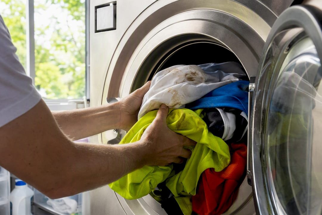
Pro Tip: If your field has a distinctive background color, brown dirt infields, green turf, blue-painted courts, avoid picking a jersey color that closely matches it. A green jersey on green turf might look sharp in a locker room photo and disappear completely on game film.
What Kit Color Rules Do Leagues and Governing Bodies Set?
Before you finalize anything, check your specific league or governing body’s rulebook. Conventions are common, but they’re not universal, and assuming a tradition is a rule is how teams get penalized or forced into a same-day scramble.
- Many sports follow a dark home, light away convention, giving officials and fans an easy visual cue for which team is which.
- Some leagues require a documented alternate or clash kit for situations where both teams’ primary colors are too similar to distinguish at a glance.
- FIFA and similar governing bodies publish specific kit regulations covering color contrast between opposing teams, goalkeeper distinction, and referee visibility, and these rules vary by competition level, so check the exact tournament or league document rather than assuming the pro-level rule applies to your rec league.
- Youth and school programs often answer to a state or district athletic association rather than an international body, and that association’s rulebook is the one that actually governs your uniform.
Plan your alternate kit at the same time as your primary set, not as an afterthought six weeks before a color conflict comes up. A light-colored away jersey using your same primary and secondary colors, just inverted in proportion, usually satisfies both identity consistency and rulebook flexibility. If your league has a scheduler or coordinator role, loop them in on your color decision before you order anything. A five-minute email confirming your colors don’t clash with a common opponent can save an entire team from showing up to a game morning short a set of jerseys.
How Should You Test and Approve Colors Before Ordering?
Skipping the testing phase is the single most common reason teams end up paying for a second production run. Follow this sequence in order, and don’t skip steps even when you’re excited to place the order.
- Order a printed mockup and a physical fabric swatch. A digital rendering and a printed sample can look noticeably different once dye meets fabric, and a swatch is the only reliable way to catch that gap early.
- Test number and logo contrast at distance. Print the final design at game size, prop it against a wall, and check readability from at least 20 feet away under normal room lighting.
- Run a field test in real conditions. Photograph the swatch or mockup under your actual stadium lights, gym lights, or outdoor sun, and if games are filmed, check how it reads on camera too.
- Collect player and parent feedback. A quick group text with a photo of the mockup catches complaints before 20 jerseys are cut, not after.
- Lock in exact color codes. Record the hex, Pantone, and CMYK values for every color in your palette so future reorders, banners, and merchandise match exactly rather than drifting over time.
- Request a color-match proof from your vendor. A responsible vendor will confirm your codes against their fabric stock before full production starts, catching mismatches while they’re still cheap to fix.
A few practical notes make this process smoother:
- Build revision time into your ordering timeline. Two rounds of mockup changes is normal; five is a sign the color direction wasn’t settled before design started.
- Budget for the possibility of a replacement run if colors fade unevenly after a season of washing, especially with darker palettes.
- Keep your final color codes on file somewhere the whole coaching staff can access, not just in one person’s email inbox.
How Capra Sports Turns Your Color Choices Into Approved Uniforms
Once you’ve settled on a direction, the gap between “we like these colors” and “we have jerseys that match them exactly” is where most teams run into trouble. Capra Sports built its process around closing that gap fast.
The workflow runs in a straightforward sequence: you share a design brief covering your identity and color priorities, a Capra designer builds a free digital mockup, you request a physical swatch or sample to confirm the color reads correctly in hand, and production starts only after you approve the final proof. No guessing whether the screen color will match the fabric color.
- A 10-set team minimum means a small rec team or a first-year club program doesn’t have to over-order.
- Direct designer collaboration with unlimited revisions means your three-color palette gets refined until it actually looks right, not just approved on a deadline.
- A free sizing sample lets you hold the fabric and check the color under your own gym or field lighting before committing to a full team order.
- Published quantity pricing with breaks at 20 and 50 sets, so you know the cost before you order.
Pro Tip: Request your fabric swatch in the exact lighting your team plays under, whether that’s fluorescent gym lights or afternoon sun. It’s the fastest way to catch a color surprise before it’s on 20 jerseys.
A color palette only becomes a uniform once it survives contact with real fabric, real lighting, and a real referee squinting at your numbers from midfield.
The Case for Treating Visibility as a Design Requirement, Not an Afterthought
Most color guides treat psychology as the main event and visibility as a footnote. That ordering is backward. A jersey that perfectly captures your team’s competitive spirit is useless if the number disappears against the jersey color from the stands or the away kit blends into a rival’s home color under stadium lights.
The uncomfortable truth: plenty of teams pick colors that look great in a logo mockup and then discover, mid season, that the color reads completely differently under gym fluorescents or on a phone camera at a Saturday tournament. That’s not a psychology problem. It’s a testing problem, and it’s entirely preventable.
If there’s one thing worth prioritizing above the mood board, it’s ordering the physical swatch before falling in love with anything on screen. Identity should shape the direction of your palette. Fabric, lighting, and a tape measure held 20 feet back should decide whether it actually works on game day.
— Agha
Get Your Colors Onto a Real Uniform, Fast
Once your palette is settled, the fastest way to see it become a real jersey is to skip the guesswork and go straight to a mockup. Capra Sports builds custom sublimated uniforms with a 10-set team minimum, meaning a 10-player rec team gets the same quality as a 30-player program.
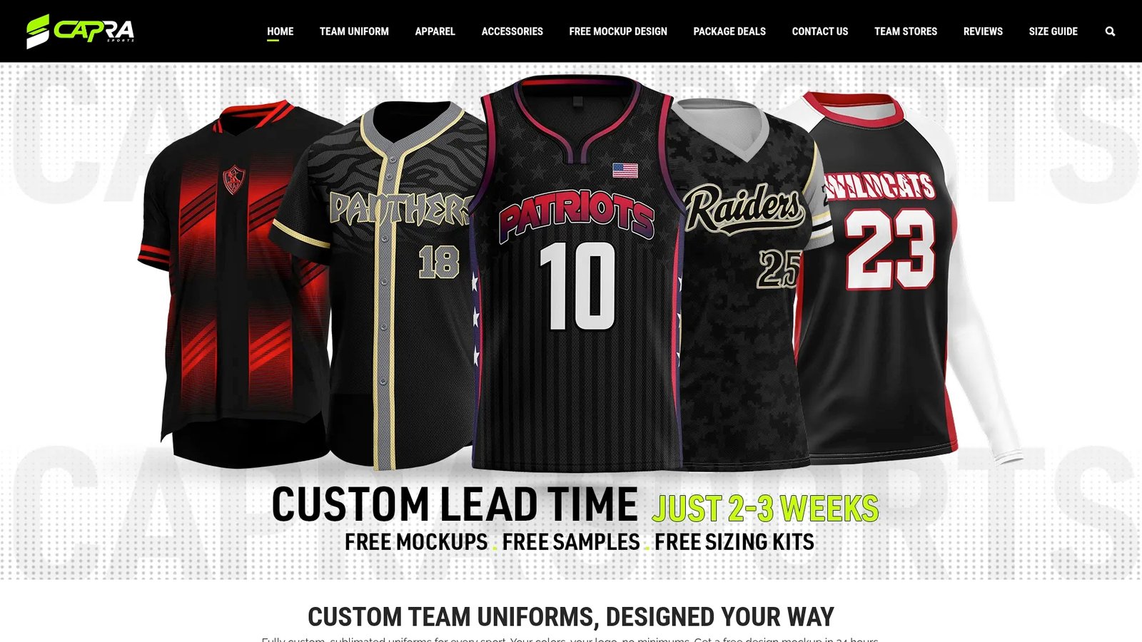
Every order includes direct collaboration with a professional designer for unlimited revisions, plus a free sizing sample so you can check your exact colors on fabric before committing to a full team run. That combination, a 10-set minimum, real human designers, physical proof before production, is what turns a color palette on paper into jerseys your team is proud to wear on opening day. Start your free design mockup and see your colors on a real uniform before you spend a dollar on full production.
Next step: see what a full basketball team kit costs per player, or request a free 24-hour mockup of your design.
Sources
FAQ
How Do I Pick Team Colors From Scratch?
Start with your team’s identity, list two or three traits you want to project, then match those traits to a color family, and build a three-color palette (primary, secondary, accent) around them. Confirm the palette against your league’s kit rules and a fabric swatch before ordering.
How Do I Change My Team’s Colors If We Already Have a Uniform?
Treat a color change like a rebrand: check whether your league requires advance notice of a kit change, then follow the same mockup and swatch testing process you’d use for a brand-new team before committing to a full order.
What Is the 3-Color Rule?
The 3-color rule limits a uniform system to one primary color, one secondary color, and one accent color to keep the design cohesive across jerseys, trim, and numbers. Teams that need a fourth visual element typically substitute a neutral like white, black, or gray instead of adding another saturated color.
What Are Some Good Team Colors?
There’s no universal “best” color, since the right choice depends on your identity, your league’s existing colors, and visibility against your field or court. Navy and gold, black and orange, and red and white are common high-contrast pairings that read well at distance and photograph clearly under most lighting.
How Long Does It Take to Finalize Team Colors Before Ordering Uniforms?
Plan for at least two to three weeks between initial design mockups and final color approval, factoring in swatch shipping time and at least one round of revisions. Building this into your season timeline avoids a rushed decision right before games start.
Should We Match Our School or Organization’s Existing Colors?
If your team represents an established school or club, staying close to existing colors usually preserves brand recognition and avoids confusing fans and sponsors. A new or independent program has more freedom to choose colors purely based on identity and visibility.