
Hit ΔE Under 2: Pantone Color Matching Workflow for Designers
The reliable route to Pantone color matching starts with the official source: pick your target in Pantone Color Finder or Pantone Connect, soft-proof it against the correct ICC profile for your printer and substrate, then confirm with a printed test chart and a Delta-E check before signing off. Skip any of those steps and you’re approving colors on faith, not evidence.
TL;DR:
- Using Pantone’s official tools and ICC profiles for soft-proofing reduces color drift and ensures consistent matching across different substrates and printers.
- Physical checks with printed test charts on the actual material, under controlled lighting, are essential to verify color accuracy beyond digital previews.
- Pantone spot colors outperform CMYK in bright, metallic, or saturated hues that process inks cannot replicate, but they increase costs and complexity for multiple or branding-critical colors.
- A Delta-E below 2 indicates a perceptually negligible difference, whereas values above 5 are easily noticeable, making calibration and proper profiling crucial.
- Relying solely on photo-based matching tools is risky, and physical referencess like spectrophotometer readings or sample swatches are necessary for precise color reproduction.
Table of Contents
- What Tools Actually Help You Find and Confirm a Pantone Color?
- Pantone Vs Process Color: What Every Designer Needs to Know
- How Do You Build a Repeatable Pantone Matching Workflow?
- Can You Trust Colors Pulled From a Photo?
- Why Doesn’t My Print Match the Swatch? Common Fixes
- How Capra Sports Handles Pantone Color Matching for Team Uniforms
- The Overlooked Truth About Pantone Matching
- Sources
- FAQ
What Tools Actually Help You Find and Confirm a Pantone Color?
Pantone Color Finder and Pantone Connect are the starting point for any serious color decision. Color Finder lets you browse and search the official library by code, name, or visual similarity, while Connect syncs those same libraries into your design software so the code you pick on screen is the code that gets specified on the job ticket. Neither tool measures color from a photo or a fabric sample. They confirm what a swatch officially is.
For a physical check, the Pantone Color Match Card pairs with a phone camera to approximate how close a material sits to a target Pantone color. It’s a useful gut check on a tight deadline, but Pantone itself positions it as a fast comparison tool, not a lab-grade instrument.
- Pantone Color Finder / Connect: authoritative lookup and code confirmation, digital only.
- Pantone Color Match Card: phone-camera comparison for quick, approximate checks on physical goods.
- Spectrophotometer: the actual measuring instrument, used when a job demands documented accuracy rather than a visual estimate.
- Image-to-PMS or hex-to-PMS converters: fast and convenient, but these tools produce approximations that shift depending on lighting, camera profile, and screen calibration.
Treat converters as a first guess, never a final answer. Every approximate match needs validation against a printed proof before it goes into production.
Pantone Vs Process Color: What Every Designer Needs to Know
A Pantone spot color is a premixed ink. CMYK, or process color, builds an approximation of that same color out of four halftone dot patterns layered on top of each other. That distinction is why a bright orange or a metallic gold can look flawless on a Pantone chip and disappointing on a CMYK proof.
Pantone’s own materials describe spot inks as capable of reaching saturated and metallic hues that CMYK’s dot structure simply can’t replicate, since process printing is limited to what four ink combinations can simulate. Fujifilm’s comparison of the two systems makes the same point: spot inks deliver cleaner, brighter results, and some vivid or metallic Pantone colors fall outside the CMYK gamut entirely.
The Pantone Color Bridge exists to bridge that gap. It shows each spot color next to its closest CMYK simulation, so you can decide upfront whether a fallback will pass or whether the job genuinely needs a spot ink or an extended-gamut process.
A few things worth weighing before you commit to spot ink:
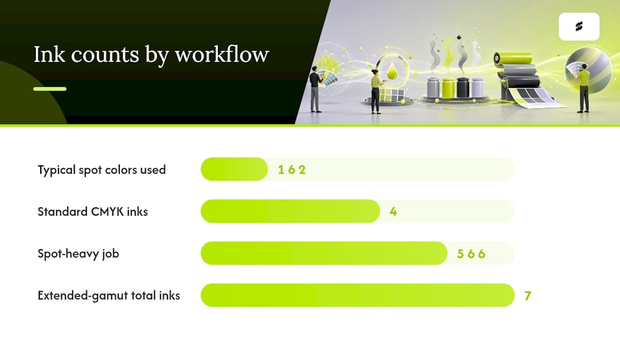
- Cost and press setup: spot colors often mean an extra ink station or run, which changes pricing and lead time.
- Number of spot colors: one or two brand-critical colors is common; five or six starts eating into the economics of the job.
- Extended-gamut printing: some presses add orange, green, and violet to standard CMYK specifically to reach the colors process ink normally misses.
Most production work, in practice, is a hybrid: process color for photography and gradients, one or two spot inks reserved for brand-critical solids like a logo or a team’s primary color.
How Do You Build a Repeatable Pantone Matching Workflow?
A workflow only earns its name if it produces the same result twice. Here is the sequence that keeps Pantone color matching predictable from file to finished piece:
- Pick the official swatch and record the code. Use Pantone Connect inside your design file so the exact code travels with the artwork, not a verbal description of “kind of a royal blue.”
- Soft-proof against the correct ICC profile and run a Delta-E check. A matched ICC profile tells your software exactly how a specific printer, ink, and paper combination reproduces color, and skipping this step is the single most common cause of reds drifting toward orange or blues sliding toward purple. Set your approval tolerance before you print: a ΔE under 2 is generally imperceptible to the human eye, while anything approaching 5 reads as a visibly different color, according to ViewSonic’s explainer on Delta-E.
- Print a test chart on the real substrate and check it under controlled lighting. Production guides on sublimated fabric printing consistently point to this as the step that actually catches problems, since a soft proof on a calibrated monitor still can’t tell you how ink behaves on polyester versus cotton twill.
- Escalate to a press check or certified proof when the stakes are high. Document whatever CMYK recipe and ΔE tolerance gets approved, so reorders match the original run instead of drifting a little further each time.
Pro Tip: If you’re working in sublimation, the biggest variable isn’t the ink, it’s the press. Heat, dwell time, and pressure all shift the final color, so lock those settings once you’ve dialed in a match, use a substrate-specific ICC profile for the exact paper and fabric combination, and don’t let anyone “eyeball adjust” the press after the test chart passes.
Can You Trust Colors Pulled From a Photo?
Not fully, and that’s fine as long as you treat a photo as a starting point rather than a final answer. A smartphone photo bakes in a dozen variables before the color ever hits your screen: auto white balance, the phone’s own camera color profile, ambient lighting, and then whatever calibration (or lack of it) your monitor has. Two people photographing the same red jersey in different rooms can end up with two different hex codes, and neither is wrong exactly, just incomplete.
If you need a workable approximation from an image, a few habits tighten things up:
- Include a neutral gray or white reference card in the frame so you can correct white balance after the fact.
- Shoot in consistent, diffused lighting, ideally daylight-balanced, and avoid mixed light sources.
- Capture in RAW or through a color-managed workflow rather than a compressed JPEG straight off the camera roll.
None of that replaces a physical read. For textiles and dyed substrates especially, dye lots vary, fabric texture scatters light differently than a flat surface, and a spectrophotometer reading or a mailed physical swatch is the only way to get a number you can actually stand behind. If a client insists on matching “the exact red from this Instagram photo,” a partner resource like IPD Boat Graphics’ printed color swatch samples is a good example of the kind of physical reference that settles the argument faster than another round of screenshots.
Why Doesn’t My Print Match the Swatch? Common Fixes
Most mismatches trace back to one of a handful of causes, and most are fixable without reprinting from scratch.
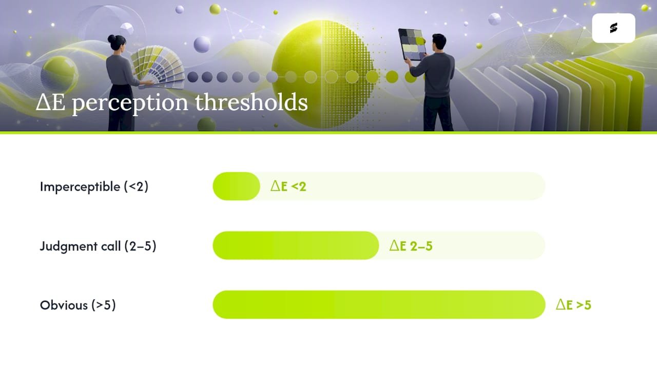
Delta-E is your diagnostic tool here as much as your approval metric. A ΔE under 2 sits below what most people can perceive, while a ΔE above 5 is an obvious, complaint-generating difference. Anything landing between those two numbers is a judgment call, which is exactly why setting the tolerance before printing saves an argument after.
- Missing or wrong ICC profile: install the profile matched to your exact printer, ink, and paper, not a generic one from the manufacturer’s default set.
- Double color management: turn off color management at either the RIP or the driver level, never both simultaneously, or the software fights itself.
- Stale test charts: reprint the chart after any ink, paper, or press change rather than trusting an old reference.
- Sublimation-specific drift: check heat, dwell time, and pressure first, confirm you’re using a matched ink and paper combination, and design in RGB when your workflow calls for it.
How Capra Sports Handles Pantone Color Matching for Team Uniforms
Custom sublimated uniforms live or die on color consistency across a full roster, which is exactly where a Pantone-aware process earns its keep. Every team order is built around a free design mockup and a sample approval step, so the color a coach signs off on is the color that ships, not a guess made from a screen.
When you submit a design request, a few details speed up an accurate match:
- The Pantone code or a digital swatch for your team’s primary and secondary colors.
- An approved proof or a stated ΔE tolerance if the color is brand-critical.
- Notes on fabric finish and whether any color needs a metallic or fluorescent treatment.
Coaches and athletic directors can start that process through Capra’s free custom uniform mockup request, and the step-by-step coach’s guide to designing a team uniform walks through what information keeps a color consistent from the first mockup to a reorder two seasons later.
The Overlooked Truth About Pantone Matching
Most advice on this topic obsesses over software: which app, which converter, which plugin claims the closest hex-to-PMS match. That’s backwards. The research keeps pointing to the same conclusion: software gets you close, and substrate plus press conditions decide whether “close” survives contact with reality.
A ΔE reading off a screen is a prediction, not a guarantee. The color that matters is the one on the printed chart, under real light, on the actual fabric or paper the job ships on. Designers who skip that step because a soft proof “looked right” are the ones fielding angry calls three weeks later when a full team’s jerseys come back a shade too orange.
If there’s one thing worth prioritizing above every tool on this list, it’s the printed test chart on the real substrate. Everything upstream of that, the Pantone code, the ICC profile, the Delta-E target, exists to make that final physical check pass on the first try instead of the third.
— Agha
Sources
- What is Delta E and why is it important for color accuracy? — ViewSonic
- Understanding different color spaces — Pantone
- Pantone vs CMYK — Fujifilm Print
FAQ
Is There an App to Match Pantone Colors?
Pantone Connect is the closest thing to an official app, syncing Pantone libraries into design software so you can pick and confirm a code digitally. The Pantone Color Match Card works with a phone camera for quick physical comparisons, but neither replaces a spectrophotometer reading for production-critical jobs.
How Do You Get an Exact Pantone Color Match?
Start with the official Pantone code from Color Finder or Connect, soft-proof it using the correct ICC profile for your printer and substrate, then print a physical test chart and check it under controlled lighting. A Delta-E reading under 2 confirms the match is imperceptible to most viewers.
What Is a Good Delta-E Tolerance for Print Approval?
A ΔE below 2 is generally treated as imperceptible, while a ΔE above 5 reads as a clearly visible difference. Many production workflows accept up to ΔE 3 as a reasonable middle ground for standard commercial jobs.
Why Does My Sublimated Uniform Color Look Off From the Digital Proof?
Sublimation color shifts usually come down to press heat, dwell time, or pressure, an ICC profile that doesn’t match the exact ink and paper combination, or a proof that was never checked against a printed test chart on the actual fabric.
Can CMYK Ever Match a Pantone Color Exactly?
Not always. CMYK simulates color through halftone dots and can’t reach some saturated or metallic Pantone hues, which is why the Pantone Color Bridge exists to show the closest achievable CMYK fallback before a job goes to press.