
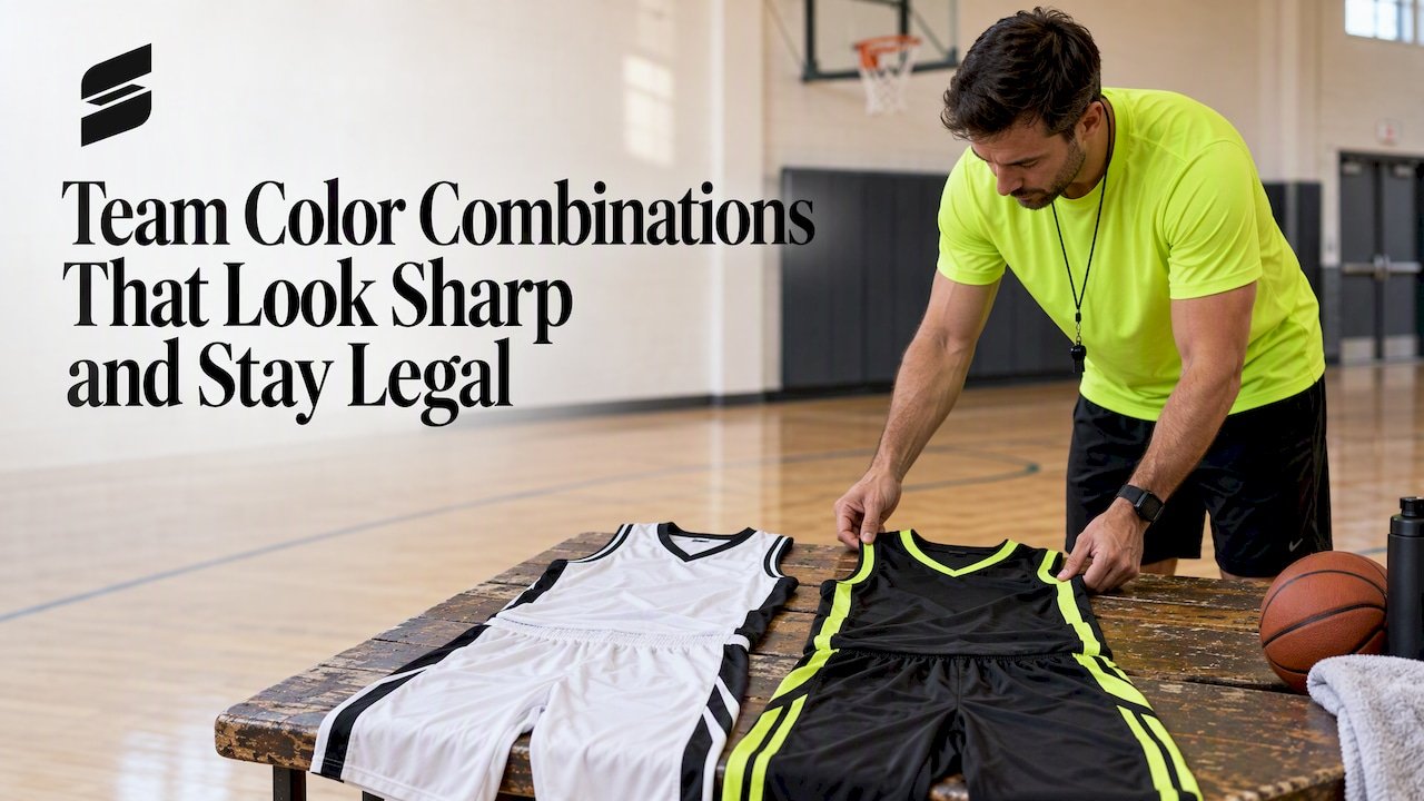
Team Color Combinations That Look Sharp and Stay Legal
The best team color combinations pair one bold primary color with a strong neutral and a small accent, then pass a contrast test: can a parent in the last row read the number? Navy and gold, black and red, and green and white all work for that reason. Below you will find the pairings that hold up, a simple way to split the colors across a uniform, the rules that limit your choices, and a checklist before you approve a design.
TL;DR
- Start with one primary color, add a neutral (white, black, gray or silver) and keep the accent to a small trim.
- Use the 60-30-10 split: roughly 60% primary, 30% secondary, 10% accent.
- Contrast beats trend. Numbers need a solid color that clearly separates from the jersey, and high school rulebooks enforce it.
- Plan the home and away sets together so the two never look alike on the court or field.
- Ask for a mockup before you commit. At Capra Sports, free mockups come back within 24 hours.
Table of Contents
- What the most common team colors tell you
- Color combinations that work for team uniforms
- How to split your colors: the 60-30-10 rule
- Check contrast before you fall in love with a palette
- Rules that limit your color choices
- Plan your home and away colors together
- Our perspective: choose for the sideline, not the screen
- Color ideas by sport
- A step-by-step way to choose your final palette
- Try your palette on a real uniform
- FAQ
- Sources
What the most common team colors tell you
Before you pick something unusual, look at what teams already choose. A color database covering 8,443 sports and athletics color values shows neutrals (black, white, gray and silver) making up roughly 36% of the total. Blue follows at about 25%, then red at about 18%.
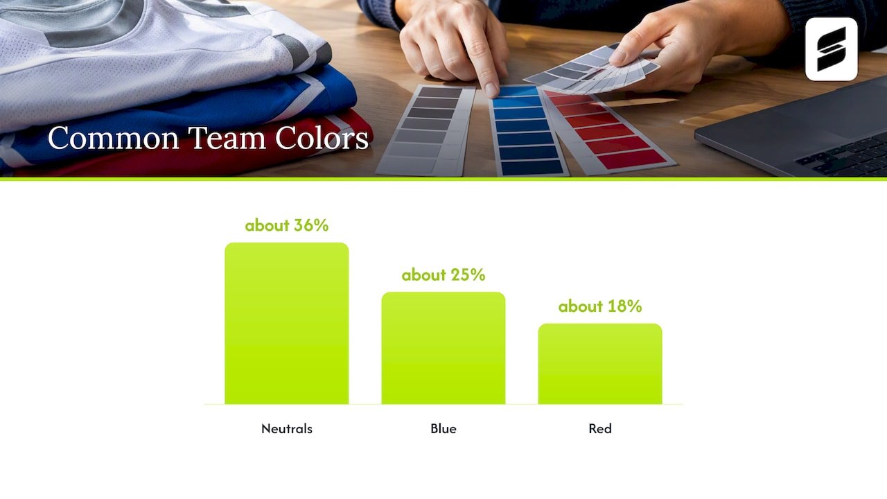
That pattern is not an accident. Neutrals make every other color easier to read, and blue and red are strong against both white and black. If your league has six teams and four of them wear blue, you do not have to avoid blue. You do have to choose the partner color with care, because the partner is what makes your team recognizable.
A practical takeaway: choose your neutral first. White gives you the cleanest home look. Black hides wear and makes bright colors pop. Gray and silver soften a palette without adding a competing hue.
Color combinations that work for team uniforms
The pairings below are standard for a reason. Each one has a clear light and dark side, so numbers and names stay readable.
| Combination | Why it works | Good fit |
|---|---|---|
| Navy and white | Maximum contrast, traditional, easy to pair with any accent | Baseball, basketball, school programs |
| Navy and gold | Deep base with a warm accent that carries from a distance | Football, volleyball |
| Black and red | Aggressive, high energy, strong in gym lighting | Basketball, soccer |
| Black and white | The most flexible pair, makes a good away set | Any sport |
| Royal blue and orange | Opposite sides of the color wheel, so each color lifts the other | Youth leagues, 7v7 |
| Forest green and white | Distinctive, uncommon in many leagues | Soccer, softball |
| Maroon and gray | Mature and understated, neutral does the heavy lifting | Schools, adult leagues |
| Purple and gold | Rich and memorable, strong contrast in value | Volleyball, football |
| Teal and black | Modern, stands apart from the red and blue crowd | Newer club teams |
| Pink and white or gray | Bright and clean when the pink is a strong, saturated shade | Volleyball, softball |
Three notes on the table. First, “contrast” means light against dark, not just different hues. Red and green are different colors, but at a distance they can read as the same gray tone. Second, an accent works best when it is a real third color, not a lighter version of the primary. Third, if a pair is on the list but your league already has a team in those colors, change the accent or flip which color leads.
You can see how these ideas look on actual kits in our football uniform ideas and basketball uniform design ideas pages, or browse a bold orange and black 7v7 design and a black and blue football set.
How to split your colors: the 60-30-10 rule
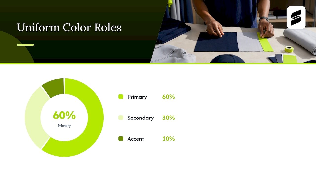
Design guidance often recommends the 60-30-10 approach: a primary base, a supporting secondary color and a small accent. The same guidance suggests balancing bold colors with neutrals to avoid visual fatigue. It was written for websites and classrooms, but it carries over to a jersey well.
Here is how that looks on a uniform:
- 60% primary: the body of the jersey and shorts or pants. This is the color people name when they describe your team.
- 30% secondary: side panels, sleeves, the shorts if the jersey is primary, or the number and lettering.
- 10% accent: piping, collar trim, a thin stripe or a small logo detail.
A worked example: a youth basketball team picks royal blue as its primary. The home jersey is 60% royal blue, with white side panels and numbers (30%) and a thin orange trim at the neckline and armholes (10%). The away jersey flips it: white body, royal blue numbers and panels, same orange trim. The team reads as the same team in both sets, and both are easy to read.
The rule breaks down when a team wants four or five equal colors. Every extra color at equal weight makes the uniform busier and the numbers harder to find. If your school has three official colors, use two as the main pair and let the third live in trim or on warmup gear.
Check contrast before you fall in love with a palette
This is where good ideas fail. A palette that looks great on a screen can turn muddy under gym lights or on a field with a long sightline.
Design guidance on accessibility sets a benchmark of a 4.5:1 contrast ratio between text and its background (the WCAG AA level). That standard was built for digital content, not jerseys, and no league requires you to meet it. But it is a handy gut check for numbers and names: if a free online contrast checker gives your number and jersey color a low score, a spectator and an official will have trouble too.
Quick ways to test a combination:
- Convert your mockup to grayscale. If the number nearly disappears, the two colors are too close in lightness.
- View it small, at about the size of a phone thumbnail. Numbers should still be readable.
- Step back across the room. Neon yellow on white and light gray on silver both fail this test quickly.
- Check it with someone who has color vision deficiency. Red on green is the classic trouble pair.
Neon colors deserve special mention. They get attention, but a neon number on a white jersey is weak. Use a neon as the jersey color or as trim and keep the number in a dark, solid color.
Rules that limit your color choices
Your league may have more say than you do. Read the rulebook for your sport and level before you finalize anything.
For high school play, the National Federation of State High School Associations (NFHS) publishes uniform guidance by sport. Its softball uniform summary states that team members’ uniforms must be the same color and style, that a back number is required and at least 6 inches high, and that the number must be a solid color contrasting with the shirt. Exposed undergarments must be a solid single color: black, white, gray or a school color. Other sports have their own details on number size, placement and color, so check NFHS for the sport you play. Your state association may add rules on top.
A few other points apply across levels:
- A thin outline on a number that does not otherwise contrast is a common reason for an illegal uniform. Make the number itself contrast, then add an outline if you want one.
- Many leagues require that the home team wear the lighter color and the visitor the darker, or the reverse, depending on the sport and level. Ask your league which applies.
- Recreational and travel leagues often have their own palette restrictions, such as banning a color already claimed by another team. Ask the league office before ordering.
- Goalkeepers, liberos and some other positions usually need a distinct color from the rest of their team and from opponents.
For a deeper look at this, our guide to how to design a uniform that meets kit rules walks through the checks before you submit a design.
Plan your home and away colors together
Pick colors as a set. The home uniform is usually the one people think of, but the away uniform is what you wear when the other team’s color is close to yours. If your home is navy, your away should not be royal blue.
A reliable approach is a light-dark pair built from the same palette:
- Home: primary color body, neutral or secondary color numbers.
- Away: neutral body (white or light gray), primary color numbers.
- Shared: the same accent trim, the same font, the same logo placement.
Your primary color then does not need to appear on both bodies. It just needs to appear on both uniforms. If you play in a league with many blue teams, the white-based away set saves you.
We cover the contrast side in more depth in why home and away colors need contrast, and our uniform color matching checklist covers what to confirm so that shorts, jerseys and warmups look like they belong together.
Our perspective: choose for the sideline, not the screen
We see the same pattern with new teams. A coach arrives with a favorite color and a rough idea, and the first mockup looks fine on a laptop. The trouble shows up later: the accent disappears on a dark jersey, the number competes with a gradient, or the away set looks almost identical to the home one.
Our advice is to settle three things before you look at any graphics. Choose the color that represents the team. Choose the neutral that will carry the number. Choose one accent and promise yourself it stays under about a tenth of the uniform. Then look at the home and away sets side by side, not one at a time.
Gradients and sublimated patterns are a good way to add depth without adding colors. A purple gradient football set or a beige and blue gradient baseball jersey shows how shading can give a two-color palette more energy. Keep the number area clean so the gradient does not fight the digits.
This is also why we give every team a mockup before an order is final. Seeing the colors on a real uniform shape, with the number in place, catches problems that a swatch never will.
— Agha
Color ideas by sport
The same palette does not always suit every sport, because the viewing distance, lighting and uniform shape differ.
Basketball and volleyball
Indoor sports are viewed under bright, even lighting and fairly close up. That allows more detail: side panels, contrast trim and bold numbers. Dark jerseys with bright numbers are popular. Volleyball also allows lighter, brighter colors such as pink, teal and gold, as long as the number is solid and clear.
Football and 7v7
Football is seen from a distance, often from far up in the stands and often on camera. Choose strong value contrast between jersey and pants, and between jersey and number. An orange and white football design is a good example of a pairing that carries on a wide field.
Baseball and softball
These sports usually have a white or gray home look and a colored away. If your league follows that tradition, build your palette around it: a strong colored jersey, white pants, and one trim color that ties them together. Pants and jerseys have to read as a set, and you can plan that in our baseball uniform builder.
Soccer
Soccer is a game of two similar-looking teams on a big field, so distinct colors matter more than in most sports. Gold, green and bright blue stand out against the typical red and white. See a gold soccer design for an example.
A step-by-step way to choose your final palette
- Write down your constraints. League color rules, school colors, and any colors that opponents in your league already use.
- Pick your primary. The color the team wants to be known for.
- Choose your neutral. White, black, gray or silver, whichever makes your numbers easiest to read.
- Add one accent. Keep it small. Trim, piping or a logo detail.
- Build the away set. Flip the primary and neutral, keep the accent.
- Run the contrast tests. Grayscale, thumbnail and across-the-room.
- Check the rulebook. Number size, number color, and any league or state restrictions.
- Review a mockup. Look at both sets, front and back, before approving.
If you want more help with the early part of this process, our guide on how to choose team colors goes through the identity side, and how to design a custom team uniform takes you from color to finished design.
Try your palette on a real uniform
Capra Sports makes custom sublimated uniforms for basketball, baseball, softball, soccer, football, volleyball and cheer. You work directly with professional designers, get free design mockups within 24 hours, and can ask for unlimited revisions until the colors are right. Team orders start at a 10-set minimum, and we send one sizing sample at no extra charge. Pricing is listed on our pricing page ([PRICE TBD] per piece for your sport), and you can start with a basketball uniform or see our custom football uniforms.
FAQ
What are the best team colors?
There is no single best set, but navy and white, black and red, and royal blue and orange are consistent performers because they combine a strong light-dark contrast with a clear identity. Choose the pair that no other team in your league uses, and that gives your numbers the best contrast.
How many colors should a team uniform have?
Two main colors plus one accent is the usual limit. A neutral can act as one of the two. More than three colors tends to make the uniform look busy and makes numbers harder to read.
Can we use neon colors?
Yes, as long as your league and state association allow it and the number stays readable. Use neon as the jersey color or as trim, and keep the number in a dark solid color. Neon text on a light background usually has low contrast.
Do the home and away uniforms need the same colors?
They should share a palette, but not the same body color. A common setup is a colored home jersey and a white or light away jersey with the same numbers, accent and logo. That keeps the team identity intact while giving you contrast against any opponent.
Where can I check what my league requires?
Start with your league or state association, since each can add its own rules. For high school sports, the NFHS publishes the national rulebooks and uniform summaries by sport.
Sources
- Official Color Codes for Sports and Athletics
- Best color palettes for websites and classrooms (Adobe Express)
- Why is color accessibility important? (Adobe Blog)
- NFHS softball uniform summary
- National Federation of State High School Associations