
5 Free Basketball Jersey Fonts + 1 Pro Pick That Print Well
For fast, legible jerseys, six fonts do most of the work: Oswald and Saira Condensed for names, Squada One and Anton for bold numbers, Bebas Neue for all-caps wordmarks, and Sequel Sans when you need a licensed, retail-grade look. The rule that matters more than any single font choice: pick something bold, high-contrast, and forgiving under your printing method, then test it at full size before you commit.
TL;DR:
- Most free fonts suitable for jerseys are bold, condensed, and tested for legibility at full size and from a distance.
- Paid fonts like Sequel Sans offer multiple weights and styles that create a cohesive brand identity for professional or retail-grade jerseys.
- Testing font legibility at actual size and across all jersey sizes is crucial before finalizing, especially to avoid issues with printing tolerances.
- Pair contrasting fonts, such as a condensed name with a wider number, to create clear hierarchy without clashing visually.
- Always check license restrictions, especially for commercial use, and request physical samples or mockups to ensure fonts reproduce well on fabric.
Table of Contents
- What Are the Best Basketball Jersey Fonts to Use for Free?
- Are There Paid Fonts Worth Buying for a More Authentic Look?
- How to Choose a Jersey Font: The Practical Checklist
- How Do You Pair Fonts for Names, Numbers, and Wordmarks?
- Where Should You Download Fonts, and What Do the Licenses Actually Mean?
- Printing and Reproduction Realities for Jersey Fonts
- How Do You Create a Quick Mockup for a Basketball Jersey Font?
- Guidelines for Customizing Fonts Without Losing Legibility
- Editor Perspective: When to Approximate and When to Commission
- Capra Sports: Design Help, Free Mockups, and Production Options
- Sources
- FAQ
What Are the Best Basketball Jersey Fonts to Use for Free?
You don’t need a paid license to get a jersey that reads clearly from the top row of the bleachers. A handful of free fonts have become the unofficial standard for fan gear, rec league uniforms, and quick mockups because they’re bold, condensed, and hold up at distance.
There’s no single downloadable NBA jersey font. Every pro team uses custom, proprietary lettering that isn’t licensed for public use, which is why designers reach for bold condensed sans-serifs to approximate that look instead of copying it outright.
- Oswald: A tall, condensed workhorse that reads well as a name font on the back and holds up in bold weight for numbers too. Free under the Open Font License, no commercial restrictions.
- Saira Condensed: Narrow numerals and tight letterforms make this a strong pick for longer surnames that need to fit an arc without shrinking. Also open license, safe for team merchandise.
- Squada One: Wide, chunky numerals built for distance reading. This is the font a lot of fan-made jersey mockups lean on because the shapes stay legible even when compressed for a phone screen.
- Bebas Neue: All-caps display letters that work great for one-word wordmarks or short team names stamped across the chest. Free for personal and commercial use.
- Anton: The heaviest of the group, almost poster-weight. Best for oversized numbers or a single bold wordmark where you want maximum visual weight with minimal detail.
Each of these lives on free repositories with permissive licenses, but always check the specific license file. A font marked “free” on one site can carry different terms on another.
Are There Paid Fonts Worth Buying for a More Authentic Look?
Paid type families earn their price when you’re building a system, not just a jersey.
Sequel Sans is the clearest example of why this matters. The professional basketball league Unrivaled built its entire visual identity, jerseys included, around Sequel Sans Extended Bold as a single typographic voice across uniforms, signage, and digital assets.
- When to buy a family instead of grabbing something free: retail sales, broadcast graphics, or any project where the number font, the wordmark, and the sponsor lockup all need to feel like one brand.
- What a paid family gives you that free fonts often don’t: multiple widths and weights designed to work together, so your name font and number font share the same DNA instead of looking bolted together.
- When to skip fonts entirely and commission custom lettering: league branding requirements, a permanent team identity, or any situation where you can’t risk two teams showing up in near-identical type.
How to Choose a Jersey Font: The Practical Checklist
Picking a font that looks good on a screen is easy. Picking one that survives a 20 foot viewing distance, a size run from youth small to adult XXL, and your printer’s tolerances takes a checklist.
- Test legibility at full size first. A font that looks sharp at 12 points on your laptop can fall apart once it’s stretched across a jersey’s back. Print it at the actual finished dimensions before you approve anything.
- Build in hierarchy. The number should read as the dominant element, bolder and slightly wider than the name above or below it. Designers consistently flag this as the detail that separates a readable jersey from a cluttered one.
- Fix your spacing rules early. Arched names need looser letterspacing at the ends of the curve and tighter spacing at the peak, or the word will look like it’s stretching apart. Two-word surnames need a fixed gap you apply consistently across every roster name, not eyeballed per player.
- Set a size range and test the extremes. Numbers typically run larger on adult sizes and proportionally smaller on youth cuts. Check both ends of your size run, not just the middle.
- Filter by printing method before you fall in love with a font. A style with delicate serifs or thin script strokes might look perfect in a design file and then vanish under screen printing or heat transfer.
Pro Tip: Print your chosen font at life size, tape it to a spare jersey, then check it from the opposite baseline and from the stands. If you can still read the number from that distance, it passes.
How Do You Pair Fonts for Names, Numbers, and Wordmarks?
Pairing isn’t about matching two fonts that look similar. It’s about matching two fonts that contrast enough to create a clear hierarchy without fighting each other for attention.
- Pair a condensed sans for the player name with a wider, blockier numeral underneath. The contrast in width does most of the hierarchy work for you.
- Save outlines, drop shadows, or multi-color strokes for sublimation projects. Simplify those same details into solid shapes if the job is headed for embroidery.
- Arc your name text digitally, then check it on a printed mockup and, ideally, on a player in motion. Static previews hide problems that only show up when fabric moves.
- Push stroke width and color contrast harder than feels necessary on screen. Gym lighting and stadium glare wash out subtle color choices fast.
Once the font is picked, size it properly. Our jersey number size guide lists front and back number heights by sport.
Where Should You Download Fonts, and What Do the Licenses Actually Mean?
Stick to repositories built for this exact use case: FontSpace, 1001fonts, and Google Fonts all host large libraries with license terms stated plainly on each font’s page. Commercial type foundries selling families like Sequel Sans are the other legitimate route when you need a licensed, professional-grade option.
- Read the license before you use anything for a team that sells merchandise. “Free for personal use” almost never covers jerseys you plan to sell.
- Webfont licenses and desktop app licenses are usually separate purchases. A license that lets you embed a font on your website doesn’t automatically clear it for a print file sent to a uniform vendor.
- If a font is personal use only and you’re producing team gear for sale, either buy the commercial license from the foundry or swap in one of the fully free alternatives above.
Printing and Reproduction Realities for Jersey Fonts
The font that looks best in your design software isn’t always the font that survives production. Each printing method has its own tolerance for detail, and knowing that before you finalize a choice saves a reprint.
Sublimation handles fine detail and multi-color fills better than embroidery or many heat transfer processes, which means thinner strokes and subtle styling survive intact. Screen printing and heat transfer generally want simplified, high-contrast shapes with no tiny counters that can clog or peel. Embroidery is the strictest filter of the three: bold, uncomplicated letterforms hold their shape in thread, while thin serifs and narrow counters just collapse into a blob.
- Request vector outlines from your designer, never a flattened image file.
- Supply an exact weight and scale spec, such as “numbers 10 inches tall on a size L jersey,” so nothing gets guessed at production time.
- Ask for a physical sample before committing to a full team order, especially the first time you use a new font.
How Do You Create a Quick Mockup for a Basketball Jersey Font?
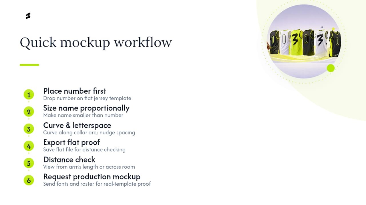
You don’t need professional design software to see whether a font choice actually works—tools like WOVA can help automate quick mockups for your design process. Start by dropping your chosen name and number font directly onto a flat jersey template, either a free vector template or a photo of a blank jersey, using free tools like Canva, Photopea, or even PowerPoint for a rough pass.
Set the number in its final font first, since that’s the element people see from the farthest away, then build the name around it at a proportionally smaller size. Curve the name text along the collar arc if your template calls for it, and nudge letterspacing until the curve looks even rather than bunched at one end.
Once the layout feels right, export it flat and hold it at arm’s length, or better, view it on a phone screen from across the room. That rough distance test catches spacing problems a close-up screen view will hide every time.
If you want a production-accurate version instead of a rough draft, sending your font selections and roster details through a free mockup request gets you a proof built on the actual jersey template and fabric, not a flat approximation. That step matters most right before you commit to a full team order, since a mockup on the real cut catches sizing and placement issues a flat template can’t show.
Guidelines for Customizing Fonts Without Losing Legibility
Team identity often means pushing a stock font past its default settings: adding an outline, skewing it slightly, or combining two fonts into a custom wordmark. That’s fine, as long as every change gets tested against the same legibility standard you’d apply to an unmodified font.
Start with one change at a time rather than stacking five effects at once. Add an outline, test it at distance, then decide if you also need a drop shadow, rather than guessing at the combined effect. Outlines and shadows are the easiest way to make a free font feel custom, but heavy strokes can close up thin counters, especially on letters like “A,” “B,” and “R” once they’re printed small.
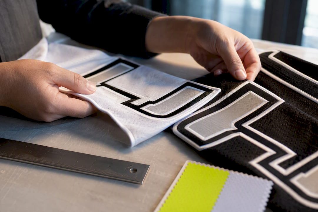
Skewing or italicizing a font to suggest motion works for a wordmark but rarely works for numbers, since officials and scorekeepers need to read digits instantly without decoding an angle. If your team wants a genuinely unique look tied to local identity or a mascot, that’s usually the point where a stock font, however customized, stops being enough and custom lettering from a professional designer becomes worth the cost.
Whatever you change, run it back through the same full-size print test from the checklist above. A customization that looks sharp in a design file and turns illegible on fabric isn’t a stylistic risk worth taking with a full team order riding on it.
Editor Perspective: When to Approximate and When to Commission
Free substitutes earn their keep for mockups, fan gear, and one-off recreational teams where budget matters more than brand permanence. The math changes once you’re selling retail jerseys, locking in a multi-year identity, or answering to league branding rules. That’s when a licensed family or custom lettering stops being a luxury and starts being the cheaper option long term. Either way, proof at life size and order a physical sample before you run a full batch. Skipping that step is the single most common reason teams reorder.
— Agha
Capra Sports: Design Help, Free Mockups, and Production Options
Once you’ve picked a font, the gap between a design file and a jersey you can actually wear is where most DIY projects stall. Custom basketball uniforms can be built from your font and color choices, produced with sublimation printing that handles fine detail, with no minimum order quantity holding up a small roster.
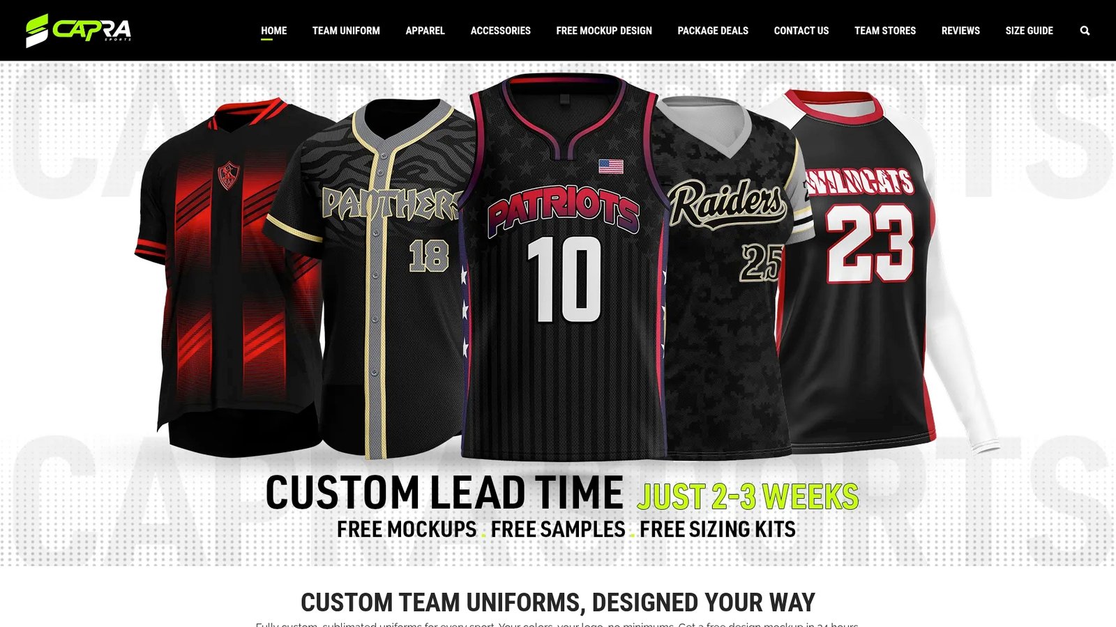
Orders typically start with a free design mockup, allowing you to see font and number treatment on the jersey template before production, along with the possibility of revisions with a designer. If you’re ready to move from font selection to a finished jersey, request a free mockup or browse the basketball uniform options to see sizing and styles for your team.
Sources
FAQ
What Fonts Are Best for Basketball Jerseys?
Oswald and Saira Condensed work well for names, while Squada One, Anton, and Bebas Neue handle numbers and bold wordmarks that need to read from a distance.
What Are Some Good NBA-Style Fonts?
There’s no official downloadable NBA font since every team uses custom, proprietary lettering, but bold condensed sans-serifs like Oswald and Anton are the closest free approximations designers use for fan projects.
What Font Is Best for Printing Jersey Numbers?
Anton or Squada One print reliably across most methods because their thick, simple strokes hold up under screen printing, heat transfer, and sublimation alike, and Capra Sports’ sublimation process can also handle finer detail if your design calls for it.
Can I Use a Free Font for a Team I’m Selling Merchandise For?
Only if the license explicitly covers commercial use. Fonts marked “free for personal use” require a separate commercial license before you sell jerseys built with them.
Do I Need a Designer to Create a Jersey Mockup?
Not for a rough draft, since free tools like Canva or Photopea handle a basic layout, but a production-accurate mockup from a service like Capra Sports’ free design request catches sizing and placement issues a flat template can’t.