
10 Football Uniform Ideas Coaches Can Mock Up Today
Ten uniform concepts cover almost every situation a team faces: a throwback anniversary kit, an all-black alternate, a minimal two-color classic, a gradient third jersey, metallic accent trim, a heritage sash design, a modern colorblock set, retro stripes, a stadium-to-street lifestyle kit, and a hi-vis goalkeeper concept. Each one solves a different problem, whether that’s broadcast visibility, merchandise sales, or just looking sharp on a tight budget.
- Throwback anniversary kit — leans on program history, which sells well to alumni and parents.
- All-black alternate — reads as premium on camera and photographs cleanly under stadium lights.
- Minimal two-color classic — the cheapest to produce and the easiest for referees and cameras to read.
- Gradient third jersey — gives boosters something new to buy without touching the primary identity.
- Metallic accent trim — small doses of shimmer catch light without hurting number contrast.
- Heritage sash — a diagonal or shoulder band that nods to old-school kits while looking current.
- Modern colorblock — split-panel design that separates a team visually from every opponent on the schedule.
- Retro stripes — vertical or shoulder stripes borrowed from 1970s and 1990s kits, still a fan favorite.
- Stadium-to-street lifestyle kit — designed to double as everyday wear, extending its life past game day.
- Hi-vis goalkeeper concept — a bright, single-color kit that keeps the keeper visually separate from both teams.
Pro Tip: Pick your top two ideas, then request a free digital mockup before committing to fabric or colors — it costs nothing to see it rendered first.
Key Takeaways
The strongest football uniform ideas pair a clear visual identity with practical contrast, sizing, and printing choices made early in the design process.
| Point | Details |
|---|---|
| Start with a story | Define one sentence describing what the kit should say before picking any colors. |
| Simplify the palette | One dominant color plus one supporting color reads better on camera and in person. |
| Match method to lifespan | Use sublimation for full-color, multi-season kits and heat transfer for one-off alternates. |
| Protect goalkeeper visibility | Keep goalkeeper colors distinct from both teams to meet standard match-management rules. |
| Get a mockup first | Caprasport builds a free mockup with no minimum order before you commit to production. |
Table of Contents
- Football Uniform Ideas: A Gallery of Proven Styles
- Design Trends Shaping Football Kits in 2026
- How to Design a Football Uniform Step by Step
- Choosing Materials and Printing Methods for Football Kits
- What to Expect: Costs, Sizing, and Production Timelines
- Inside the Pro Designer Workflow for Kit Production
- Picking Colors That Boost Visibility and Team Identity
- Staying Compliant With League Uniform Standards
- Adding Personalization Without Losing Team Identity
- Sources
- FAQ
Football Uniform Ideas: A Gallery of Proven Styles
Looking at what already works beats guessing at what might. Below are the styles that show up again and again in college, professional, and club football because they solve real problems: visibility, identity, or budget.
Throwback/anniversary. Programs celebrating a milestone season often revive a specific era’s colors, numbering font, and collar style. Stanford’s all-black alternate wasn’t a throwback, but it proved that a single bold color choice can generate more attention than a full redesign. Mississippi State has taken the opposite approach, running anniversary and throwback styling to tie current rosters to program history. Style tags: throwback, heritage. Best for: programs with 25+ years of history, homecoming games, alumni merchandise pushes. Composition note: shoot a full-kit flat-lay next to an archival photo from the original season for the strongest visual contrast.
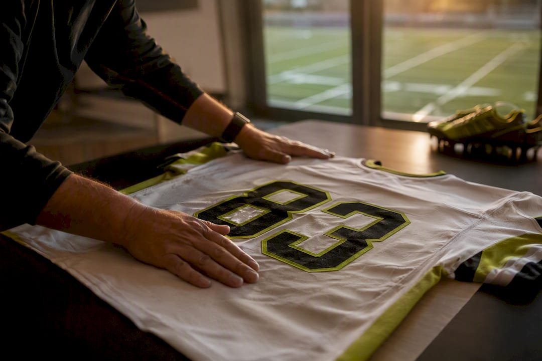
All-black alternate. A single dominant color with tonal numbering (black on black, outlined for legibility) reads as aggressive and modern on television. Style tags: alternate, minimal, modern. Best for: one-off “blackout” games, night games under stadium lights. Contrast check: numbers need a visible outline or the referee’s high-definition camera angle will lose them entirely.
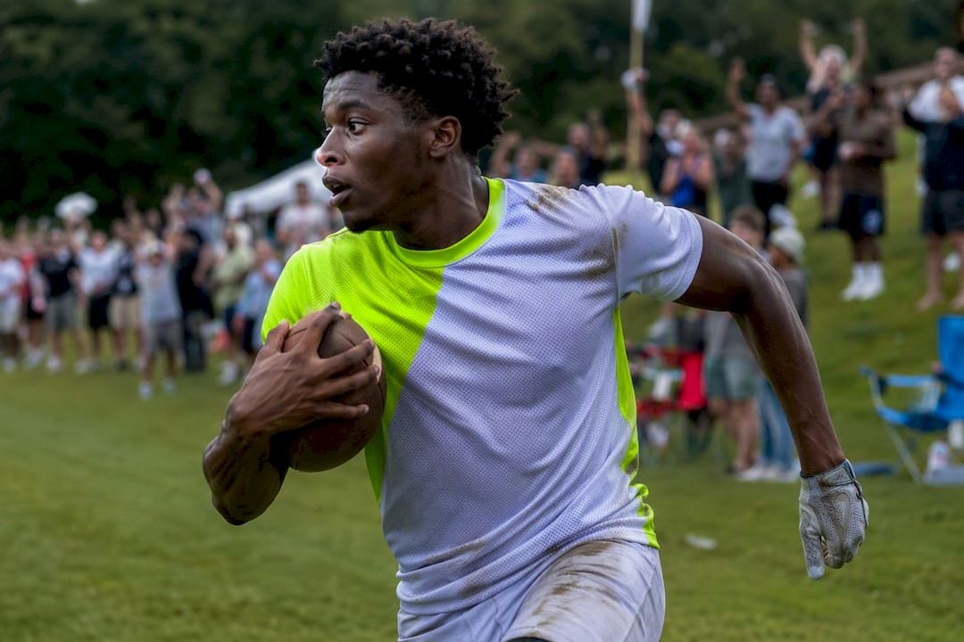
Colorblock modern. Splitting the jersey into two or three color zones, often diagonally across the chest, creates a shape that’s instantly recognizable even in a crowd of jerseys. Style tags: modern, colorblock. Best for: teams wanting a completely new look that still photographs well. Composition note: use a player-in-stadium shot rather than a flat-lay. The color split reads differently in motion.
Minimal/modern classic. One primary color, one supporting color, and almost no extra graphics. This is the safest, cheapest, and most durable design direction, and it happens to be the one that ages best. Style tags: minimal, classic. Best for: youth programs on tight budgets, teams that reorder every season and want the design to stay relevant for years.
Retro stripes. Vertical shoulder or torso stripes borrowed from 1970s and 1990s kits. Style tags: retro, throwback. Best for: programs with a distinct historical look worth reviving. Contrast check: heavier stripe patterns can visually blend with a busy background on standard-definition broadcasts, so keep number placement on a solid color panel.
Gradient/ombre third kit. A soft fade between two team colors, often used for a limited “third” jersey sold as merchandise rather than worn every game. Style tags: gradient, alternate. Best for: boosting fan gear sales without touching the primary or away identity.
Metallic/chrome accents. Small amounts of metallic ink or thread on numbers, crest outlines, or trim. Style tags: premium, accent. Best for: senior night, playoff runs, or any single high-stakes game where a team wants a visual upgrade without a full redesign.
Stadium-to-street lifestyle kit. Built to look as good in the hallway as it does on the field, this concept borrows silhouettes and colorways from streetwear. It’s become one of the more visible directions in recent creative jersey roundups, which highlight heritage references and premium collaborations as a growing trend. Style tags: lifestyle, modern. Best for: programs that want players wearing the kit off the field too.
Hi-vis goalkeeper concept. Bright yellow, orange, or green kits that stand apart from both teams and the officials. Style tags: goalkeeper, high-visibility. This isn’t optional styling. Distinct goalkeeper colors are a practical necessity for match management, preventing confusion in fast-moving plays near the goal.
Photo galleries from major outlets remain one of the best free references for composition. The college football uniform galleries that outlets like NFL.com publish each season show how color balance and alternate kits actually look in game photography, not just on a flat design file.
Design Trends Shaping Football Kits in 2026
Kit design in 2026 is being pulled in two directions at once: toward performance engineering and toward emotional storytelling. Both matter, and the strongest concepts blend them rather than picking one.
- Stadium-to-street crossover — kits designed to work as everyday apparel extend a uniform’s value well past game day and give boosters something they’ll actually wear.
- Textured graphics and sublimation detail — subtle patterns (topography lines, fabric-woven textures, tonal crests) add depth without hurting number contrast, something flat single-color prints can’t achieve.
- Zoned ventilation and performance engineering — modern kits map mesh panels to actual heat and movement zones on the body rather than adding vents decoratively. Designers following the seven-step design framework test these zones alongside color choices during the tech pack stage.
- Sustainability in materials and sourcing — recycled polyester blends and reduced-waste cutting patterns are becoming standard requests from athletic directors, not just a marketing add-on.
- Retro and heritage revivals — programs are mining their own archives for colorways and fonts instead of chasing generic trend cycles, which is part of why heritage-driven designs dominated recent year-end creative roundups.
- Premium accent finishes — metallic ink, embroidered crests, and tonal outlines used sparingly to signal a higher-end look without redesigning the whole kit.
Why any of this matters comes down to scrutiny. Every kit now gets seen through a high-definition camera lens, a phone recording from the stands, or a VAR replay freeze-frame. A pattern that looks sharp on a design screen can turn into visual noise once it’s moving at game speed on a 4K broadcast.
Pro Tip: Before finalizing any textured or patterned design, view a mockup at actual game distance, roughly 20 to 30 meters, not zoomed in on a laptop screen. What reads as detail up close often disappears entirely from the sideline.
How to Design a Football Uniform Step by Step
Good kits don’t start with color. They start with a story. Designers who follow a structured process consistently produce better results than teams that jump straight to picking a color palette, because every later decision, from crest placement to fabric choice, ties back to that starting point.
Here’s the seven-step flow that works:
- Define the story or “north star.” What does this kit need to say about the program? One sentence is enough. Owner: head coach or program director.
- Build a moodboard. Pull five to seven reference images that capture texture, silhouette, and heritage cues. This keeps the whole group aligned before anyone touches actual colors. Owner: designer or volunteer with design software access.
- Lock the color palette and run a visibility check. Two colors, maximum three. Test them against the away team’s likely colors and under stadium lighting conditions.
- Set crest and number placement rules. Follow your league’s contrast and numbering requirements before finalizing artwork position.
- Build the tech pack. This is the spec sheet a factory actually works from: measurements, seam placement, Pantone or hex codes, fabric swatches, number fonts.
- Order mockups and run fittings. Get renders of the full outfit, shirt, shorts, and socks together, not just the jersey.
- Approve a sample, then move to production. Physically check stitching, color match, and fit before signing off on a full order.
Supplier briefing checklist:
- Exact hex or Pantone codes for every color
- Crest files in vector format (not a JPEG)
- Preferred number font and outline style
- Full size run with player-by-player measurements
- Printing method preference (sublimation, screen print, heat transfer)
- Sponsor or patch placement, if applicable
- Firm deadline with buffer built in
Pro Tip: Photograph your sample under actual field lighting, not office fluorescents, and get written feedback from at least three players before approving production. A color that looks perfect indoors can shift noticeably under stadium floodlights.
| Design step | What it produces |
|---|---|
| Moodboard | A shared visual direction everyone agrees on before colors are picked |
| Tech pack | The exact spec sheet a factory needs to cut and print correctly |
| Sample approval | A physical check on fit, color accuracy, and stitching before full production |
Choosing Materials and Printing Methods for Football Kits
For full-color graphics, gradients, or anything with more than two colors, sublimation is the right call. For simple designs with one or two flat colors and a small order size, screen printing or heat transfer can save money without sacrificing much.
The difference comes down to how the ink or dye actually gets onto the fabric. Sublimation dyes the fibers themselves, so there’s no raised layer to crack, peel, or fade, which is why it handles complex, full-bleed graphics and gradients better than any other method. Screen printing lays ink on top of the fabric in layers, which works well for bold, simple logos in one or two colors but gets expensive fast once you add more colors. Heat transfer applies a pre-printed design using heat and pressure. It’s the cheapest option for very small orders but tends to crack or peel faster than the other two methods.
| Method | Best for | Durability | Relative cost |
|---|---|---|---|
| Sublimation | Full-color graphics, gradients, complex patterns | Very high, won’t crack or peel | Moderate, scales well with color complexity |
| Screen printing | Simple 1-2 color logos, larger orders | Moderate, can crack over time | Low for simple designs, rises with more colors |
| Heat transfer | Small orders, quick turnarounds | Lower, prone to peeling with wash | Lowest for small quantities |
Fabric choice matters just as much as printing method. Performance knits and breathable mesh handle sublimation cleanly and keep players comfortable in heat, while heavier retro-style cotton blends can mute color vibrancy but nail an authentic vintage look for throwback concepts. Reading more on how sublimation actually holds up over a season is worth it before locking in a fabric decision.
Pro Tip: Match your printing method to how long the kit needs to last. A one-game alternate can get away with heat transfer. A primary kit worn for three seasons needs sublimation or it won’t survive the wash cycle.
What to Expect: Costs, Sizing, and Production Timelines
Most custom kit orders move through four phases: design approval, sample production, full manufacturing run, and shipping. Each phase adds time, and skipping the sample step to save a week almost always costs more later in reprints.
Cost typically breaks down into a few components: any design or mockup fee, a sample cost per kit style, the per-unit price at your final quantity, optional add-ons like embroidered crests or sponsor patches, and shipping. Teams working with low minimum order quantities can control costs by keeping print complexity simple, standardizing sizes across age groups where possible, and reusing a base template across multiple seasons instead of redesigning every year.
- Confirm final roster sizes and numbers before the sample stage, not after
- Build in a buffer week for sample revisions. First samples rarely nail color exactly
- Lock sponsor or patch placement early. Late additions delay full production
- Order slightly ahead of season start. Shipping delays happen even with reliable suppliers
Pro Tip: Always leave room for at least one round of sample revisions in your timeline, especially if your league requires specific numbering or contrast rules. Rushing this step is the most common reason teams miss opening kickoff with the right kit.
Inside the Pro Designer Workflow for Kit Production
Professional kit designers work from a four-stage framework: Moodboarding, Creative Development, Tech Packs, and Production and Quality Assurance. Each stage has a specific job, and skipping one usually shows up as a problem later.
Moodboarding sets the emotional direction using five to seven reference images. Creative development turns that direction into actual color and pattern options. The tech pack stage is where the design becomes a real spec sheet, with measurements, stitch lines, seam placement, fabric swatches, and exact Pantone or hex values written down for a factory to follow. Production and quality assurance is the final check before a full run gets cut.
What belongs in a tech pack:
- Full body measurements by size
- Seam and stitch line placement
- Fabric swatch references
- Exact color codes, not just color names
- Number font and outline specifications
Designers following this seven-step framework run a few quick validation checks before signing off: visibility under stadium lighting, number legibility at roughly 20 meters, and contrast against the most common opponent colors on the schedule.
Pro Tip: Photograph every sample under match lighting and file it alongside the tech pack. When you reorder next season, that photo record saves you from re-explaining color decisions from scratch.
Picking Colors That Boost Visibility and Team Identity
Color choice isn’t just about looking good. It’s about being instantly readable from the stands, the sideline, and a broadcast camera at the same time. One dominant color with a single supporting color tends to outperform busier palettes for exactly this reason: simpler palettes photograph more consistently and get recognized faster in a crowd of jerseys.
Contrast is the real driver of visibility, not brightness alone. A bright color against a similarly bright background can actually be harder to read than a darker color with strong contrast against numbers and trim. That’s why most successful kits pair a saturated primary color with either white, black, or a strongly contrasting secondary, rather than two colors of similar intensity.
Team identity works best when color choices connect to something real, a school color, a regional reference, a program history, rather than an arbitrary trend. That connection is also what makes fans and boosters more willing to buy the gear. When picking a palette, test it in three conditions: bright daylight, stadium floodlights, and a black-and-white printout. If the design still reads clearly in grayscale, the contrast is strong enough to work under almost any camera or lighting condition a season will throw at it.
Staying Compliant With League Uniform Standards
Every governing body has its own rules on jersey numbering, contrast, and what counts as a legal uniform, and those rules matter more than any single design idea. Skipping this check can mean a kit gets rejected right before kickoff.
The specifics vary by league and level. High school programs typically follow standards set by state associations under NFHS guidelines, college programs follow NCAA uniform rules, and international or club soccer follows FIFA or UEFA kit regulations depending on competition. Numbering requirements are the most commonly enforced rule: numbers usually need to meet minimum height requirements on both the front and back of the jersey, and they must contrast clearly against the base color. Goalkeeper kits face an additional requirement in nearly every rule set: the color needs to be visually distinct from both competing teams and the match officials, which is why hi-vis goalkeeper concepts show up so consistently across levels of play.
Before finalizing any design, check your specific league’s current handbook rather than assuming last season’s rules still apply. Requirements around sponsor patch size, number placement, and even sleeve length get updated periodically, and a design that was legal two seasons ago isn’t guaranteed to still pass inspection today.
Adding Personalization Without Losing Team Identity
Names, numbers, and patches are where a uniform becomes personal, but too much customization can undercut the team-first look that makes a kit work in the first place. The goal is balance: give players individual recognition without turning the roster into 20 different-looking jerseys.
Numbers should always take priority over names in terms of visibility. A number needs to be readable from the stands and the broadcast booth; a name on the back is a bonus, not the main event. Keep the font and outline style identical across every player, only the digits and letters change. Patches, whether they mark a captain, a memorial, or a sponsor, work best in a fixed location decided once at the tech pack stage rather than negotiated player by player.
A few practical rules keep personalization clean:
- Standardize name font size and placement across the entire roster
- Reserve one small, consistent zone for patches (sleeve or chest) rather than scattering them
- Confirm number contrast rules with your league before finalizing size and color
- Offer optional personalization (nicknames, senior year, jersey retirement) only on off-field or lifestyle apparel, not the game-day kit
Done well, personalization builds buy-in from players and parents without making the team look like a mismatched collection of individual jerseys.
A Coach’s Quick Note on What Actually Changed Our Kits
The smallest change that made the biggest difference for our program wasn’t a redesign. We switched from white shorts to charcoal gray. Our field turns to mud by October, and white shorts looked terrible in every game photo after the first quarter. We also started testing number legibility by standing 25 meters back before approving any sample, not just eyeballing it up close. Both changes cost nothing extra in production. If your pitch gets muddy or your stands sit far from the field, start there before you touch color or crest design.
Get a Free Mockup Before You Commit to a Design
Caprasport turns the ideas above into a real mockup before you spend a dollar on production, with no minimum order size holding you back if you’re outfitting a small roster or a full varsity program. Send over your team name, primary colors, a crest file, and which style from this list caught your eye, and a designer builds a free mockup you can actually show your players and boosters.
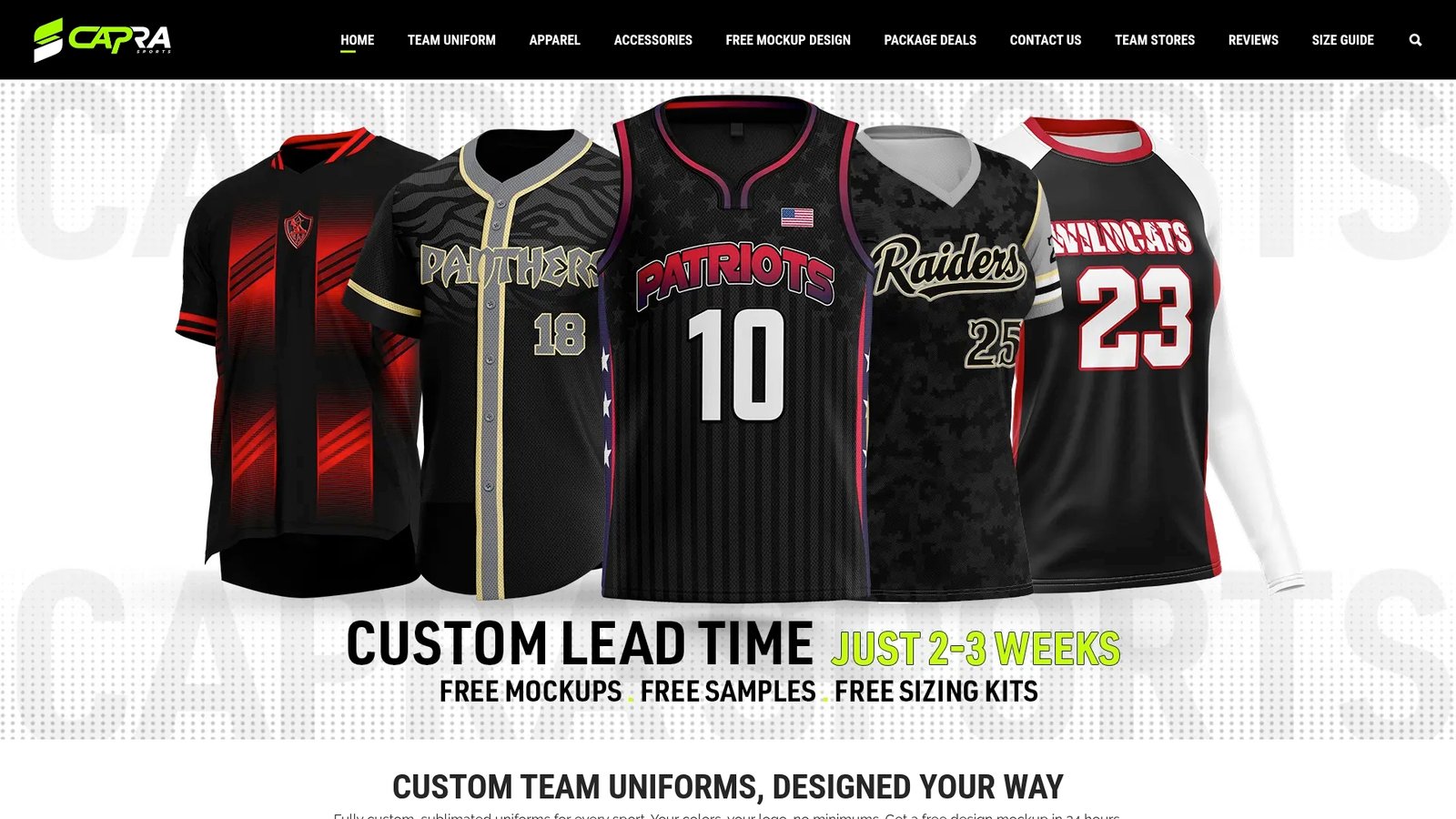
What you get working directly with a factory-direct shop: no minimum order quantities, free samples so sizing gets checked before the full run ships, unlimited revisions with a real designer instead of a template generator, and sublimated printing built for full-color graphics like gradients and colorblock designs. Head over to the custom football uniform page to start a request, or go straight to the free mockup request form and get a design back before your next practice.
Sources
- Moodboard to Iconic Kit: The 7-Step Design Framework
- How to Design a Custom Football Kit: A Complete 2026 Guide | OnReplay
- The 20 jersey designs that hit Creative Soccer Culture hardest in 2025
- 14 for ’14: Best uniforms in college football
FAQ
Can I Design My Own Football Uniform?
Yes. Most suppliers, including Caprasport, offer free digital mockup tools or direct designer support so you can build a custom look using your own colors, crest, and numbering before ordering anything.
What Are the Latest Trends in Football Uniform Design?
Current directions include stadium-to-street lifestyle kits, textured sublimation graphics, zoned ventilation for performance, sustainable fabric sourcing, and heritage or retro revivals pulled from a program’s own archive.
What Is the Most Popular NFL Uniform?
There’s no single official ranking, but all-black alternates and heritage throwback designs consistently draw the most attention in fan polls and media coverage, largely because of how strongly they photograph under stadium lighting.
What Are the Latest Trends in Uniforms Generally?
Across football, basketball, and soccer, the shared trend is simplification: fewer colors, sharper contrast, and premium accent details like metallic trim used sparingly rather than across the whole kit.
Recommended
- How to Design a Custom Team Uniform | Coach’s Guide | Capra Sports
- Custom Football Uniforms for Teams | Capra Sports
- How Custom Uniforms Are Made: Mockup to Delivery | Capra Sports
- Free Custom Uniform Mockup in 24 Hours | Capra Sports
Want to test one of these looks on a real cut? Design your own football jersey online – free, on the exact garment template we print.