
5 Checks to Make Jersey Number Fonts Production-Ready
For maximum readability at game distance, choose bold, condensed block numerals with a contrasting outline or double-outline border. That combination survives sublimation printing, patterned fabrics, and the ten yards of distance between a number and the person trying to read it. You’ll find this style in both free options like Jersey M54 and licensed families like Sport Numbers, so budget doesn’t have to limit your choice.
TL;DR:
- Bold, condensed block numerals with a contrasting outline are essential for maximum readability at game distance, especially on patterned or sublimated fabrics.
- For best visibility, choose fonts with appropriate stroke width and open counters, and test digit pairs that are often misread, such as 6/8 or 9/0, at actual size before production.
- Outline treatments like double outlines significantly improve legibility against complex backgrounds, with careful consideration of size and contrast to avoid blurring at distance.
- Licensing proper numeral fonts from dedicated sources ensures legal use and access to the full digit set, which helps streamline layering and size consistency in production.
- Always request a printed proof on the actual jersey pattern to verify contrast and legibility, since vector specimens can mislead about how numbers will perform on fabric.
Table of Contents
- What Makes Good Jersey Number Fonts
- How to Choose a Font for Your Jersey’s Numbers
- Outline, Inline, and 3D Treatments: What Each One Actually Does
- Where to Find and License Jersey Number Fonts
- Capra Sports’ Take on Specifying Number Fonts for Custom Orders
- The Real Trade-Off Nobody Mentions in Font Roundups
- Get Production-Ready Numerals Without the Guesswork
- Sources
- FAQ
What Makes Good Jersey Number Fonts
The numeral families that hold up on a uniform share a short list of traits, and none of them are about looking clever up close. Jersey number fonts get read from bleachers, broadcast cameras, and referee sightlines, not from a design portfolio.
Here’s a working shortlist worth testing against your own team colors and printing method before you commit.
- Jersey M54 — A classic sports block face that’s been the default for scrimmage jerseys and mockups for years. It’s free for personal use, but check with the type designer before running it on merchandise you plan to sell, since commercial rights aren’t automatically included on the DaFont listing.
- Sport Numbers (Gerald Gallo) — Built specifically for uniform work, this family ships with defined aspect ratios (6:10, 8:10, 10:10, and 12:10) plus dedicated vertical and oblique numeral variants, according to the font’s specimen page. The designer credit and documented proportions make it easy to match traditional league looks. MyFonts carries the same family with full licensing details for commercial print work.
- Winner Numerals — This isn’t one font but a full styling system: 49 numeral treatments spanning inline, outline, 3D, notch, and stencil effects, built as a companion set for layered production, per Sportsfonts’ product page. If your print shop can layer colors, this is the family to hand them.
- Jersey Number (Wow Magic) — A bold slab-serif display font with a varsity feel, sold for retail-style kits and merchandise graphics on Creative Market. It reads more “team store” than “on-field,” which makes it a strong pick for fan apparel rather than game jerseys.
- Free collection picks — Sites like DaFont and FontSquirrel host dozens of block-style athletic numerals under personal-use licenses. Treat these as sketch and mockup tools first; verify commercial terms before production.
Most college and pro programs lean on the block or varsity families above rather than script or decorative numerals, and for good reason: officials, scorekeepers, and broadcast graphics teams all need to identify a player in under a second.
How to Choose a Font for Your Jersey’s Numbers
Picking a numeral face isn’t about taste. It’s a checklist problem, and skipping a step is how teams end up with numbers that look great on a screen and blur into mush on the field.
- Check stroke width against counter size. A “counter” is the open space inside a digit like 6, 8, or 0. If the stroke is too thick, that space closes up and the number turns into a blob at a distance.
- Test digit pairs that get confused. Numbers 6/8, 9/0, and 2/7 cause the most misreads. Print a proof with all ten digits side by side before finalizing anything.
- Match proportions to placement. Back numbers can run wider and taller since there’s more real estate. Sleeve and short numbers need condensed forms to avoid crowding.
- Confirm minimum size against viewing distance. Font specimens built for athletics reference aspect ratios like 6:10 or 8:10 for a reason. Stray too far from those proportions and legibility drops fast at 20 to 30 feet.
- Account for your printing method early. Sublimation dye can bleed slightly into fabric weave, which softens edges and reduces contrast in ways screen printing usually doesn’t.
Pro Tip: Print your numeral proof at actual game size, not screen size. A “6” that looks perfectly bold on a 27-inch monitor can lose half its contrast once it’s shrunk onto an 8-inch sleeve number.
Open, closed, condensed, wide. It sounds like a lot of variables until you print two proofs side by side and one is instantly easier to read from across the room. That’s the test that matters.
Outline, Inline, and 3D Treatments: What Each One Actually Does
A single-color numeral on a solid jersey rarely needs help. A numeral fighting a busy pattern, a camouflage print, or a sublimated gradient background needs a rescue plan, and that’s what outline treatments are for.
- Double-outline (layered border): Two contrasting rings around the numeral, typically dark then light or vice versa. This is the single most effective fix for legibility against patterned or heavily sublimated fabric, because it creates a hard-edged buffer between the number and whatever chaos sits behind it.
- Single outline: Works fine on jerseys with a clean, solid-color background. Adding a second ring only when the base color is busy keeps the design from looking overworked on simpler kits.
- Inline (a thinner line running inside the numeral’s edge): Adds visual interest but shrinks the solid mass of the digit, which can hurt readability at small sizes like sleeve numbers.
- Notch cuts: Small angular cuts into the stroke, popular for a sharper athletic look. Fine on chest and back numbers; risky on anything under four inches tall.
- 3D or drop-shadow effects: Good for retail merchandise graphics, weaker for game jerseys, since the shadow can register as noise from a distance.
Winner Numerals bundles inline, outline, 3D, and notch as interchangeable style options within one numeral system, which is exactly why production teams like it: you can prototype three treatments without switching fonts. As a rule of thumb, a 1 to 2 point contrasting border restores most of the legibility a busy fabric pattern takes away.
Where to Find and License Jersey Number Fonts
Skip generic free-font search results if the jerseys are going into production. Check dedicated foundries and marketplaces instead: MyFonts, YouWorkForThem, SportsFonts, and Creative Market all carry numeral-specific families with proper specimens and licensing terms attached.
Before buying or downloading anything, run through this checklist:
- Does the license cover commercial printing, or personal use only?
- Are there limits on how many seats, designers, or machines can use the file?
- Does the license allow embedding into design software and font subsetting for production files?
- Can you legally sell finished merchandise that includes the numeral design, or does that require a separate rights tier?
- Does the family include a numeral-only specimen showing all digits 0 through 9, plus vertical and oblique variants if you need them for sleeve placements?
Request the full 0 to 99 glyph set before locking in a font. Some numeral families only ship single digits and leave double-digit kerning as a manual fix, which turns into a production headache when you’re stamping fifty jerseys on a deadline.
Capra Sports’ Take on Specifying Number Fonts for Custom Orders
Font choice on a screen and font performance on a finished jersey are two different things, and the gap between them usually shows up during production, not design. Requesting a mockup before committing to a print run is the single best way to catch a legibility problem while it’s still cheap to fix.
A numeral that looks razor sharp in a vector file can soften noticeably once sublimation ink meets fabric weave. That’s why a layered-outline proof matters more than the font name on the label.
Custom-designed team uniforms that include designer collaboration, low minimum order quantities, and free samples can help teams verify numeral sizing and outline choices before a full order ships. Because production runs through sublimation, we recommend requesting a proof on your actual jersey pattern, not a plain swatch, especially for busy colorways.
The Real Trade-Off Nobody Mentions in Font Roundups
Most advice on jersey number fonts treats the font choice as the whole decision. It isn’t.
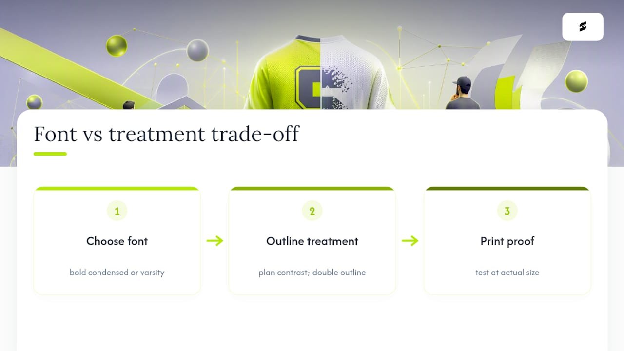
Here’s where conventional advice falls short: it treats a font specimen sheet as proof that a numeral will read well on fabric. A specimen shows you clean vector shapes on a white background. It doesn’t show you what happens when that same “8” sits on a camouflage-pattern jersey under sublimation dye, or what a “6” does at sixty feet under stadium lights.
If you take one thing from this, take this: pick a bold condensed block or varsity numeral family first, then spend equal effort on the outline treatment and the print proof. A great font with no contrast plan will underperform a mediocre font with a well-executed double outline every time. Test at actual size before you commit to a full team order, not after.
— Agha
Get Production-Ready Numerals Without the Guesswork
Picking the right numeral family solves half the problem. Getting it printed correctly, at the right contrast, on the right fabric, solves the other half, and that’s where Capra Sports comes in. Unlike ordering blind from a font marketplace and hoping your print shop interprets the outline correctly, Some custom uniform services pair orders with a professional designer and a free mockup so customers can see the exact numeral, size, and outline treatment before production starts.
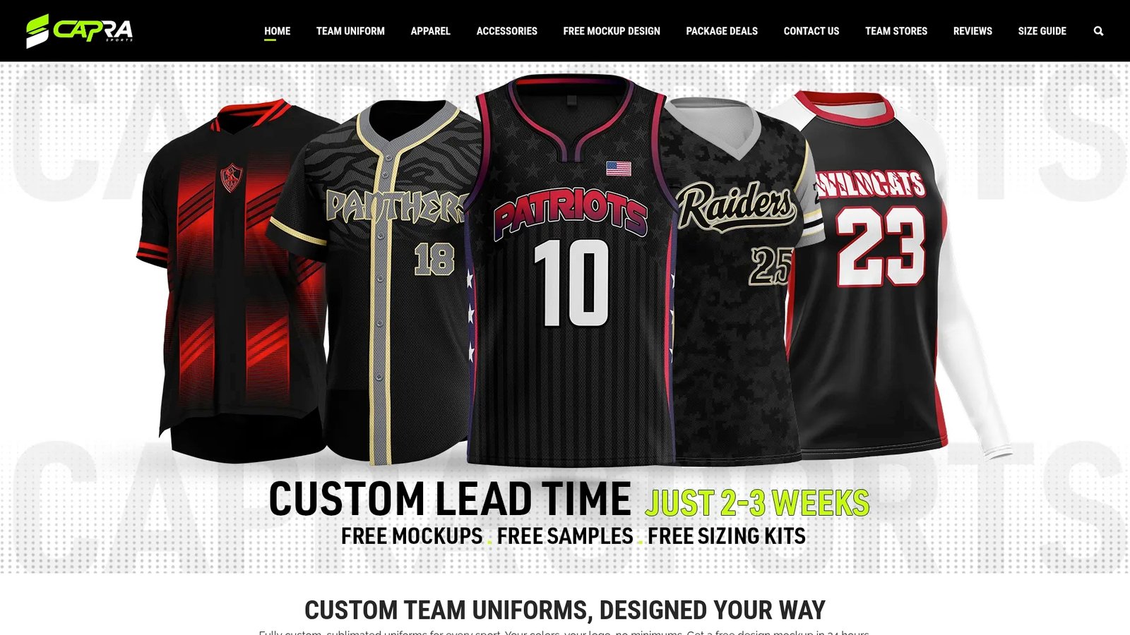
Whether you’re outfitting a football program or a rec league basketball team, you can request a custom uniform design and specify your numeral style, placement, and outline treatment directly with a designer. Football programs specifically can start from Capra’s custom football uniform options and build numeral treatments around the jersey pattern from day one. No minimum order requirements and free samples before committing can help ensure numbers will read clearly from the sideline. Start your mockup request today and see the proof before you pay for a production run.
Sources
- Sport Numbers Font – YouWorkForThem
- Sport Numbers | MyFonts
- Winner Numerals – Sportsfonts
- Jersey M54 Font | DaFont
- Jersey Number – Display Font / Sports Font / Varsity Font | Creative Market
FAQ
What font style is best for football jersey numbers?
Bold condensed block numerals with a single or double contrasting outline read best under stadium lighting and on broadcast cameras, which is why most programs favor block or varsity-style families over script or decorative fonts.
What font looks best for numbers in general?
For any application where numbers need to be read quickly and at a distance, a condensed block face with even stroke width and open counters outperforms decorative or script styles, since the goal is instant recognition, not ornamentation.
What is the best font to use on a jersey?
Licensed families built specifically for uniforms, like Sport Numbers, tend to outperform generic block fonts because they include proper aspect ratios and vertical or oblique variants already sized for sleeve and back placements.
What is a good font for jersey numbers in Cricut projects?
Free block-style athletic numeral fonts like Jersey M54 work well for Cricut cutting projects since their simple, closed shapes cut cleanly, though commercial use on items you plan to sell may require a separate license from the designer.
Do jersey numbers need an outline if the jersey is a solid color?
Not always. A single-color numeral on a clean, solid-background jersey usually reads fine without an outline, but any pattern, gradient, or heavily sublimated design benefits from at least a single contrasting border for legibility.