
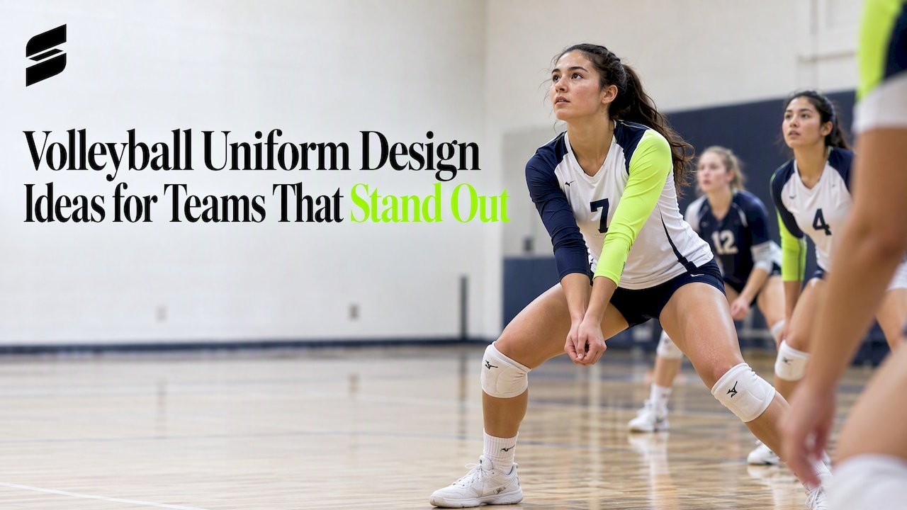
Volleyball Uniform Design Ideas for Teams That Stand Out
The best volleyball uniform designs are simple at a distance and detailed up close. Pick two or three colors, keep the number big and readable, give your libero a clearly different top, and save the creative energy for one feature: a sleeve, a side panel, a gradient or a pattern. This guide walks through eight layouts that work, the color pairings behind them, and the rules that shape what you are allowed to put on a jersey.
TL;DR
- Start with the rules, not the artwork: the libero jersey must contrast clearly with the rest of the team, and number placement is regulated.
- Limit the palette to two or three colors. A bold main color, one accent and a neutral reads best from the bleachers.
- Choose one signature element (a gradient, a side panel, a pattern) instead of stacking several.
- Plan the libero jersey, the numbers and any names at the same time as the main design, not afterward.
- Ask for a mockup before you commit. At Capra Sports, free mockups come back within 24 hours.
Table of Contents
- Check the rules before you sketch
- Eight volleyball jersey layouts that work
- Choosing colors that read from the bleachers
- Cuts and fits: the design decision people forget
- Our perspective: design for the rally, not the render
- Build your design in five steps
- Ordering with Capra Sports
- FAQ
- Sources
Check the rules before you sketch
A design that looks great and gets a player turned away at the pre-match check is a waste. Two sets of rules matter most for American teams: USA Volleyball for clubs and NFHS for high schools. Your state association or league may add its own, so confirm with your athletic director or league office.
The libero jersey
The libero is the one player who must look different from the rest of the team. For both USA Volleyball and NFHS, the libero jersey needs a dominant color that clearly contrasts with teammates’ jerseys. USA Volleyball’s guidance lists combinations it considers not distinctive enough, including purple and black, dark green and black, navy and maroon, and white and light yellow.
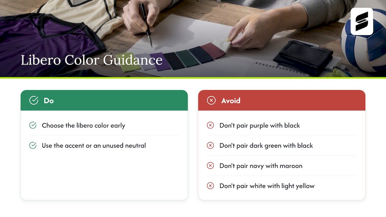
That has a direct design consequence. If your team plays in navy and maroon, a libero in maroon and navy will not pass. Plan a libero color from the start: usually your accent color, or a neutral that your main design does not use. Under NFHS rules, the libero’s bottoms may be any color, while other teammates must wear like-colored bottoms, which gives you a little extra room on the libero set.
Numbers and their placement
Numbers are not decoration. They are how officials and scorekeepers track players. NFHS has changed the standard: beginning in 2029, uniform numbers must simply be centered on the upper half of the uniform, replacing the more detailed measurement requirements. Until then, check your current NFHS or state association rulebook for the exact sizes and positions your league requires, and design the number zone first. Any graphic that crowds it is the first thing to move.
Player names
Names on the back are popular, and they are allowed in many settings. USA Volleyball’s casebook addresses the case where a team prints last names on the back: the name may appear provided it does not displace the number. In practice, put the name above the number in a smaller size, and keep the number the clear focal point.
Eight volleyball jersey layouts that work
These are the layouts we see teams return to, with notes on who they suit and where they go wrong.
1. Solid body with contrast sleeves
The main color covers the torso, and the sleeves or cap sleeves switch to your accent. It is clean, it prints crisply, and it makes the libero decision easy: flip the colors. Best for school programs that want a classic look and need it to survive several seasons of roster changes.
2. Side panels
A vertical band of contrasting color runs from underarm to hem. Side panels create a slimming line and leave the front and back clean for logos and numbers. Keep the panel color different from the number color so the digits never compete with it.
3. Gradient and fade
Sublimation handles smooth color transitions without the stiff feel of layered materials. A fade from a dark color at the shoulders to a lighter one at the hem gives you movement with no extra pieces. Keep the numbers in a solid, high-contrast color so the fade does not swallow them. Gradients also photograph well, which matters for club teams whose recruiting happens on social media.
4. Color block diagonal
One diagonal split across the chest or back, in two or three colors. It looks athletic, and it works on both short sleeve and long sleeve jerseys. The risk is a split that runs through the number zone. Slide the split above or below it, or keep the number inside a single color field.
5. Pattern accents
Tonal patterns such as subtle geometric shapes, a mascot silhouette or a wave line add texture without adding colors. Use them on a single area, such as the side panel, shoulder yoke or sleeve. A pattern over the entire jersey makes numbers hard to read from across a gym.
6. Two-tone pairings with a neutral
When in doubt, pick one bold color and one neutral. Red and black is a strong version of this, and our red and black volleyball uniform shows how a dark neutral frames a vivid main color. Pink and gray is the softer cousin: see our pink and gray volleyball jersey for how a light neutral calms a bright one.
7. Long sleeve designs
Long sleeves give you more canvas and are popular for cooler gyms and for players who prefer more coverage. They also let you carry color down the arm: a pink and black pairing like our long sleeve volleyball uniform uses the sleeves for the contrast, and a black and blue long sleeve set uses the same idea in cooler tones.
8. Matching home and away sets
A light home set and a dark away set, built from the same layout with colors inverted. Many leagues expect two sets so teams can avoid color clashes. Designing both together keeps the team identity consistent. Our pink volleyball uniform is an away-style set that shows how the same graphic language can carry over to a second color.
Choosing colors that read from the bleachers
Gym lighting is uneven, and parents and scouts watch from a distance. A few practical checks:
- Test in grayscale. Convert your mockup to black and white. If the number disappears, the contrast is too low.
- Keep the number color distinct from every color behind it. A white number across a color block that includes a light gray stripe will fail.
- Limit the palette to three colors. More than that and the design reads as noise, and matching your logo gets harder.
- Match your school or club logo. Pull your brand colors directly from the logo file so the uniform and the warmup gear agree.
- Think about the opponent. If your league uses a dominant color in your area, such as red, consider something that stands apart.
Bright colors, pastel pairings and neon accents are all possible with sublimation. The trend is toward bold accents on dark bases, but a trend is not a reason. Pick the palette your players will be proud to wear for the whole season.
Cuts and fits: the design decision people forget
The same artwork looks different on a fitted cut than on a relaxed one. Think about these choices when you design:
- Sleeve length. Short sleeve, cap sleeve, sleeveless and long sleeve each change where your color blocks land.
- Fit. Players move constantly, reaching and diving. A jersey that rides up exposes the lower number and breaks up your graphic.
- Bottoms. Spandex shorts, or your league’s required style, are part of the look. Match the stripe or accent color to the top.
- Youth vs. adult proportions. A graphic that is balanced on an adult medium can look top-heavy on a youth small. Ask to see the mockup scaled across sizes.
Sizing deserves its own check. Capra Sports provides one sizing sample at no extra charge so you can try fit before the whole team order is made, which is the cheapest way to avoid reordering a size run.
Our perspective: design for the rally, not the render
We see a pattern in the mockups that come back for revision. Teams fall in love with a design on screen, then discover on the court that the number is too thin, the libero version was an afterthought, or the accent color vanishes under gym lights. So we push teams to treat the jersey as a working tool first.
Our advice is simple. Pick the one thing you want people to remember about your team, and give it room. Then make everything else support it. A team with one strong gradient and a huge, clean number beats a team with six features fighting for attention.
We also encourage coaches to bring their libero into the conversation early. The libero jersey is the piece most often redone, because it was designed last. If you choose the libero color before the main design is final, you avoid a contrast problem later.
Finally, use the revision process. At Capra Sports you work directly with professional designers and can revise the design until it is right, and the mockup is free. Looking at it, ask three questions: can I read the number from the far baseline, does the libero look different, and would a player want to wear this on picture day? If all three are yes, order.
— Agha
Build your design in five steps
- Gather the rules. Ask your league, athletic director or state association for uniform requirements, especially number size and libero rules.
- Choose your palette. Two or three colors from your logo, plus one libero color that contrasts clearly.
- Pick a layout. Choose one of the eight above and decide on a single signature feature.
- Place numbers and names. Reserve the number zone, then add names or logos around it.
- Review the mockup. Check grayscale contrast, libero contrast and size scaling, then request revisions until the team agrees.
If you want to experiment before talking to a designer, our volleyball jersey maker lets you try colors and layouts yourself. For more inspiration organized by team type, see our volleyball jersey ideas for coaches and teams.
Ordering with Capra Sports
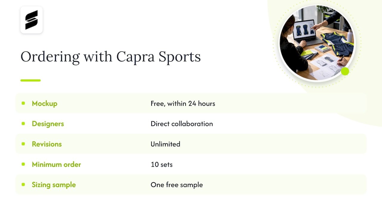
When you are ready, we build custom sublimated volleyball uniforms around your colors, logo and roster. You get a free design mockup within 24 hours, direct collaboration with our designers and unlimited revisions. Team orders start at a 10-set minimum, and one sizing sample comes at no extra charge. Pricing for volleyball is [PRICE TBD]. Browse our custom volleyball uniforms for teams to see current styles, or start from a ready-made look such as our short sleeve volleyball uniform.
FAQ
What makes a volleyball uniform design look professional?
Restraint. Stick to two or three colors, use one signature feature, and make the number large and high-contrast. Consistency across tops, bottoms and warmups matters as much as the artwork itself.
What colors can the libero wear?
The libero jersey must have a dominant color that clearly contrasts with teammates’ jerseys. USA Volleyball says pairs such as navy and maroon or purple and black are not distinctive enough. Choose the libero color while designing the main set, and confirm it with your league.
Can I put player names on volleyball jerseys?
Often yes. USA Volleyball’s casebook allows last names on the back as long as they do not displace the number. High school teams should check their state association, since NFHS rules apply there.
Where do numbers go on a high school jersey?
Follow the current NFHS rulebook and your state association until the change takes effect. Beginning in 2029, numbers must be centered on the upper half of the uniform.
How do I see my design before I order?
Use our volleyball jersey maker for a first draft, then request a free mockup from our designers. It arrives within 24 hours, and you can revise it as many times as you need.
Sources
- USA Volleyball: 2025-26 Uniform Feedback, QA and Resources
- USA Volleyball: 2025-27 Casebook of Approved Rulings
- NFHS: Judgment Call on Second Contact Eliminated in High School Volleyball