
Baseball Jersey Fonts: A Designer’s Guide That Survives Production
For baseball jerseys, pair a clean script for the team wordmark with a heavy, simple block font for numbers, then let your production method make the final call. Sublimation forgives fine detail. Embroidery does not.
Three font families dominate real baseball uniforms: script with tails for team names, varsity or block styles for numbers and player names, and Tuscan or western decorative faces for throwback and heritage looks. The deciding rule is simple: pick fonts that reproduce well in your production method, not just ones that look good on a screen.
- Names lean toward script or a clean varsity face for personality.
- Numbers need block or varsity styles for distance legibility.
- Before you commit to a font, confirm your production method (sublimation, embroidery, or heat-press) with your kit supplier and request a mockup.
TL;DR:
- Choosing a font that survives actual production involves prioritizing legibility at game distance and ensuring strokes are thick enough for embroidery or heat-pressing.
- Use a script font for team names and a heavy block or varsity style for numbers to prevent visual clutter and improve readability.
- Always verify licensing rights and request a physical mockup of the jersey to confirm the font’s appearance and durability before mass production.
- Fonts with consistent stroke width adapt better to curved or angled panels, especially on sleeves and back numbers, reducing distortion.
- Capra Sports offers free mockups within 24 hours, enabling teams to see their chosen fonts on actual jerseys before confirming orders.
Table of Contents
- What Are the Best Baseball Jersey Fonts to Use?
- How Do You Choose a Font That Actually Survives Production?
- How Do You Pair Scripts and Numbers on One Jersey?
- How Do You License Fonts for Team Uniforms?
- What Font Rules Does Capra Sports Apply to Every Jersey?
- How Do Fonts Adapt to Curved or Angled Jersey Panels?
- Why Most Font Guides Get This Backward
- Get Your Font Chosen and Mocked Up in 24 Hours
- Key Takeaways
- FAQ
What Are the Best Baseball Jersey Fonts to Use?
Every baseball-style font falls into one of four buckets, and knowing which bucket you’re shopping in saves hours of back-and-forth with your printer.
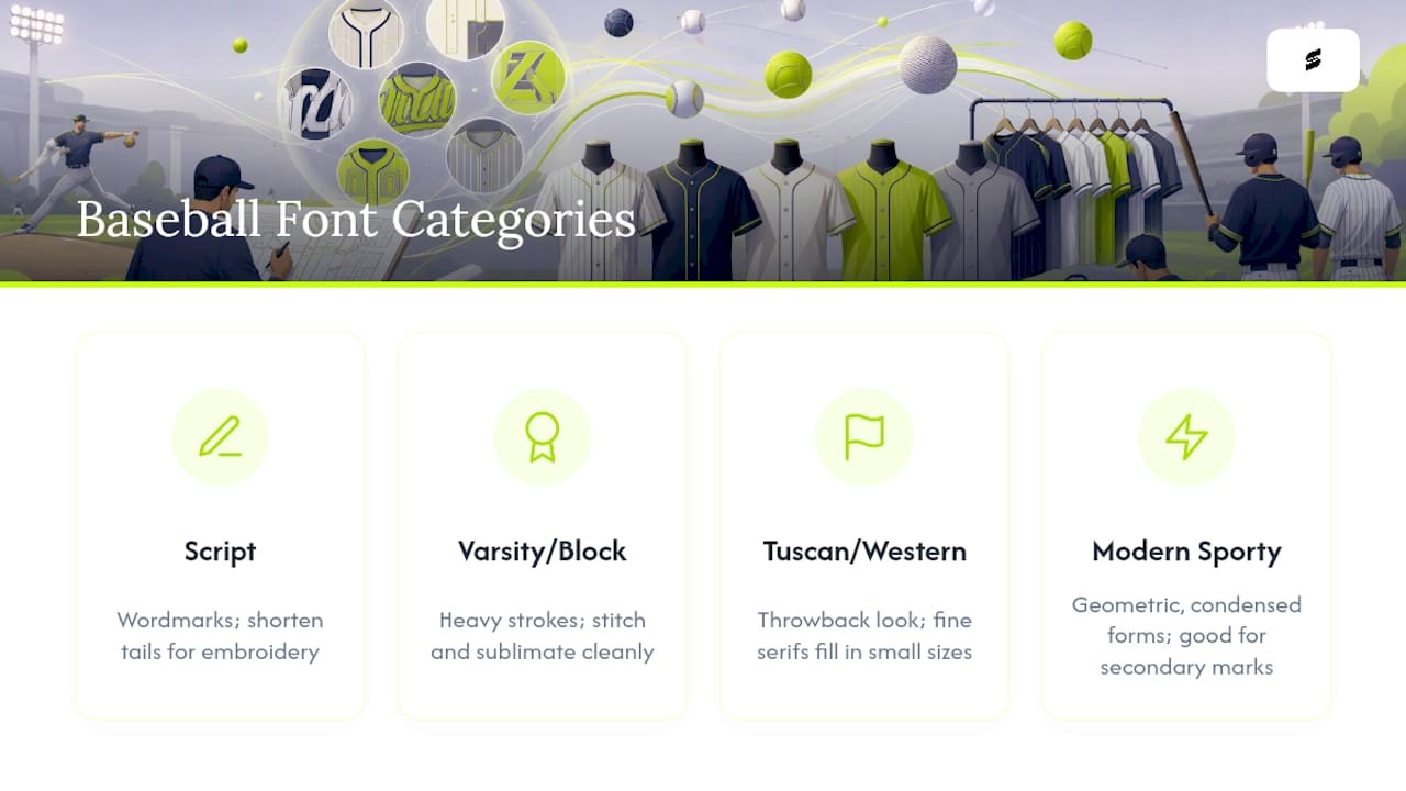
Script with tails is the classic team-name look: connected strokes, sweeping tails, the kind of lettering you see across the chest on throwback uniforms. It works best as a wordmark, not as small text. If you’re embroidering rather than sublimating, plan to shorten those tails. Long, thin swashes that look elegant in a digital mockup often snap or bunch under a needle. Paid baseball script families frequently include swash alternates specifically so designers can dial back the drama without losing the letterform’s identity.
Varsity and block styles are the workhorses. Heavy strokes, simple counters (the enclosed spaces inside letters like “o” or “a”), minimal ornamentation. These stitch cleanly, sublimate cleanly, and read from the bleachers. Most back numbers and a large share of player-name treatments use this family for good reason.
Tuscan and western decorative fonts carry the heritage, old-frontier feel you associate with 1900s barnstorming teams. They’re striking on throwback jerseys but risky for anything smaller than a chest wordmark. Fine serifs and split strokes tend to fill in or vanish once thread or ink hits fabric at a small scale.
Modern sporty displays — geometric, condensed, slightly aggressive letterforms — fit teams that want a contemporary identity rather than a retro one. These work well for secondary marks, sleeve text, or number treatments on soccer-crossover or travel-ball uniforms.
Pro Tip: Before falling for a font because it looks great in a 300-point preview image, shrink it to the actual size it will print on your jersey. A lot of decorative detail disappears below two inches.
How Do You Choose a Font That Actually Survives Production?
Picking a font that looks right on a monitor is the easy part. Picking one that survives a sewing machine or a heat press is where most first-time designers get burned.
- Check legibility at game distance. Names and numbers need enough stroke weight and cap height to read from across a field, not just across a desk.
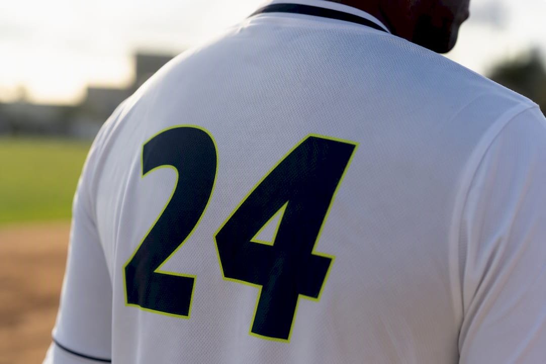
- Scale numbers correctly. Back numbers are typically the largest element on the jersey; chest numbers run smaller and need proportionally thicker strokes to stay legible at that reduced size.
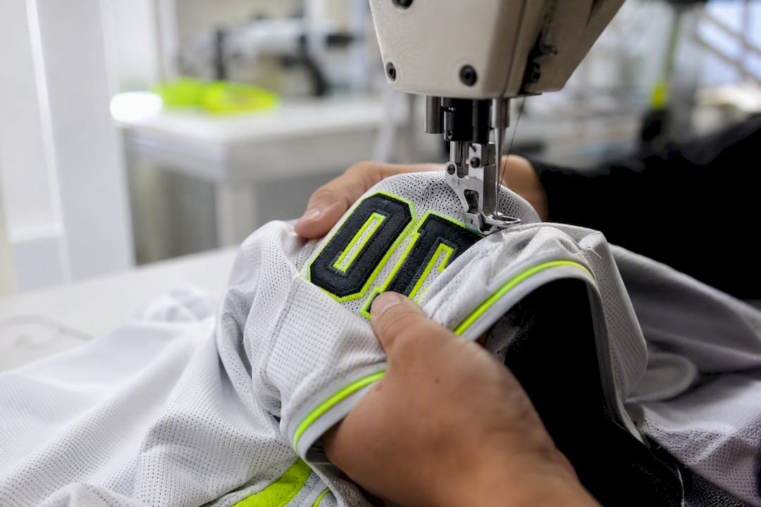
- Avoid hairlines for embroidery. Any stroke thinner than roughly a needle’s width will either drop out or blob during stitching. Test alternate glyphs or simplified counters before finalizing.
- Match the font to the process. Sublimation reproduces gradients, thin lines, and fine serifs faithfully because it’s dye infused into the fabric itself. Embroidery and heat-press vinyl both struggle with the same fine detail, since thread and pressed material have physical limits that ink doesn’t.
- Request a physical sample before bulk production. A stitched mock or a sublimated proof will show you exactly what a PDF mockup cannot: how the actual letterform holds up on actual fabric.
The gap between “looks good in Illustrator” and “looks good on a jersey” is almost always a production-method mismatch, not a bad font choice.
How Do You Pair Scripts and Numbers on One Jersey?
The rule that keeps jerseys from looking cluttered: one decorative face, one functional face, never two of either.
Let the script carry personality on the chest or sleeve, and let a heavy block or varsity numeral carry legibility on the back. Trying to make both elements ornate usually competes for attention and reads as busy from ten feet away.
- Keep outline width proportional to the number’s stroke weight. A number with heavy strokes needs a heavier outline; a thin outline on a bold number looks like an afterthought.
- Use a double outline only when you need contrast against a busy or textured jersey pattern. On solid colors, a single clean outline almost always reads better.
- For embroidery, shorten or remove long swashes and tails on script fonts, or swap in a shorter alternate glyph if the font family includes one.
- Center chest wordmarks slightly higher than instinct suggests. Fabric drapes downward on a moving body, and text placed at true visual center often ends up looking low once a player is actually wearing it.
- Test your color pairing on both the light and dark version of the jersey before locking it in. A number that pops on white can disappear against navy without a strong enough outline.
Numbers deserve their own check. Our guide to production-ready jersey number fonts covers what to test before you approve a numeral, and the jersey number size guide gives the heights by sport.
How Do You License Fonts for Team Uniforms?
Personal-use fonts and commercial fonts are not the same product, even when they’re free to download. A personal license lets you use a font for your own non-commercial projects. Selling or producing team merchandise, even for a rec league, generally requires a commercial license, because you’re using the typeface to generate revenue or represent an organization.
- Desktop/print licenses cover static designs like mockups and print-ready art.
- Embedding or OTF production licenses cover sending the actual font file to a manufacturer for direct production use, which is a separate right from simply printing with it yourself.
- Buy from established foundries or marketplaces, and keep a copy of your license or receipt on file in case a manufacturer asks for proof.
- Large galleries list hundreds of baseball-style fonts, but a large share are personal-use only. Confirm licensing before a single file goes to a printer.
- A premium retro sports font with a clear commercial license is usually worth the cost over a free alternative with vague or restrictive terms, especially for a team logo you’ll reuse for years.
Verify your license terms before you send anything to a manufacturer. That single step prevents the most common (and most avoidable) legal headache in custom apparel.
What Font Rules Does Capra Sports Apply to Every Jersey?
The Capra Sports design team has built a short list of font rules that hold up across hundreds of custom baseball orders, not just in theory.
Three rules come up on nearly every project. First, favor numerals with heavier counters. Thin, elegant numbers look sharp in a rendering and disappear at game distance. Second, shorten decorative swashes before they go to stitch. A tail that reads as “vintage” in a mockup often reads as “broken thread” after embroidery. Third, verify the font’s commercial license and request a sample mockup before any bulk order moves forward.
A font that only works as a flat image isn’t finished. It’s not approved until we’ve seen it stitched or sublimated on actual fabric, because that’s the only test that matters.
Capra Sports backs this with a free mockup delivered within 24 hours, a 10-set team minimum, and direct designer collaboration through unlimited revisions, so a font choice gets tested against reality before it’s locked into a full team order.
How Do Fonts Adapt to Curved or Angled Jersey Panels?
Jersey lettering rarely sits on a flat plane. Chest wordmarks curve across a placket, sleeve numbers angle around a raglan seam, and back numbers stretch over a panel that shifts with every pitch and swing. A font that looks balanced in a straight line can look warped or uneven once it follows a curve.
Fonts with consistent stroke width across all letters adapt to curves more predictably than fonts with dramatic thick-thin contrast. A script with heavy variation between its thick downstrokes and thin connectors can look lopsided once bent around an arc, because the curve exaggerates whichever side of the letter carries more visual weight.
For panels with a pronounced angle or slope, work with vector outlines rather than a static font file, since a graphic designer can adjust individual letter spacing and baseline curvature by hand. Automated text-on-a-path tools in design software get you close, but they often distort letterforms unevenly, stretching some characters more than others. A manual pass to even out that distortion is usually the difference between a wordmark that looks intentional and one that looks stretched.
Numbers on curved back panels benefit from slightly increased letter spacing compared to a flat layout, since tight kerning that looks fine on paper can appear to collide once the fabric curves around a shoulder blade or side panel.
Why Most Font Guides Get This Backward
Most articles about baseball jersey fonts are glorified font lists. Hundreds of names, screenshots, maybe a download link. What they skip is the part that actually determines whether the jersey looks good six weeks later: production reality.
A gorgeous script means nothing if it turns to mush under a sewing needle. A “free commercial use” tag means nothing if nobody checks it before the order ships. The conventional advice treats font selection as a design decision made once, in isolation, on a screen. It isn’t. It’s a decision made in conversation with a printer or embroiderer, revised at least once, and confirmed with a physical sample before it touches a real uniform.
If there’s one thing worth prioritizing over everything else in this guide, it’s this: get a mockup before you fall in love with a font. Screens lie about scale, about stroke weight, about how thread behaves. Fabric doesn’t.
— Agha
Get Your Font Chosen and Mocked Up in 24 Hours
You don’t have to guess whether your script survives embroidery or whether your numbers will hold up at game distance. Capra Sports builds every custom jersey around a free 24-hour design mockup and a free sizing sample, so you see the exact font, exact stitch, and exact color combination before you commit to a full team order. With a 10-set team minimum and direct access to a professional designer for unlimited revisions, you get the production check most font guides tell you to do yourself, done for you instead.
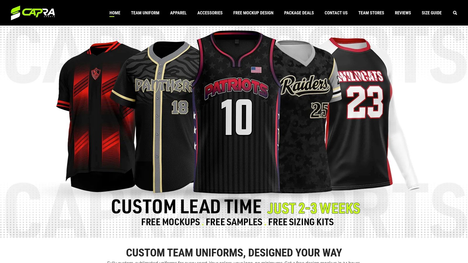
Whether you’re outfitting a Little League squad or a travel ball program, start with Capra Sports’ custom baseball jersey page and request your free mockup today. You’ll see your team name and numbers rendered in your chosen font, on your actual jersey style, before a single stitch goes into production.
Key Takeaways
The right baseball jersey font is the one that survives your actual production method, not just the one that looks best in a digital mockup.
| Point | Details |
|---|---|
| Match font to production | Sublimation preserves fine detail; embroidery needs heavier strokes and shortened tails. |
| Separate script from block | Use one decorative face for names and one simple, heavy face for numbers. |
| Check licensing first | Confirm commercial rights before sending any font file to a manufacturer or printer. |
| Test on a curve | Fonts with even stroke width hold up better on curved chest panels and sleeve numbers. |
| Request a sample | Capra Sports provides free mockups within 24 hours so you can verify fonts before bulk production. |
Next step: see what a full baseball team kit costs per player, or request a free 24-hour mockup of your design.
FAQ
What fonts are best for jerseys?
A clean script or varsity face works best for team names, while a heavy block or varsity numeral style works best for numbers, since it holds up better at distance and under stitching.
What are some good baseball fonts?
Baseball-style script fonts with swash alternates, varsity block fonts, and Tuscan or western decorative fonts for throwback designs all serve different roles on a uniform, from wordmarks to numerals.
What font is used for baseball?
There’s no single font used across all baseball jerseys. Teams typically use custom or hand-refined type treatments, often combining a script wordmark with a distinct block numeral rather than one uniform typeface.
What font do Topps use?
Topps trading cards typically use custom or licensed display typography for team names and player names rather than a single publicly named font, and the exact treatment varies by card set and year.
Do I need a commercial license for a jersey font?
Yes. Producing team uniforms for sale or organized play generally requires a commercial or embedding license, since a personal-use license doesn’t cover apparel production or revenue-generating use.