
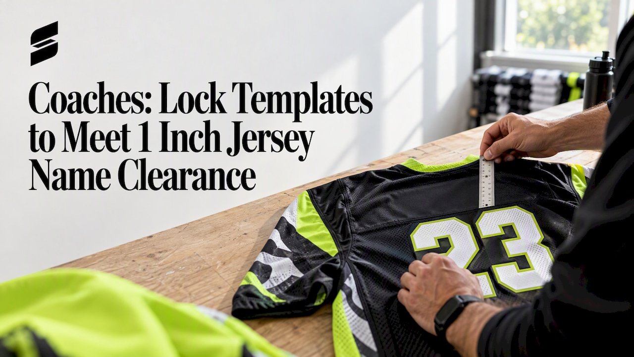
Coaches: Lock Templates to Meet 1 Inch Jersey Name Clearance
Keep at least 1 inch of clearance between name and number blocks, and always confirm your league’s exact rules before you print, since competition requirements can override these defaults.
TL;DR:
- League rules vary, requiring verification of exact letter height and spacing, especially for international competitions like UEFA and FIFA.
- When ordering large rosters, locking a template with fixed font, size, and placement ensures consistency and minimizes mismatches across jerseys.
- Fabric type influences placement, legibility, and durability, with heavier fabrics better holding stitched or heat-pressed elements over a season.
- Proper placement of names above the number, with at least one inch of clearance, is key to maintain readability and team appearance.
- Using a templates-first approach and ordering a sizing sample helps catch fit and clarity issues before mass production.
Table of Contents
- Quick reference for name and number sizing by sport
- How sizing norms differ across sports and why
- A repeatable process for measuring and placing names
- Materials and application methods that affect sizing
- League rules and a pre-production compliance checklist
- How Capra Sports keeps name and number production consistent
- Considerations for different jersey fabrics and durability
- How player movement affects where a name should sit
- Placing names with accented letters and non-Latin scripts
- Why legible, consistent placement matters more than it seems
- Get compliant, consistent names and numbers from a custom uniform provider
- FAQ
- Sources
Quick reference for name and number sizing by sport
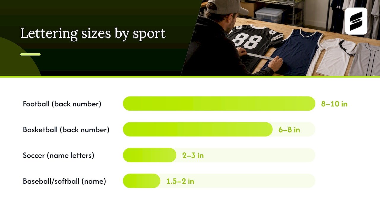
Before you lock a production template, scan the ranges below. These are starting points: always check your specific league’s rulebook for exact figures, since competitive leagues often set tighter tolerances than recreational play.
A youth basketball jersey, for example, often runs 5 to 6 inch back numbers rather than the adult 8 inch standard. Our team uniform sizing guide breaks down how these ratios shift across youth, junior, and adult cuts.
How sizing norms differ across sports and why
Each sport’s sizing convention reflects a different priority: official visibility, broadcast readability, or simple tradition. Understanding the reasoning behind the numbers helps you decide when to size toward the top or bottom of a range.
Football numbers run large because officials need to identify players at a distance during fast-developing plays, and because many leagues mandate numbers on both chest and back. Front numbers in the 4 to 6 inch range, paired with 8 to 10 inch back numbers, keep players identifiable from the sideline and the stands alike. Our football uniform page covers how these functional requirements shape layout decisions for school and club programs.
Basketball numbers follow a similar logic but in a tighter space. Back numbers commonly measure 6 to 8 inches, with 4 to 6 inch front numbers positioned higher on the chest. The NCAA publishes equipment and uniform guidance that affects collegiate number placement, so college programs should check sport-specific manuals rather than relying on general recreational conventions.
Soccer carries some of the most explicit international rules of any sport. Name letters typically run 2 to 3 inches, matching the 5 to 7.5 centimeter range set by international competition regulations, and names must sit above the number on the back of the shirt rather than below or beside it.
Baseball and softball place less emphasis on names entirely. Many recreational and some competitive leagues skip back names altogether, relying on numbers alone for identification, while others use smaller 1.5 to 2 inch lettering to fit above a sleeve or back-panel number without crowding. Our custom baseball jerseys page outlines sleeve number options that some programs use alongside or instead of back names.
Hockey and volleyball both lean on larger numbers for fast-paced visual tracking, but volleyball often regulates front-chest number placement more tightly, since jerseys sit closer to the body and numbers must stay visible during serves and blocks. Our volleyball uniform page details front-chest positioning standards relevant to that sport.
A short list of adjustment principles applies across every sport:
- Size toward the larger end of a range when your league plays outdoors or under stadium lighting with distant spectators.
- Size toward the smaller end when jersey panels are narrow, such as fitted basketball or volleyball cuts.
- Scale youth jerseys proportionally, generally 70 to 80% of adult dimensions, rather than using a flat inch reduction.
- Default to your governing body’s stated minimum whenever recreational convention and competition rule disagree.
A repeatable process for measuring and placing names
Consistency across a roster depends on a repeatable process, not eyeballing each jersey individually. Set up your workspace with a flat lay table or mannequin form, a fabric measuring tape, tailor’s chalk or a washable marking pen, and your chosen template file if you’re working with a digital mockup tool.
Follow these steps for every jersey style before you run a full roster:
- Lay the jersey flat, back facing up, and locate the collar seam as your baseline reference point.
- Measure down from the collar seam to mark the top of the name box, typically 1 to 2 inches below the seam before the lettering begins.
- Set the name block width target, generally 8 to 12 inches for adult jerseys, and choose a letter height that fits your sport’s standard without crowding the panel.
- Center the name block horizontally, then measure down from the bottom of the name to mark the top of the number block, keeping at least 1 inch of clearance between the two.
- Verify clearance from both side seams and any stitched panels, armholes, or zippers that could interfere with the printed or stitched area.
A simple ratio keeps sizing consistent across a mixed roster: tie your name block width to chest width rather than to a fixed inch count, so a size large jersey and a youth medium both look proportionally balanced instead of oversized or cramped.
Long surnames are the most common production headache. Rather than shrinking the font for a nine-letter name and keeping it full size for a four-letter one, condense letter spacing slightly to hit a consistent width target across the roster. Tight collars on raglan-sleeve or crew-neck styles can also squeeze your top margin, so check that style’s collar depth before finalizing placement. Stitched panels, common on hybrid mesh-and-twill jerseys, sometimes shift your vertical centerline since the panel seam itself eats into available space.
Pro Tip: Lock your font, letter height, and placement template before you collect a single roster name. Changing size or position mid-batch to accommodate one long name creates visible inconsistency across the team.
Our coach’s guide to custom uniform design walks through this template-first workflow in more detail, including how to structure a roster spreadsheet that feeds directly into a locked layout.
Materials and application methods that affect sizing
The production method you choose changes how tight your clearances can run and how legible a given letter size will look once applied. Sublimation prints dye directly into the fabric fibers, producing crisp, flat edges that tolerate slightly tighter spacing between name and number blocks without blurring. Tackle twill, by contrast, uses stitched fabric letters with a visible border, which reads as more traditional but requires wider clearance since the stitching itself takes up physical space.
Heat transfer vinyl sits on top of the fabric rather than fusing into it, which can crack or peel at stress points if placed too close to seams or stretch zones. Screen printing works well on flat, stable panels but struggles on heavily textured or mesh fabric, where ink can sit unevenly across the weave.
A few clearance guidelines apply across methods:
- Keep heat-pressed elements at least 3/4 inch from any seam, zipper, or stitched panel to prevent peeling or cracking.
- Plan roughly 1 inch of vertical clearance below a name block when using tackle twill, since the stitched border adds visual and physical bulk.
- Size characters larger on mesh or heavily textured fabric, since the weave can break up fine letter edges and reduce legibility at standard sizes.
- Expect some edge softening over repeated washing regardless of method, so avoid placing fine detail or small type right at the minimum legible size.
Durability matters as much as initial sizing. Repeated washing and abrasion against pads, bags, or other jerseys gradually wear down visible edges, especially on heat transfer vinyl and screen print. Sublimated graphics tend to hold their crispness longest since the color lives inside the fabric rather than on its surface, which is one reason sublimated construction has become a common standard for team uniforms that see frequent use across a season.
League rules and a pre-production compliance checklist
Governing bodies set specific, sometimes rigid, requirements for name and number placement, and missing one of these details after production is far costlier than catching it before. UEFA’s equipment regulations require player names to sit above the number on the back of the shirt, with letter height between 5 and 7.5 centimeters and at least 4 centimeters of separation between name and number. Letters must stay clearly legible, and competitions often permit an outline for added contrast.
FIFA’s equipment regulations echo this structure, specifying legibility and color-contrast standards for names on the back of shirts and requiring that any name used in a final competition match the official list of players. A nickname may be permitted in place of a surname, but only where the competition’s own rules allow it.
College and school programs face a different set of considerations. The NCAA publishes uniform and equipment guidelines that affect number placement and sizing for collegiate competition, and these vary by sport, so checking the sport-specific manual before finalizing a design avoids a late compliance surprise. High school programs should look to their own state association’s adoption of NFHS equipment rules for the equivalent standard.
Before any bulk production run, work through a short verification checklist:
- Confirm every roster name matches the official team list character for character, including any approved nickname.
- Confirm your chosen font and letter height fall within your governing body’s stated minimums and maximums.
- Order and approve one sizing sample before committing to full production, checking both fit and print clarity.
- Run a color contrast check between letter color and jersey background under typical game lighting.
- Confirm which special characters, accents, or scripts your league permits, and verify your chosen font renders them correctly.
Exact figures vary by competition and sport, so treat the ranges above as a starting point and confirm against your specific league’s current rulebook before locking a final design.
How Capra Sports keeps name and number production consistent
A template-first workflow prevents most of the inconsistency that shows up on a finished roster. Locking font, letter height, and placement before collecting a single roster name means production staff are filling in a fixed layout rather than making individual sizing judgment calls on each jersey, which is where visible mismatches creep in.
Long surnames get handled through consistent width targets rather than per-jersey font changes. Holding every name block to the same 8 to 12 inch width, adjusted through letter spacing rather than font size, keeps a five-letter name and a twelve-letter name looking proportionally similar across a full team photo.
A few habits make the difference between a clean roster and a mismatched one:
- Lock your template’s font, size, and placement before entering roster data, so every name follows the same rule set.
- Hold name blocks to a consistent width target and adjust spacing rather than shrinking font size for longer names.
- Order one sizing sample and test both fit and print clarity before committing to a full production run.
- Check contrast and legibility under the lighting conditions your team actually plays under, not just under studio light.
- Reconfirm roster spelling and approved nicknames against the official team list immediately before production begins.
These habits apply regardless of which shop produces your uniforms, but they matter most when you’re ordering for an entire roster at once, where one overlooked detail multiplies across every jersey in the batch.
Considerations for different jersey fabrics and durability
Fabric choice shapes both where a name can sit and how long it stays legible. Lightweight polyester mesh, common in basketball and soccer jerseys, breathes well but has a looser weave that can distort fine letter edges, especially at smaller sizes. Tighter-knit interlock fabric, often used for football and baseball, holds crisp lines better and tolerates smaller lettering without losing definition.
Stretch fabrics used in compression-style jerseys present a particular challenge: the fabric’s give means a name block that looks correctly sized when flat can distort slightly once the garment is worn and stretched across the back. Choosing a slightly larger letter height compensates for this visual shrinkage under tension.
Durability also varies by fabric weight. Heavier fabrics hold stitched or heat-pressed elements more securely over a season of washing and physical contact, while lightweight mesh is more prone to minor puckering around the edges of an applied name or number. Pre-washing a sample garment before finalizing placement can reveal how a given fabric and application pairing holds up, rather than discovering an issue after a full team order has already shipped. Matching your application method to your chosen fabric, rather than treating placement and fabric as separate decisions, is one of the simpler ways to avoid a reprint later in the season.
How player movement affects where a name should sit
A jersey rarely sits still the way it does on a flat lay table. Reaching, pivoting, and sliding all pull fabric in directions that can shift a name block relative to the body, especially on raglan-sleeve or athletic-cut jerseys where the back panel stretches more than a boxier, traditional cut.
Placing a name too close to a shoulder seam or armhole means normal arm movement can distort or partially obscure it during play. Keeping the name block centered on the most stable part of the back panel, generally the area between the shoulder blades and the natural waistline, avoids most of this distortion.
Stretch zones built into modern athletic jerseys, often along the sides or underarms, should stay clear of any printed or stitched element entirely, since repeated stretching in these zones is where heat transfer vinyl and screen print are most likely to crack over time. Sports with heavy lateral movement, like basketball and volleyball, benefit from centering names and numbers slightly higher on the back panel, away from the waistband area that sees the most stretching during jumps and lateral steps. Testing placement on a worn, moving body rather than a flat garment alone catches these issues before they show up mid-season.
Placing names with accented letters and non-Latin scripts
Rosters increasingly include names with accented characters, non-Latin scripts, or letter combinations that do not fit standard Western lettering conventions, and production templates need to account for this rather than defaulting to a basic alphabet only.
Confirm early whether your chosen font supports the specific accented characters or diacritical marks a player’s name requires, since not every display font includes a full extended character set. A name missing an accent mark is a common and entirely avoidable production error.
For non-Latin scripts, check with your league whether an approved transliteration or an alternate spelling is required for competition play, since some governing bodies mandate a specific registered spelling that may differ from a player’s preferred script. Letter width can also vary significantly between scripts, so a name block width that works well for Latin characters may need adjustment to keep spacing visually consistent when a roster includes multiple scripts. Testing your chosen font against the actual range of names on your roster, rather than a generic placeholder name, is the simplest way to catch a missing character or spacing issue before bulk production begins.
Why legible, consistent placement matters more than it seems
Readable name and number placement is one of those details that looks minor until it fails. A name set too small, placed too close to a seam, or inconsistent in width across a roster photo undermines a team’s appearance in a way that has nothing to do with the uniform’s design or color. Getting the fundamentals right, collar distance, letter height, number size, and seam clearance, costs almost nothing extra and prevents a reprint that costs real time and money.
The habit worth building is simple: treat placement as a template decision made once, not a per-jersey judgment call made dozens of times. Before you place a bulk order, confirm your league’s exact rules and request a sizing sample to catch any fit or legibility issue early.
— Agha
Get compliant, consistent names and numbers from a custom uniform provider
Correct name and number placement matters less when you have one jersey to get right and a lot more when you’re coordinating a full roster. A professional workflow locks a font, letter height, and placement template before production starts, so every jersey on your roster comes out consistent regardless of name length or number of digits.
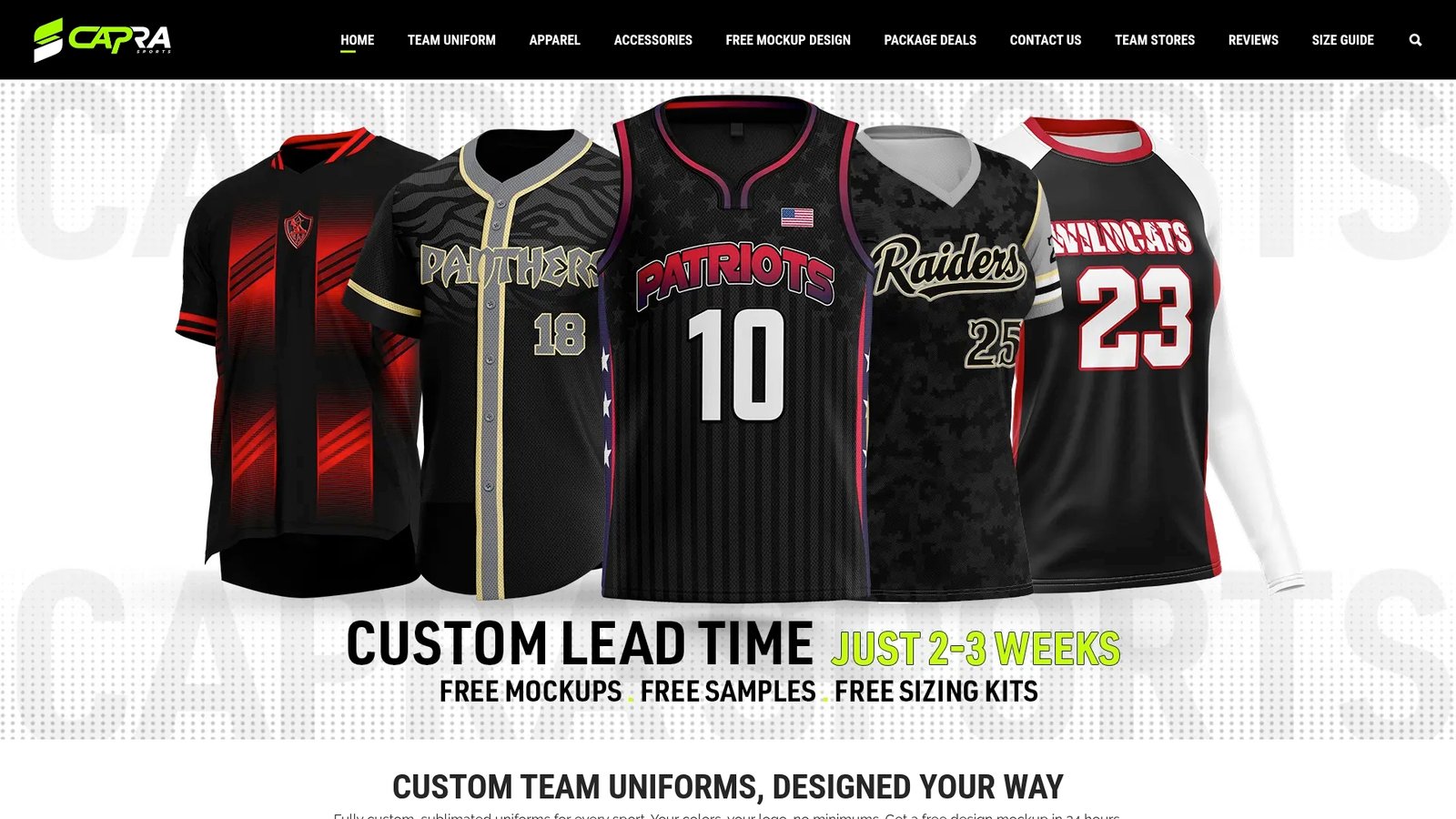
The design team collaborates on the layout itself, and every order includes a sizing sample so you can check fit, contrast, and legibility before committing to your full team quantity; for more on practical design considerations for creating consistent name and number layouts, see Design custom jackets for teams like a pro – Maker of Jacket. A few ways to support that process:
- Placement and sizing are confirmed against your sport’s typical standards before finalizing your production template.
- Unlimited design revisions are built in so your layout is right before a single jersey goes to production.
- A sizing sample is provided to test fit and print clarity ahead of your full order.
If you’re ready to move forward, visit our pricing and ordering page to see current options for custom basketball uniforms, custom soccer uniforms, custom football uniforms, and more, request your mockup, and confirm your roster details to get your team’s names and numbers right the first time.
FAQ
Where do teams put names on a jersey?
Names almost always go on the back, centered above the number, typically 4 to 6 inches below the collar seam on adult jerseys. Some sports, particularly baseball and softball, skip back names entirely and rely on numbers alone for identification.
How far down should a name sit on a jersey?
For adult jerseys, 4 to 6 inches below the collar seam is a common starting point, with youth sizes scaled proportionally smaller. International soccer competitions following UEFA’s equipment rules set more specific letter height and spacing requirements, so always confirm against your governing body before finalizing placement.
Do players use their first name or last name on a jersey?
The vast majority of team sports use the surname on the back of the jersey, since it’s the standard most governing bodies and roster systems are built around. FIFA’s equipment regulations note that an approved nickname can sometimes be used instead, but only where the competition’s own rules permit it.
Where should the name and number go on a jersey together?
The name sits above the number on the back, with at least 1 inch (or 4 centimeters, under rules like UEFA’s) of clearance between the two blocks. Front numbers, when required by the sport, typically sit centered on the chest, sized smaller than the back number to fit the available panel space.
Do all sports require the same letter and number sizes?
No. Sizing standards vary by sport and often by governing body. Football and hockey typically use larger back numbers, around 8 to 10 inches, while basketball, soccer, and volleyball generally run 6 to 8 inches, and you should always check your specific league’s rulebook for exact permitted ranges.
Sources
- UEFA regulations: Player shirt names – Equipment (Article 11)
- FIFA equipment regulations
- NCAA official website