
Uniform Color Matching: 3 Checks Coaches Need Before Ordering
Before you approve any bulk order, require a physical color reference, a lab dip tested under D65 lighting, and an agreed ΔE tolerance in writing. These three checkpoints catch most visible color mismatches before they reach your roster. The sections below turn this into a workflow you can hand to any supplier when you order team uniforms.
TL;DR:
- Initial lab dips may take days to a week, while full approval with revisions commonly takes 15 to 30 days, so plan sampling early.
- Approve a bulk swatch from the actual production lot, not just a lab dip, and require all jersey panels to come from one print run.
- Mesh and compression panels can look different from tight knit fabric despite using the same dye recipe, so approve each substrate separately.
- Prioritize readable numbers and logos over subtle shade differences, placing them on tightly woven panels rather than mesh or sheer inserts.
- For midseason additions, compare replacements with washed uniforms rather than original swatches, since expected fading can make new pieces look too bright.
Table of Contents
- Why Consistent Color Matters for Teams and Uniforms
- Color Basics Every Coach Should Use: References, Contrast, and Combinations
- Team-Ready Color Approval Checklist and Workflow
- Practical Design Tips to Make Color Matching Easier on Game Day
- How Capra Sports Supports Teams During Color Approval and Sampling
- Impact of Sublimation Printing Process on Color Accuracy
- Communicating Color Preferences with Designers to Ensure Match
- Color Matching Challenges Specific to Sports Uniform Fabrics and Designs
- Effect of Wash and Wear on Color Consistency
- Using Digital Color Matching Tools Specific to Uniform Customization
- Author Perspective: What to Prioritize When You Only Have One Approval Round
- How Capra Sports Can Help Teams Get Color Right
- FAQ
- Sources
Why Consistent Color Matters for Teams and Uniforms
A uniform is often the first thing fans, opponents, and officials notice. When jerseys, shorts, and warmups do not match, the mismatch reads as sloppy even when the fit and fabric are fine. Teams that lock down color early protect brand identity across seasons, which matters when parents reorder individual pieces mid-year or when a program adds new players.
The most common failure modes are predictable:
- Metamerism, where two colors match under one light but clash under another, such as gym fluorescents versus daylight.
- Substrate mismatch, where the same dye recipe looks different on mesh panels versus tight-knit body fabric.
- Shade-lot drift, where a reorder six months later comes from a different dye batch and reads slightly off.
Each of these costs real time: a reorder cycle, a frustrated booster club, or a team photo where half the jerseys look faded next to the rest.
Color Basics Every Coach Should Use: References, Contrast, and Combinations
Keep your palette simple before you worry about approval paperwork. A clean system is easier to match consistently across a full roster and across reorders.
- Choose one hero color, one or two supporting colors, and a neutral (white, black, or gray) for trim and backgrounds.
- Limit the number of small spot colors. Every extra tiny accent is another color a supplier has to hit exactly, and small areas are harder to measure accurately.
- Build contrast around your numbers and logos first, since readability at distance matters more than subtle shading choices.
- Test number contrast against the jersey background the way officials and scorekeepers will see it from the sideline or stands.
- Reserve your boldest, highest-contrast pairing for the chest number and back number, since those get read fastest during play.
Three combinations consistently read well on jerseys and shorts: navy with gold and white trim, black with a single bright accent such as red or orange, and forest green with white and a gray trim line. Each gives you a dominant color, a clear accent, and a neutral that is forgiving if a dye lot runs slightly warm or cool. For more combinations built around readability, see our guide on choosing team colors that look sharp on game day.
Team-Ready Color Approval Checklist and Workflow
Copy this into your order brief or vendor email before you commit to bulk production.
- Send a physical reference: a Pantone chip, a previously approved fabric swatch, or a prior uniform cutting, never a photo alone.
- Provide Lab* values if you have them, along with the fabric substrate, weight (GSM), and finish you expect.
- State which light sources the supplier should test under, typically D65 plus the gym or field lighting your team plays under.
- Set your ΔE tolerance in writing before sampling starts, using the hero and supporting color bands above.
- Request a lab dip first, then insist on a bulk swatch approval from the actual production lot before any cutting begins.
- Document who signs off on the approved bulk swatch and keep one retained sample per color for future reorders.
Sampling lead times vary, but initial lab dips often take a few days to a week from suppliers with in-house dye capability, while the full approval cycle, including revisions, commonly runs 15 to 30 days, per the lab dip approval guide. Build that window into your season schedule rather than ordering at the last minute.
Pro Tip: Keep one signed-off fabric swatch per color in a labeled envelope. It becomes your reference standard for every reorder, so you are matching against fabric, not memory.
Practical Design Tips to Make Color Matching Easier on Game Day
Some design choices reduce color risk before approval even starts.
- Use a neutral like white, black, or gray for large background panels when an exact custom shade is hard to hold consistently across a full roster.
- Place numbers and sponsor logos on panels with strong contrast and a stable, tightly woven substrate rather than on mesh or sheer inserts, which hold dye less evenly.
- Avoid splitting your signature color across two different fabrics, such as a jersey body and a separate sleeve panel, without approving each substrate separately, since the same dye recipe can read differently on each.
These choices do not replace a formal approval process, but they shrink the number of things that can go visibly wrong on a finished uniform. For visual reference on panel and placement choices that hold color well, our basketball uniform design gallery shows several working examples.
How Capra Sports Supports Teams During Color Approval and Sampling
We build sublimated uniforms for a variety of sports, and color consistency is part of every order we take on. Our team works directly with professional designers through unlimited revisions, so a color concern gets addressed before production rather than after.
We offer samples and mockups so you can check a color against the actual substrate your uniform will be cut from, not a screen rendering. That step matters most for a hero color or a sponsor panel where a slight shift would be obvious under gym lighting. Confirming color on real fabric before you approve bulk production is the single most useful habit a team can build into its ordering process.
Impact of Sublimation Printing Process on Color Accuracy
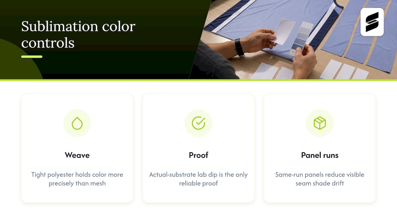
Sublimation works by turning dye into a gas that bonds directly into polyester fibers, rather than sitting on top of the fabric like a screen print. This produces color that does not crack, peel, or fade from surface wear, but it also means the dye recipe and the fabric’s weave interact closely. A tightly woven polyester holds a hero color more precisely than a looser mesh, since the same ink density spreads differently across fiber structure.
Because the color becomes part of the fiber, lighting during printing and the base whiteness of the fabric both affect the final shade. A print run checked only on screen proofs can shift once it hits fabric, which is why a physical lab dip on the actual sublimation substrate remains the only reliable proof, per the fabric color matching guide.
Panel seams are another area to watch. When a design splits a color across multiple sublimated panels cut from different print runs, even a small shade drift between runs becomes visible at the seam line. Requesting that all panels for one jersey come from the same production run, not just the same recipe, reduces this risk. This is also why a bulk swatch approval, pulled from the actual sublimation output rather than a lab sample alone, catches problems a lab dip sometimes misses.
Communicating Color Preferences with Designers to Ensure Match
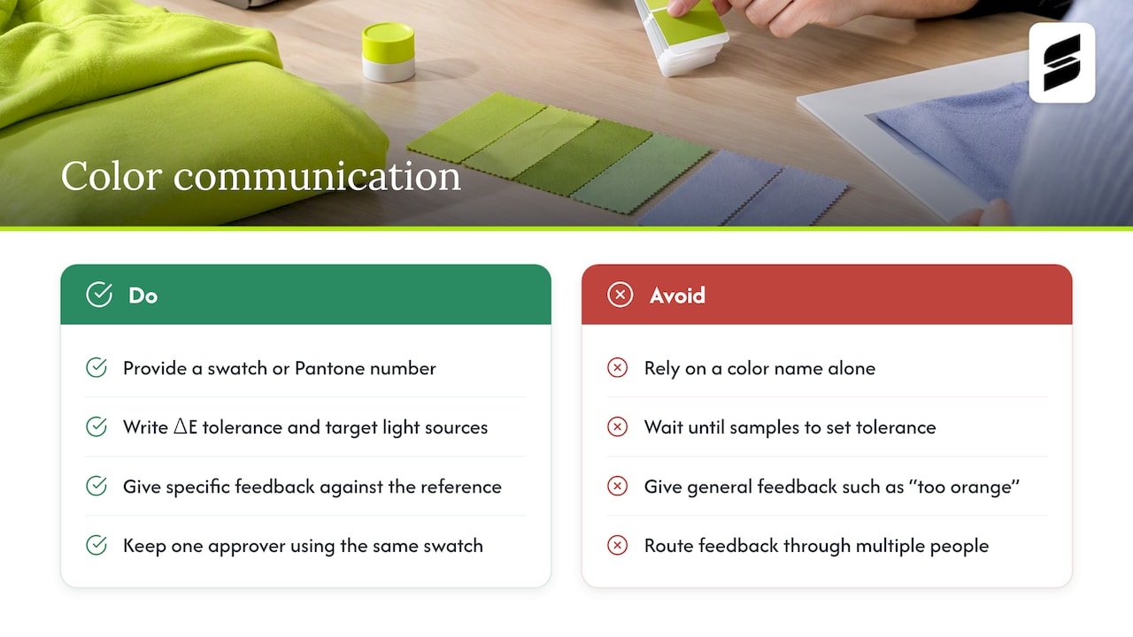
Vague color requests produce vague results. Instead of describing a color as “royal blue” or “team red,” hand your designer a physical reference, a Pantone number, or Lab* values whenever you have them. A name alone leaves too much room for interpretation between what you picture and what a screen or print renders.
Put your ΔE tolerance and target light sources in writing at the start of the project, not after the first sample arrives. This gives your designer and the production team a clear target rather than a subjective judgment call. When you provide feedback on a lab dip that misses the mark, be specific rather than general, saying something like “the red reads too orange” is less useful than noting it needs to shift cooler or darker relative to the reference swatch.
Keep one point of contact on the design conversation. Color feedback that passes through multiple people on a booster club or coaching staff tends to drift, with each person interpreting “close enough” differently. A single approver, working from the same physical swatch everyone agreed to upfront, keeps the final call consistent. Our Pantone color matching workflow for designers walks through how to translate a reference color into production specs your design team can act on directly.
Color Matching Challenges Specific to Sports Uniform Fabrics and Designs
Uniform fabric behaves differently from the fabric used in most other apparel, which creates matching challenges that do not show up in a typical clothing order. Moisture-wicking polyester, mesh ventilation panels, and compression fabric all take dye differently, even within the same garment.
Mesh is one of the harder substrates to match precisely, since its open weave scatters light differently than a tight knit, which can make an identical dye recipe look lighter or more washed out on a mesh panel than on the jersey body. Reflective or metallic trim, common on football and basketball uniforms, has its own limited palette and wider achievable tolerance, since metallic finishes do not hold color the way standard polyester does, per the ribbon color lab-dip workflow.
Multi-panel construction, common in soccer and volleyball uniforms where side panels, sleeves, and the main body are cut separately, multiplies the number of substrate and dye-lot combinations that need separate approval. A color approved once on a single swatch does not guarantee a match across every panel type in a finished uniform.
Team orders add a volume challenge on top of this. A reorder for new players months later needs to match an original run that may have come from a different dye lot entirely, which is why keeping a retained approved swatch, not just a digital color code, matters for any team planning future additions to its roster.
Effect of Wash and Wear on Color Consistency
Color approval does not end once a uniform ships. Repeated washing, sun exposure, and friction from regular wear all affect how a color holds over a season, and sublimated polyester generally holds up well against this because the dye is embedded in the fiber rather than sitting on the surface. That said, trim pieces, especially metallic or reflective accents, tend to show wear faster than the sublimated body fabric.
Washing in hot water or with harsh detergents accelerates fading more than the dye process itself typically does. Teams that want uniforms to hold their approved color through a full season benefit from basic care guidance: cold or warm water washing, mild detergent, and air drying or low heat, rather than aggressive machine drying that stresses both color and fabric.
When ordering a reorder mid-season to replace a damaged jersey or add a new player, compare the new piece against a uniform that has already been worn and washed several times, not just against the original approved swatch. A small amount of expected fade is normal, and matching the new piece to the current state of the roster, rather than to day-one color, keeps the team looking consistent on the field.
Using Digital Color Matching Tools Specific to Uniform Customization
Digital platforms can speed up parts of the color approval process, particularly for teams managing multiple colors across several uniform sets. Tools in this space combine digital color submissions with spectral data and a shared communication thread, which can shorten the back-and-forth between a team and a supplier and reduce the number of physical shipments needed to reach approval, per CSI ColorFlow’s description of its platform.
These tools work best as a supplement to physical approval, not a replacement for it. A screen, even a calibrated one, cannot fully predict how a color will look on sublimated polyester under gym lighting. Use digital tools to track submissions, store Lab* values, and keep a record of who approved what and when, but still require a physical bulk swatch before cutting begins.
For most teams ordering through a standard uniform supplier rather than managing a large multi-vendor program, a simpler system works just as well: a shared document listing your reference Pantone numbers, your ΔE tolerance, and your approved swatch photos alongside the physical samples themselves. The goal of any tool, digital or paper, is the same: a documented, repeatable record that removes guesswork from the next reorder.
Author Perspective: What to Prioritize When You Only Have One Approval Round
If you only get one real check before bulk production, spend it on the bulk swatch, not the lab dip. Approve it on the exact fabric, under D65 and whatever light your team plays under, and lock the ΔE tolerance for your hero color before you sign off. Contrast on numbers and logos matters more than subtle shade differences almost every fan will miss.
— Agha
How Capra Sports Can Help Teams Get Color Right
We handle the color approval work most teams dread, pairing your reference swatch with our design team and showing you the result on the actual substrate before anything goes to bulk production. Every order includes direct collaboration with a designer through revisions, so a color concern gets resolved before it becomes a reorder.
- Samples and mockups let you confirm your hero color and contrast choices on real fabric, not a screen preview.
- Sport-specific uniform lines for various sports all go through the same color confirmation step.
- Pricing and ordering details for every sport are listed on our pricing page, where you can see per-piece costs before you commit to a full roster order.
If you are ready to lock in your team’s colors, start with a mockup request and confirm the match before we move to bulk.
FAQ
What colors look good together in clothes?
Colors that sit opposite each other on the color wheel, such as navy and gold or forest green and white, tend to read cleanly together because they create natural contrast. For uniforms specifically, pairing one dominant color with a single bright accent and a neutral like white or black keeps the combination readable at a distance.
What are 2026 color trends?
Uniform color trends shift by sport and region each season, and no single governing body publishes an official uniform color trend list. Teams generally do better choosing colors that match their school or organization identity and hold up well in direct sunlight and gym lighting rather than chasing a seasonal trend.
Which color is best for uniforms?
There is no single best color since the right choice depends on your team’s identity, existing colors, and visibility needs under game lighting. What matters more than the specific color is confirming it holds up under a lab dip and bulk swatch approval process before a full order goes into production.
What is it called to get color matched for clothes?
This process is generally called a color approval protocol, or CAP, and it covers the reference standard, lighting conditions, sampling steps, and sign-off needed before bulk production begins. A well-run CAP typically includes a physical reference, a lab dip, a ΔE tolerance, and a documented approval step.
How long does uniform color approval usually take?
Initial lab dips can take as little as a few days from suppliers with in-house dyeing capability, but a full approval cycle including revisions commonly runs 15 to 30 days. Building that window into your ordering schedule avoids a last-minute scramble before the season starts.
Sources
This is the part suppliers should walk you through, and the part you should insist on if they do not raise it first.
A lab dip is a small fabric sample dyed to match your target color, submitted before any bulk fabric is cut. A bulk swatch comes later, pulled from the actual production dye lot. Both steps matter: a lab dip confirms the recipe is close, while the bulk swatch confirms the factory run matches it. Skipping the bulk swatch is one of the more common reasons teams discover a mismatch only after uniforms ship, according to a buyer’s guide to the lab dip approval process.
When you submit a color target, specify the exact fabric substrate, weight, and finish, since the same dye recipe looks different on mesh than on tight-knit interlock. A color approved on the wrong substrate is not really approved.
Light source matters just as much as the swatch itself. Evaluate lab dips under D65 (standard daylight) and under the lighting your team will actually be seen in, since a color that matches under one light source can shift under another, a phenomenon called metamerism. Checking under both is the simplest way to catch it, per the buyer’s guide.
ΔE under 1.0 for hero colors is generally achievable on polyester satin, with best-case tolerances typically below 1.0 on that substrate, according to a ribbon color lab-dip workflow breakdown. Measured using the CIE2000 formula, reasonable tolerance bands for team uniforms are a hero color at ΔE ≤1.0, a primary supporting color at ≤1.5, and smaller supporting elements at ≤2.0.
- How to Create a Color Approval Protocol (CAP) That Works | XingYuan
- Fabric Color Matching Guide: Lab Dip Approval & Shade Band Control | GoVoloom