
Coordinators: Mockup First Playbook to Fit the Longest Jersey Name
The fastest way to handle long names on jerseys is to build your entire lettering standard around the longest name on your roster, then decorate with a flexible method like sublimation that lets you adjust kerning and letter height precisely. If a name still won’t fit cleanly, fall back to tighter letter spacing first, then modest height reduction, and only consider abbreviations or sleeve wraps as a last resort.
TL;DR:
- Using the longest player name as the standard ensures all jerseys can be designed with a consistent lettering size and kerning, preventing repetitive adjustments late in production.
- Tightening letter spacing and reducing font weight are the least invasive tactics to fit long names without distorting their shape or compromising legibility, before resorting to name abbreviations or patches.
- Sublimation printing offers the greatest flexibility for long names, as it embeds ink into the fabric, avoiding bulk and allowing precise adjustments thatother decoration methods cannot match.
- Equipment staff typically reduce letter height to around 7/8 inch and tighten spacing for long names, prioritizing readability and visual consistency over stylistic flair.
- Confirming league-specific rules and character limits before designing is crucial, especially since retail customization tools often cap names at 9 to 12 characters, forcing teams to choose full custom sublimation if names are longer.
Table of Contents
- Why “Long Names On Jerseys” Trips Up Most Coordinators
- Fast Tactics To Make A Long Name Fit
- What Sizing Rules And League Requirements Actually Allow
- Your Step-By-Step Checklist From Roster To Approved Design
- Decoration Methods Compared: Why Sublimation Usually Wins
- What Pro Equipment Managers Actually Do With Long Names
- Capra Sports’ Workflow For Long-Name Jerseys
- Durability: Keeping Long Names Legible After Dozens Of Washes
- How Fabric Stretch Changes The Way A Long Name Reads
- Choosing A Font That Actually Reads At Distance
- Our Take: Design For The Longest Name, Not The Average One
- Get A Free Mockup Before You Commit To A Full Team Order
- Sources
- FAQ
Why “Long Names On Jerseys” Trips Up Most Coordinators
Most order-day headaches don’t come from the name itself. They come from designing each jersey separately, one player at a time, instead of deciding on a single spacing and sizing rule before anyone submits a name. Industry guidance from decoration professionals consistently points coordinators toward a “longest-name” policy: pick the letter height, font weight, and kerning that will work for your longest name, then apply that exact same spec to the entire roster. That’s the difference between a uniform set that looks designed and one that looks improvised.
Jersey name length becomes a real production issue the moment a surname pushes past 10 or 11 characters. A name like “Johnson” prints at full size with room to spare. A name like “Featherstonehaugh” does not, and neither does a hyphenated name like “Forsbacka-Karlsson” once you count the hyphen. That’s the exact situation the Boston Bruins equipment staff faced with player Jakob Forsbacka Karlsson, whose 18-character surname stretched roughly 38 inches across a jersey back that only offered about 20 inches of usable width, according to NHL.com. Their solution wasn’t a gimmick. It was math: reduce letter height, tighten spacing, and keep the name legible from the upper deck.
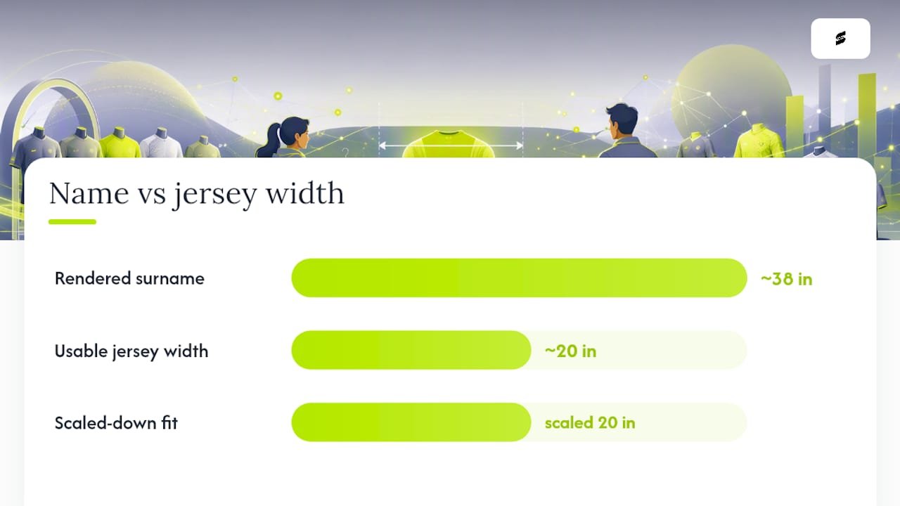
That single case is worth studying closely, because it contains almost every principle a team coordinator needs when planning custom jerseys with long names.
Fast Tactics To Make A Long Name Fit
When a name comes in long, you want a ranked list of moves, not a scramble. Here’s the order that actually works, starting with the least destructive option and ending with the one you should avoid unless nothing else works.
- Tighten kerning and trim letter weight first. Reducing the space between letters and using a slightly lighter font weight preserves the straight, readable line of text fans and officials expect. Equipment managers handling the Forsbacka Karlsson jersey reportedly preferred condensing spacing tightly between letters rather than distorting the name’s shape, per NHL.com.
- Drop letter height modestly, not drastically. A standard adult jersey name typically runs 2.5 to 3 inches tall. For a genuinely long name, dropping to 2.0 or 2.25 inches usually keeps letters readable from a normal viewing distance while buying back the width you need.
- Reserve arching or sleeve wraps for true last resorts. Arching a name across a curve, or wrapping the tail end of it toward the sleeve with a custom patch, can rescue an unworkable name. It also changes how the jersey reads at a glance and can clash with your team’s branding, so treat it as a fallback rather than a default.
- Use abbreviations or accepted short forms only where your league allows it. Some organizations permit a shortened surname or common nickname on the jersey as long as the roster and scorebook carry the legal name. Check your governing body’s rulebook before you rely on this option.
- Move off retail customizers the moment a name exceeds their character cap. Many retail online jersey builders cap name input around 9 to 12 characters and block spaces or punctuation entirely. Custom sublimated production has no such ceiling, which is exactly why teams with unusually long or hyphenated names tend to outgrow off-the-shelf builders fast.
Pro Tip: Test your tightest kerning setting on your longest name FIRST, before you finalize a team-wide font. If it still looks cramped or hard to read at that extreme, you need a different font or a slightly shorter letter height, not more squeezing.
Notice what’s missing from that list: guessing. Every option above is a controlled adjustment you can preview in a mockup before a single jersey gets printed. That’s the entire point of designing around the longest name up front instead of firefighting it later.
What Sizing Rules And League Requirements Actually Allow
Before you approve any jersey design, you need two sets of numbers locked down: the letter dimensions you’re comfortable with, and the placement rules your league or governing body enforces. Skip this step and you’ll be reordering.
Letter height guidance that holds up across sports:
- Adult jerseys typically run 2 to 3 inches for back names, with most sublimation shops treating 2.5 inches as the comfortable default.
- Youth jerseys often run smaller, but readability drops fast below roughly 1 inch. At that point, names stop being legible from the stands or the sideline, which defeats the purpose of putting a name on the jersey at all.
- Sports with fast lateral movement (soccer, basketball) benefit from slightly bolder letter weight even at reduced height, since the name is often read while the player is in motion.
Placement norms that shift when names get long:
Standard placement puts the name a set distance below the collar seam and centered above the back number. A long name doesn’t just affect letter height, it affects the whole vertical layout, since a wide block of text needs breathing room from the number below it. Coordinators who shrink letter height without adjusting the gap above the number often end up with a name that looks crammed against the collar.
League rules you need to verify before finalizing anything. Some leagues have specific requirements around what has to appear on the back of a jersey and how. The NHL, for example, requires a player’s actual surname on the jersey rather than a nickname, and other organizations set their own restrictions on abbreviations or nicknames. These rules vary by sport and by governing body, so confirm the current requirement in your league’s own rulebook before you commit to a shortened name or a stylistic workaround.
By the numbers: Retail jersey customizers commonly impose strict character limits and often reject spaces or punctuation outright. A surname like “Van Der Berg” or “O’Sullivan-Reyes” can blow past that cap before you’ve even reached the letter-height conversation, which is a strong signal you need a custom production route instead of a consumer-facing builder.
That character cap is the practical dividing line for most coordinators. If your longest roster name fits comfortably inside a 9 to 12 character retail limit, a standard online builder might work fine. If it doesn’t, you’re better off with a supplier that builds layouts around your actual roster rather than a fixed template.
Your Step-By-Step Checklist From Roster To Approved Design
Treat this as the order of operations for any team order, not just the ones with an obviously long name on the list. You won’t know which name is your longest until you’ve actually gathered everyone’s.
- Collect full legal names and preferred display names in one spreadsheet. Some players go by a shortened version of their legal name on the field. Capture both columns so nothing gets lost between registration and jersey production.
- Identify your longest name and count every character, including hyphens and apostrophes. A name like “O’Brien-Castellanos” reads as one name but counts as roughly 19 characters once you include the punctuation, and those marks take up real horizontal space in a printed layout.
- Set your team-wide spec using that longest name as the baseline. Lock in letter height, font family, and kerning based on what fits that name cleanly, then apply the identical spec to every other player. This is the single move that keeps a 20-player roster looking like one team instead of 20 different design decisions.
- Request a mockup in your chosen decoration method before approving anything. A digital proof shows you exactly how the longest name sits inside the available space, at the actual size it will print.
- Ask for a physical sample swatch if you’re using an unfamiliar font or unusually tight spacing. A screen mockup can look fine and still print differently once it hits fabric. A swatch removes that guesswork before you commit to a full team order.
- Document the final approved spec sheet and keep it on file. When a new player joins mid season or you reorder next year, that spec sheet is what keeps the new jersey matching the rest of the set instead of drifting into a slightly different size or font.
Pro Tip: Build your roster spreadsheet with a dedicated character-count column that auto-calculates length, including punctuation. It takes five minutes to set up and it’s the single fastest way to catch a problem name before it reaches your designer.
Coordinators who skip step 2 are the ones who discover a fitting problem after the first mockup comes back wrong, when a rushed fix is far more expensive than a five-minute audit would have been. Counting characters correctly matters enough that outlets covering roster oddities, including FanGraphs’ breakdown of major-league uniform character limits, treat hyphens and apostrophes as real characters that eat into your available space, not cosmetic marks you can ignore.
If your program runs multiple teams across different sports, the step-by-step coach’s guide to designing a custom uniform walks through this same intake process in more detail, including how to structure your design request so a professional designer can work from it directly.
Decoration Methods Compared: Why Sublimation Usually Wins
Your printing method decides how much flexibility you actually have once a name gets long, and the differences between methods are bigger than most first-time coordinators expect.
Sublimation dyes the design directly into the fabric fibers rather than sitting a layer on top of them. That matters enormously for long names because there’s no added bulk, no raised edge, and no seam to work around, which means a designer can adjust letter width, height, and spacing with far more precision than a physical letter kit allows. Sublimation also handles curved or unusual layouts cleanly, since the print is part of the fabric itself rather than a separate piece applied to it. If you want to understand the mechanics in more depth, Capra Sports’ breakdown of how sublimation printing works covers why the ink becomes part of the fabric rather than a coating on it.
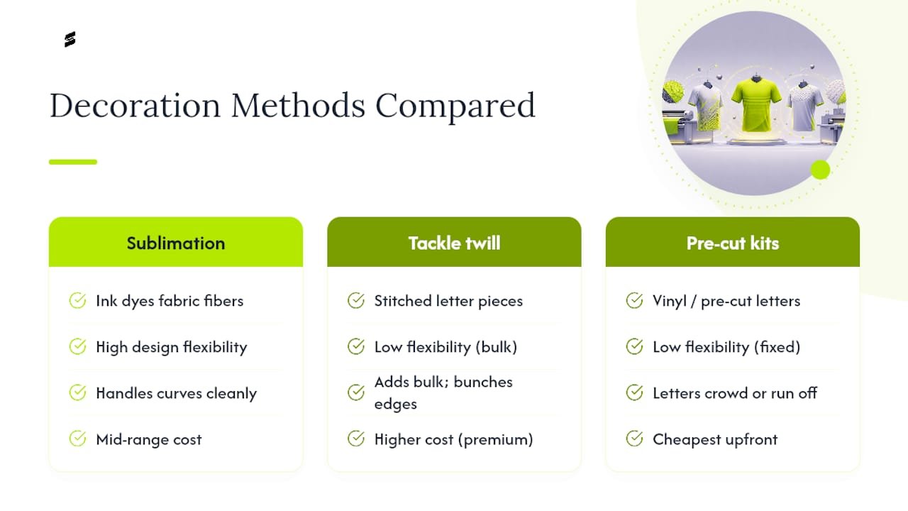
Tackle twill, the stitched-letter method common in traditional baseball and football jerseys, delivers a premium textured look that a lot of programs love. It struggles with long names for a simple physical reason: every letter is its own stitched piece, so a wide name means more fabric bulk stacked across the back panel. That bulk can stiffen the garment and, over a long run of letters, start to bunch at the edges, which is the opposite of what you want on a jersey a player needs to move freely in.
Heat transfer vinyl and pre-cut letter kits are the budget option, and they’re genuinely fine for short names on a tight timeline. The catch is that most pre-cut kits come in fixed letter sizes and fixed spacing, so you’re stuck with whatever kerning the kit allows. A long name on a pre-cut kit often means letters crowding into each other or running off the printable area entirely, with no easy way to adjust.
“The letters basically ran out of room before the name did.” That’s the recurring problem coordinators describe when a long surname meets a decoration method that can’t flex, whether that’s a stiff twill layout or a pre-cut vinyl kit sized for an average name.
For cost and reorder planning: sublimation tends to sit in a comfortable middle ground on price while offering the most design flexibility, tackle twill runs higher for its premium finish, and pre-cut kits are cheapest upfront but least forgiving for anything longer than a standard surname. If you’re ordering from a retail-style online builder rather than a full custom shop, test a physical sample before committing a full team’s order to an unfamiliar template, especially for names on the longer side.
What Pro Equipment Managers Actually Do With Long Names
Professional sports have been solving this exact problem for decades, and their fixes are surprisingly transferable to a youth soccer roster or a rec league softball team.
- Boston Bruins, Jakob Forsbacka Karlsson. Equipment staff reduced letter height to roughly 7/8 inch and tightened spacing to around 3/16 inch to fit all 18 characters of his surname into the jersey’s back panel, prioritizing a straight, readable line over any stylistic flourish, according to NHL.com.
- MLB long-surname cases. Major League Baseball has documented multiple instances of long surnames, including catcher Jarrod Saltalamacchia’s, where teams wrapped or extended lettering toward the sleeve area to accommodate a name that wouldn’t fit within a standard back panel, as covered by MLB.com.
- NBA arching versus kerning. Basketball jerseys have less vertical real estate than a hockey or football jersey, which pushes some long names toward a steep arch across the back. Equipment staff generally treat that arch as a compromise rather than a preference, favoring tighter letter spacing whenever the layout allows it.
- The consistent lesson across all three leagues: every fix started with a mockup, not a guess, and every equipment manager prioritized keeping the name readable over keeping it decorative.
The common thread is worth repeating because it’s the entire thesis of this playbook: readability comes first, arching and wrapping are fallbacks rather than defaults, and nothing gets finalized without a visual test first.
Capra Sports’ Workflow For Long-Name Jerseys
Sublimation is only as good as the shop running it, and that’s where your production partner actually earns their keep on a roster with an unusually long name.
Capra Sports builds every jersey through full sublimation, which means letter height, kerning, and layout get adjusted to your specific roster rather than forced into a fixed retail template. Team orders start at 10 sets, and every order includes a free 24-hour mockup along with a free sizing sample so you can confirm sizing on fabric before committing to a full team run. Because designers work directly with your coordinator on unlimited revisions, a name like an 18 character hyphenated surname gets the same design attention as a standard six-letter name.
When you submit a design request, a few fields make the process faster and more accurate:
| Spec Field | Why It Matters |
|---|---|
| Roster CSV with full legal names | Establishes the real character counts you’re designing around |
| Preferred display names | Flags any player using a shortened or different name on the field |
| Longest name(s) flagged | Sets the baseline letter height and kerning for the whole team |
| Desired letter height range | Gives the designer your legibility floor before mockup starts |
| Font examples or preferences | Speeds up the first mockup round significantly |
Sending those five fields with your first design request typically means your first mockup is close to final, rather than a starting point for several rounds of back and forth.
Durability: Keeping Long Names Legible After Dozens Of Washes
A name that fits perfectly on delivery day is only half the job. It has to still read clearly after a full season of washes, slides, and sweat.
Sublimated names hold up better over time than most alternatives because the ink is embedded in the fabric fibers rather than sitting on top as a separate layer. There’s nothing to crack, peel, or flake, which is the failure mode you typically see with cheap heat transfer vinyl after 15 or 20 wash cycles. Tackle twill holds its texture well but stitched edges can fray at the corners of individual letters over time, and that fraying shows up fastest on the letters at the start and end of a long name, where stress from stretching and folding concentrates.
Wash care matters more for long names specifically because tighter kerning means less margin for letters to shift or blur before they start overlapping each other. Cold water washes, mild detergent, and avoiding high-heat dryer cycles all extend how long a tight-spaced name stays crisp. Capra Sports’ guide to washing sublimated jerseys covers the specific care routine that keeps sublimated graphics, including tightly kerned lettering, looking close to day one well into a second or third season. If your program reorders jerseys year over year, that durability difference compounds, since a name that degrades slowly is one less reason to reorder early.
How Fabric Stretch Changes The Way A Long Name Reads
The fabric underneath the name matters just as much as the printing method sitting on top of it, and this is the part coordinators overlook most often.
Modern performance jerseys use stretch fabrics, often polyester blends with a percentage of spandex or similar stretch fiber, so the garment moves with the athlete. That stretch is great for fit and comfort. It’s a real complication for long names, because a name printed flat on unstretched fabric can distort slightly once the jersey stretches across a player’s back during movement. A name with several wide letters in a row, like one full of M’s, W’s, or capital letters throughout, shows that distortion more visibly than a narrower name would.
Sublimation handles this better than most alternatives because the dye becomes part of the fiber structure itself, so it stretches and recovers along with the fabric rather than resisting it. A separate applied layer, like vinyl or a woven twill patch, doesn’t have that same give, which is part of why those methods are more prone to visible puckering or bubbling around a long stretch of lettering once the garment moves.
Fabric weight plays a role too. Lighter, more breathable mesh fabrics common in soccer and basketball jerseys tend to stretch more than the heavier fabrics used in football or baseball, which is one more reason a “one size fits all” font and spacing rule across every sport your program runs usually needs adjusting sport by sport, not just name by name.
Choosing A Font That Actually Reads At Distance
Not every font that looks clean on a screen holds up once it’s shrunk down and squeezed to fit a long name, and this is where a lot of otherwise solid designs lose legibility.
Bold, condensed sans-serif fonts are the standard for a reason: they carry the most readable letterforms at the smallest sizes, and their narrower default width gives you more room to fit extra characters before you even start adjusting kerning. Avoid script fonts, heavily stylized fonts, or anything with thin strokes for a long name specifically, since thin strokes are the first thing to blur or thin out further once you compress letter height to make room.
Consistent letter width across the alphabet matters more than most coordinators realize. A font where the “I” and the “W” take up wildly different amounts of space makes even spacing nearly impossible to achieve across an 18 or 20 character name, and uneven spacing is one of the fastest ways to make a name look unprofessional even when every letter itself is perfectly legible.
If you’re choosing between two fonts and one has a slightly smaller default character width, pick that one for your longest-name roster. It gives you more flexibility before you have to touch letter height or kerning at all, and it means your standard font choice will likely work fine for every other, shorter name on the roster without any adjustment.
Our Take: Design For The Longest Name, Not The Average One
The single biggest mistake teams make with long names isn’t a bad font choice or a cheap decoration method. It’s designing the jersey around a typical name and then treating every unusually long one as an exception to be solved individually, player by player, order by order. That approach guarantees inconsistency, and inconsistency is what actually makes a roster look unprofessional, not letter height variance of a quarter inch.
Flip that order of operations. Find your longest name first, build your entire spec around it, and every shorter name on the roster will fit inside that spec with room to spare. Conventional advice spends too much time on arching and stylistic workarounds and not enough on the two moves that actually solve most problems quietly: tighter kerning and a decoration method flexible enough to support it. Sublimation earns its place here because it removes the physical constraints that stitched or applied letters run into.
If there’s one thing worth prioritizing above all else, it’s the mockup. A screen proof or physical swatch catches a bad fit before it becomes 20 identical mistakes on order day.
— Agha
Get A Free Mockup Before You Commit To A Full Team Order
You’ve got the playbook: measure your longest name, set one standard, and pick a decoration method that flexes with you instead of against you. Capra Sports puts that playbook into action with full sublimation printing, a 10-set team minimum, and a free 24-hour mockup before you spend a dollar on production.
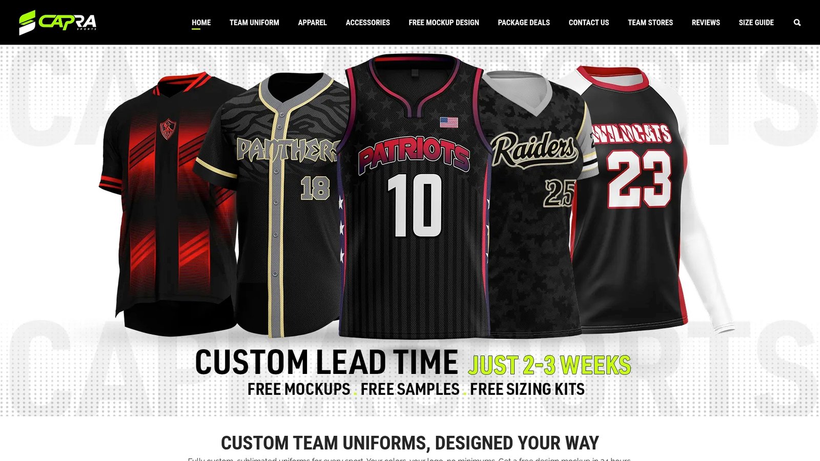
Send over your roster CSV, flag your longest name or names, note your preferred display names, and tell us your target letter height. From there, our designers build a mockup around your actual roster, not a generic template, and you can request a free sizing sample if you want to see the sizing on real fabric before approving anything. Your free mockup comes back within 24 hours, so you’re not stuck waiting to see whether a tricky name fits cleanly. Head to the free design request form to start that process, or browse the design catalogues and size charts to see what’s possible across basketball, baseball, soccer, football, and volleyball kits.
Next step: see what a full baseball team kit costs per player, or request a free 24-hour mockup of your design.
Sources
FAQ
What is the longest name ever printed on a jersey?
Jakob Forsbacka Karlsson’s surname is one of the most cited examples in professional sports, requiring the Boston Bruins equipment staff to shrink letter height and spacing to fit it across the jersey back, according to NHL.com.
Who has the longest name on an MLB jersey?
MLB has documented several long-surname cases, including catcher Jarrod Saltalamacchia, whose lengthy last name led teams to wrap or extend lettering toward the sleeve area rather than shrink it beyond legibility, as reported by MLB.com.
What are some of the longest surnames seen in sports overall?
Beyond Forsbacka Karlsson and Saltalamacchia, hyphenated and multi-part surnames are increasingly common across soccer and international rosters, and each one presents the same core fitting challenge: more characters than the standard layout was built for.
How long can a name be before I need custom production instead of a retail customizer?
When a name approaches or exceeds common retail customization character limits, many tools will cap the input or block punctuation entirely, which usually means moving to a full custom sublimation supplier like Capra Sports.
Should I count hyphens and apostrophes when measuring name length?
Yes. Hyphens and apostrophes take up real horizontal space in a printed layout, so a name like “O’Brien-Castellanos” should be counted at its full character length, punctuation included, when you’re setting your team’s longest-name standard.
Does my league allow abbreviated names on jerseys?
Rules vary significantly by governing body. Some organizations, including the NHL, require a player’s actual surname rather than a nickname, so always confirm the current requirement in your specific league’s rulebook before finalizing any abbreviation.